Groton Quarterly

Stoltze has been partnering with Groton School on their award-winning admissions suite and branding for the last 5 years. In late 2024, we began working on their quarterly alumni publication, giving the design an overall refresh, and also producing the related annual report.
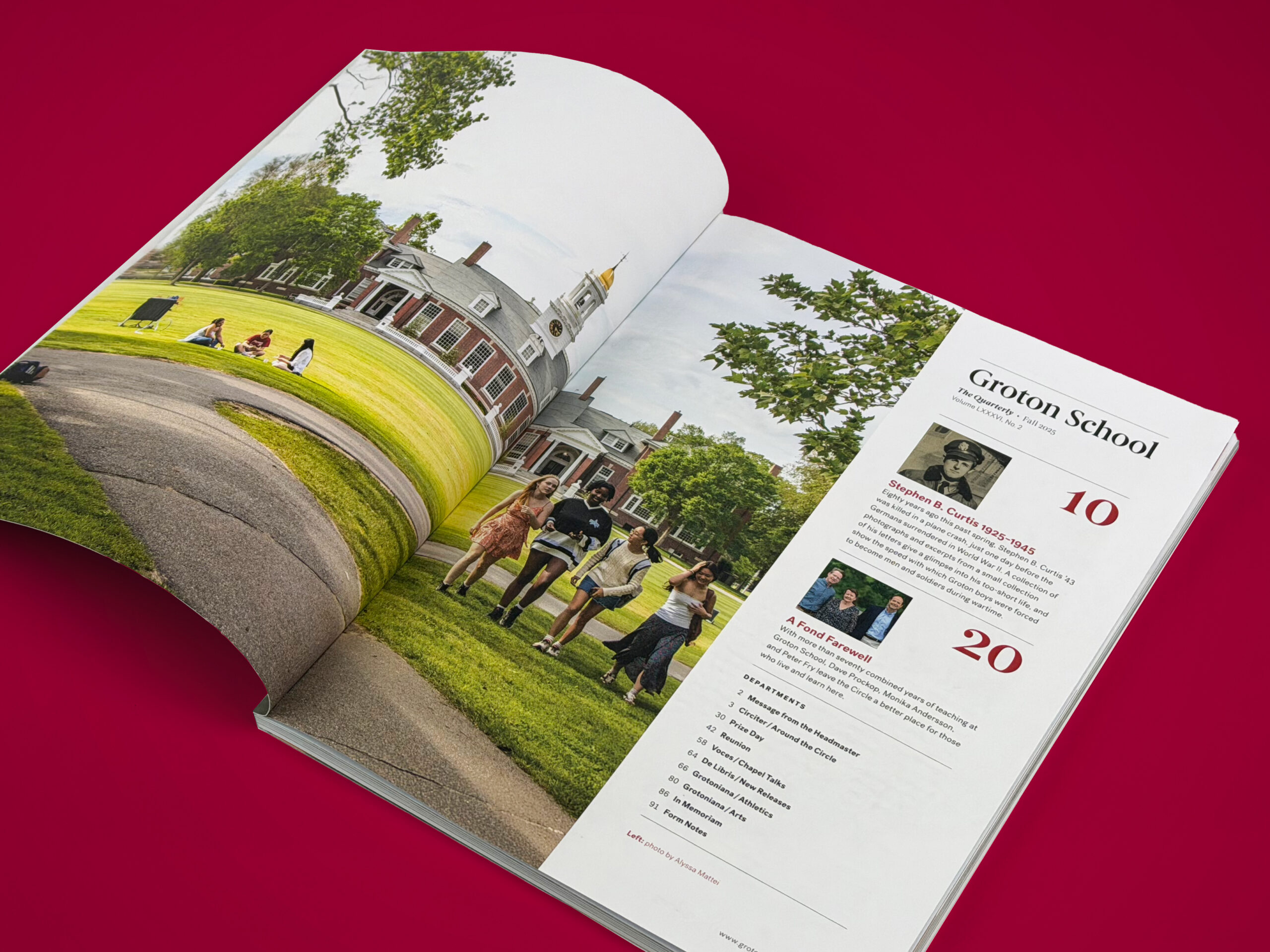
Our approach to updating the Quarterly began with a simpler, bolder cover treatment, featuring ‘Groton’ as the magazine title, set in Berlingske—a modern interpretation of a classic calligraphy-built serif font—ensuring consistency with other Groton materials we’ve designed over the years. We are also incorporating the fonts Post Grotesk and Miller in various combinations for headlines and text, selected for their legibility and elegance. While the publication’s page size remains the same, we have restructured the underlying grid to accommodate more content and to enhance readability.