The Davis Museum Catalogues
Identity / Book Design / Catalogs
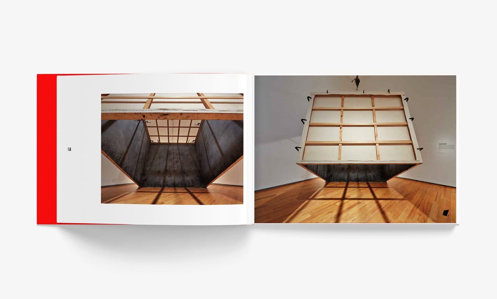
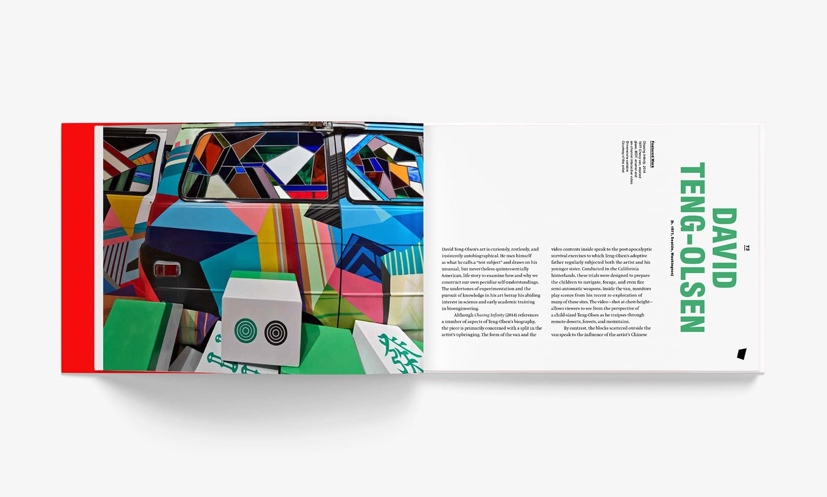
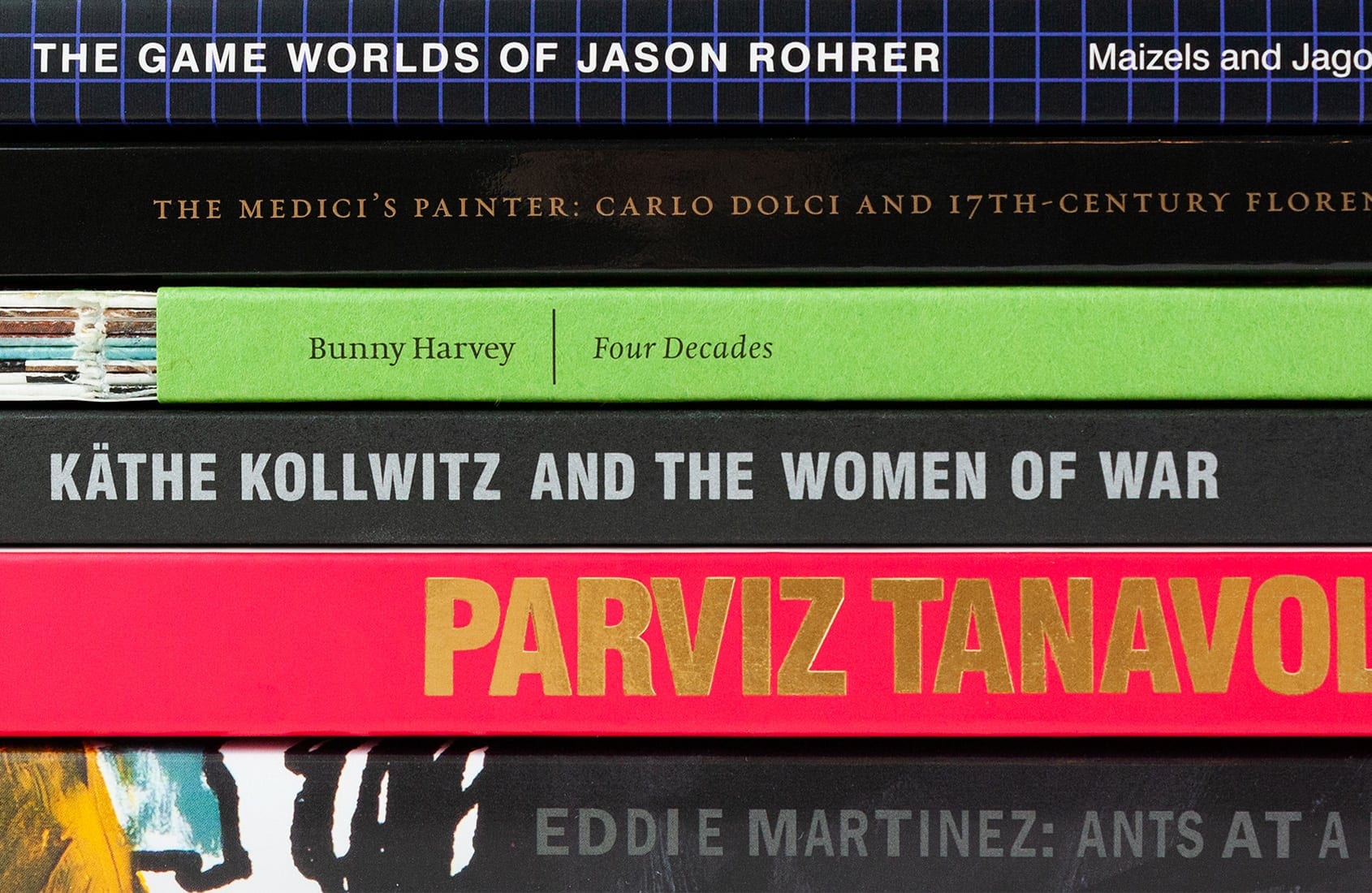
As an acclaimed academic art museum, the Davis brings a variety of engaging exhibits to the Wellesley campus each semester. Since 2014, Stoltze has partnered with the museum on a series of award-winning exhibition catalogs that capture the spirit and experience of each show. We work closely with the Davis team to reflect the curatorial insights as well as the materiality, technique, and presence of the art. To that end, we often use special construction and print techniques, including die-cuts, exposed smyth-sewn binding, French folds, and spot metallic inks. Each book varies in format, structure, and tone, but all reflect the Davis’ bold vision.
Identity / Book Design / Catalog
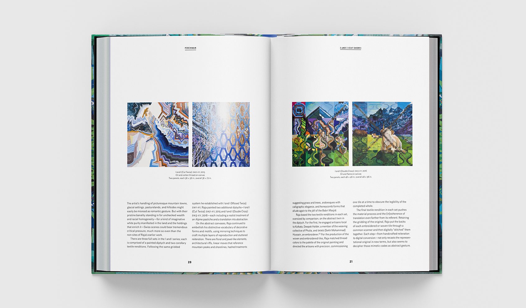
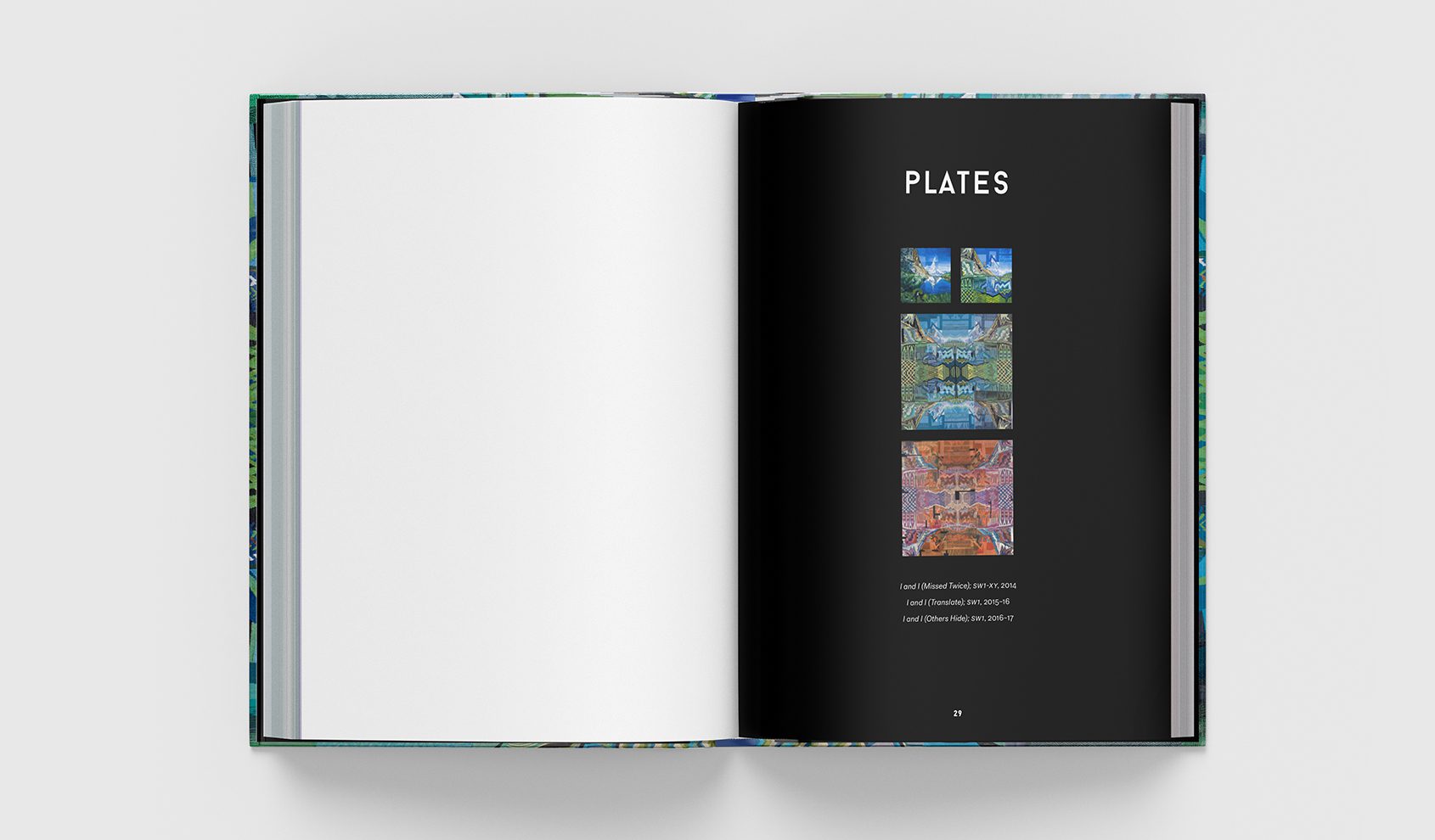
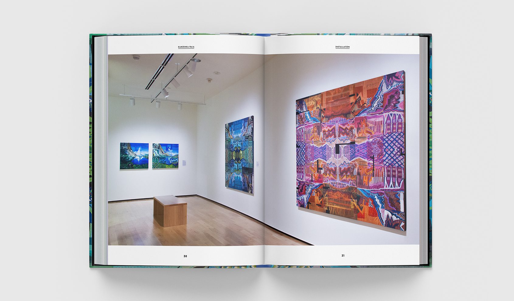
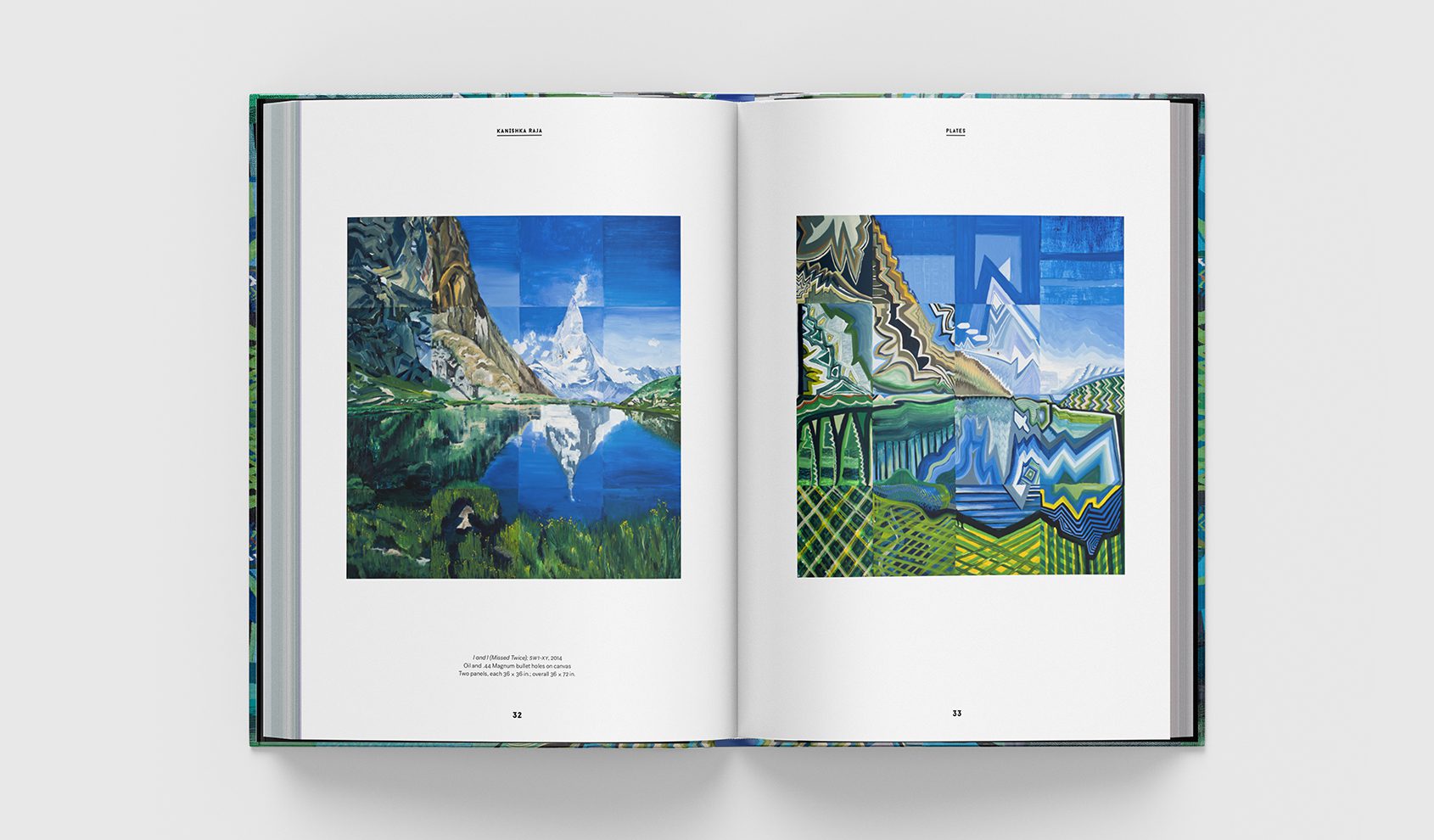
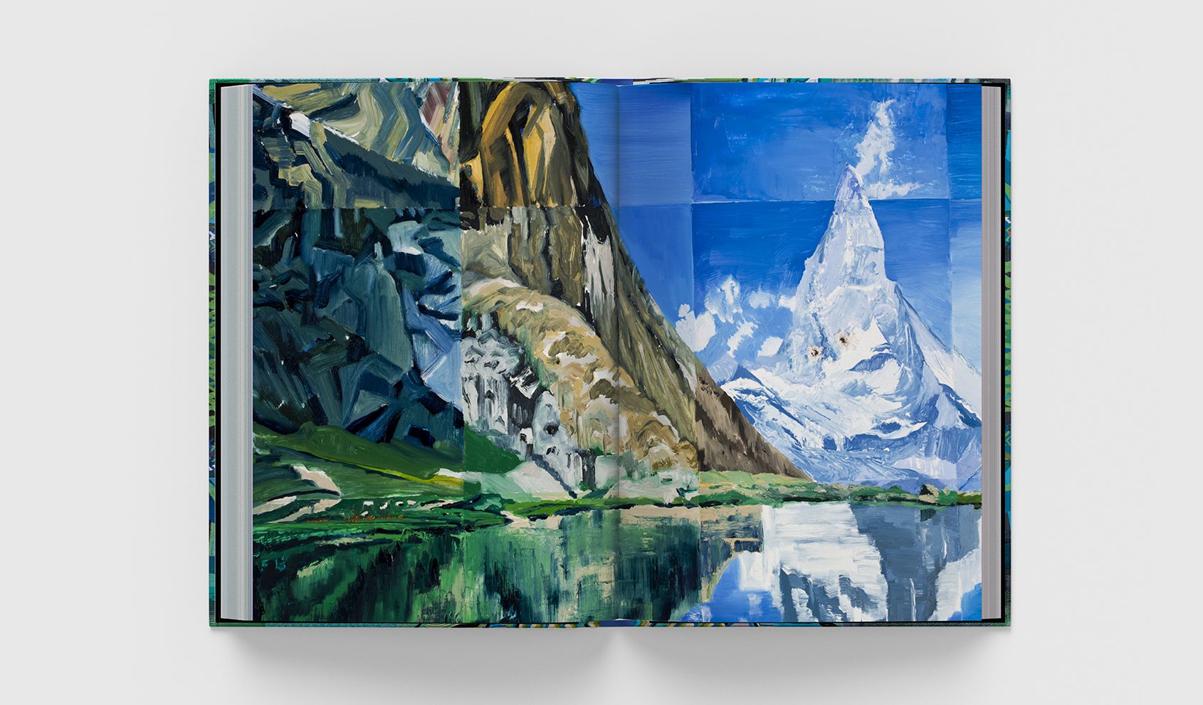
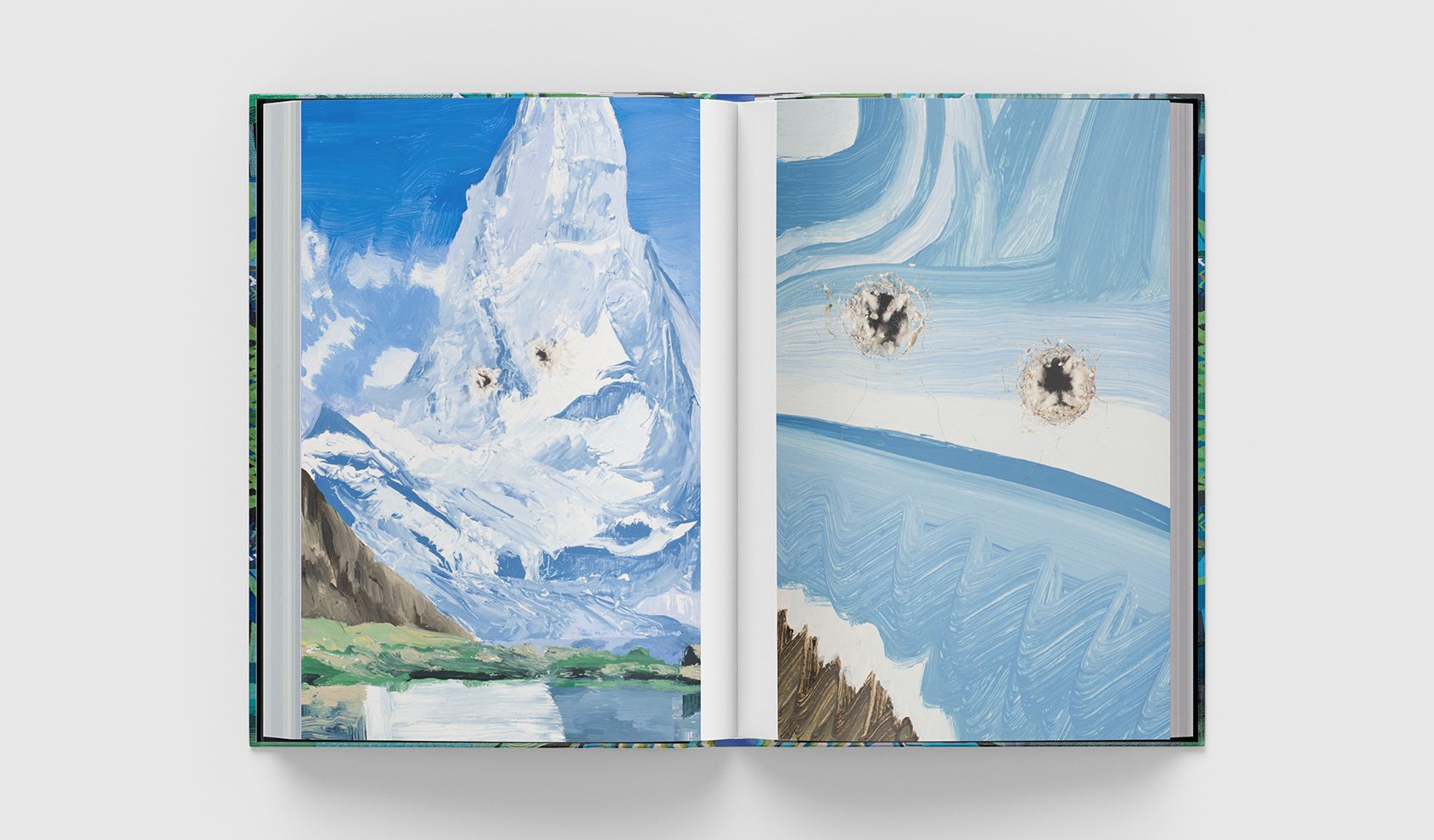
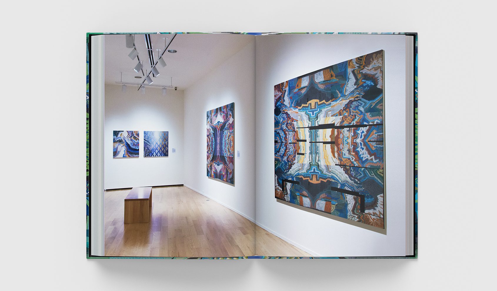
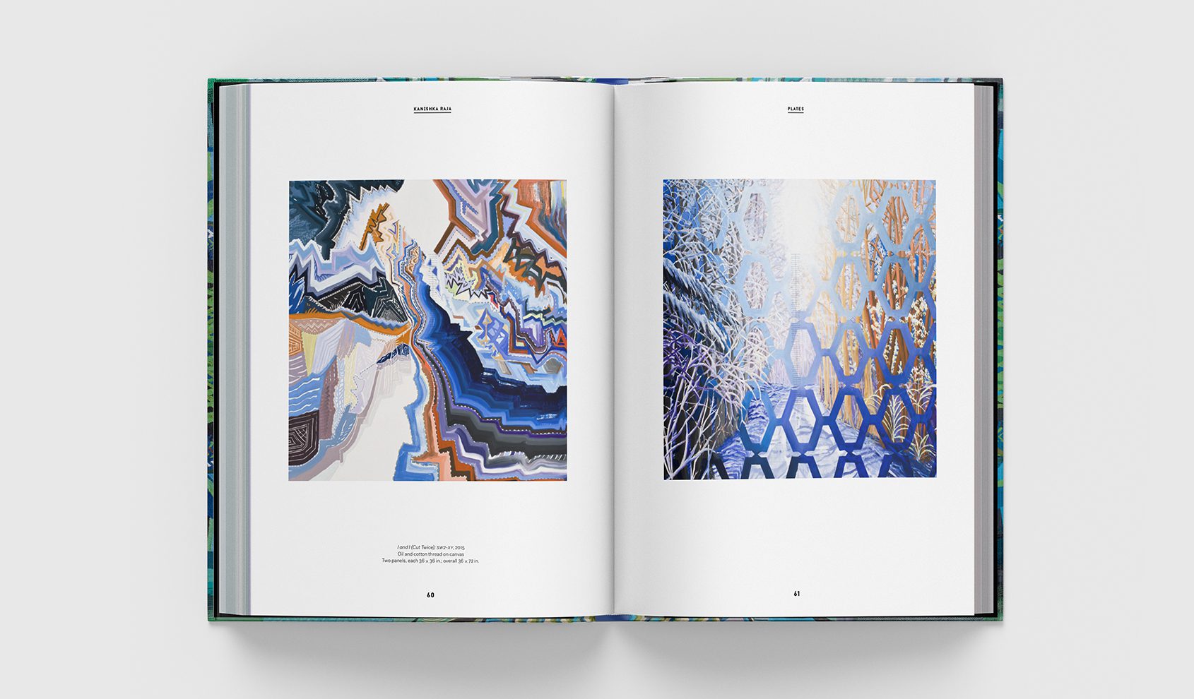
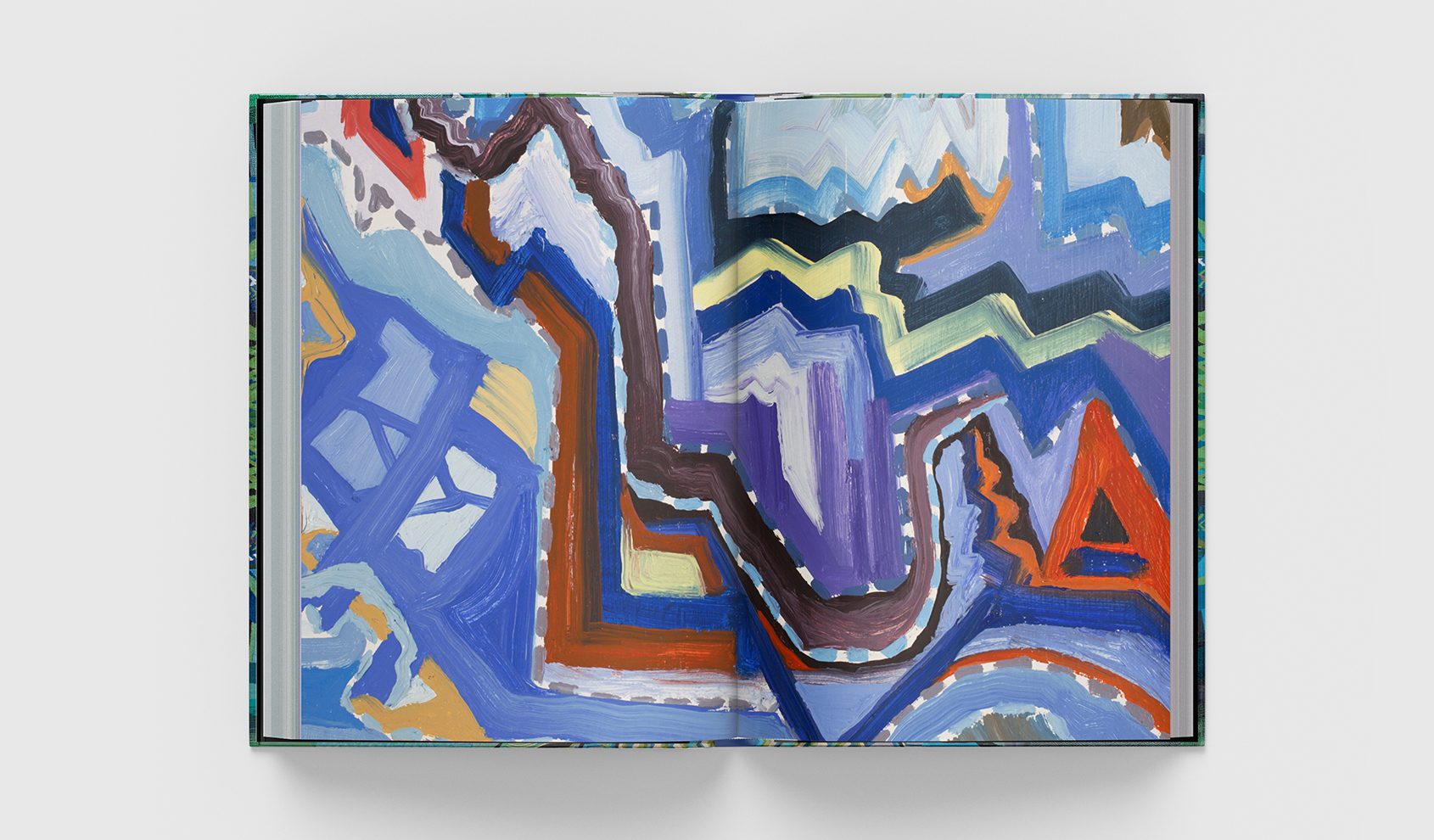
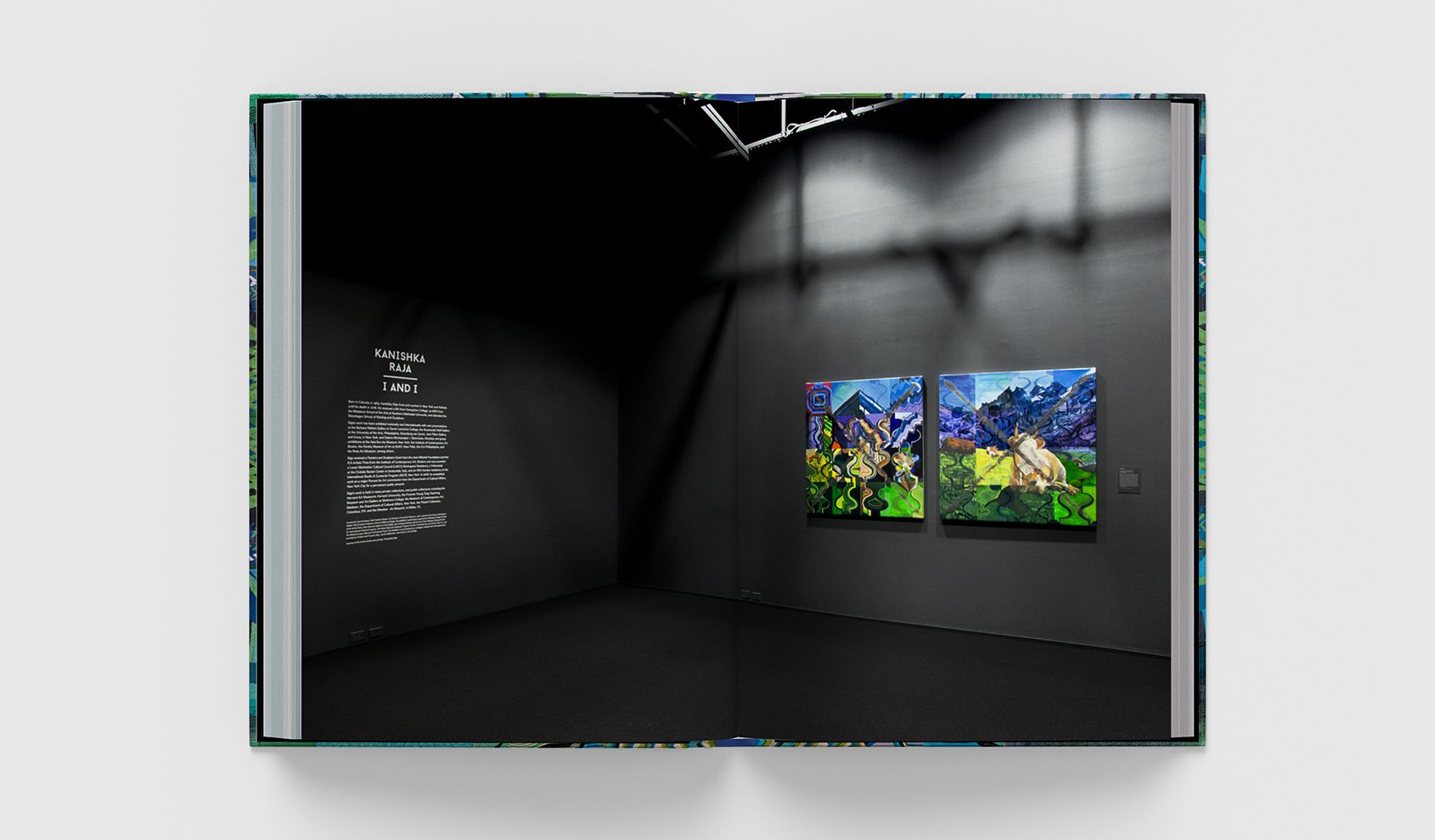
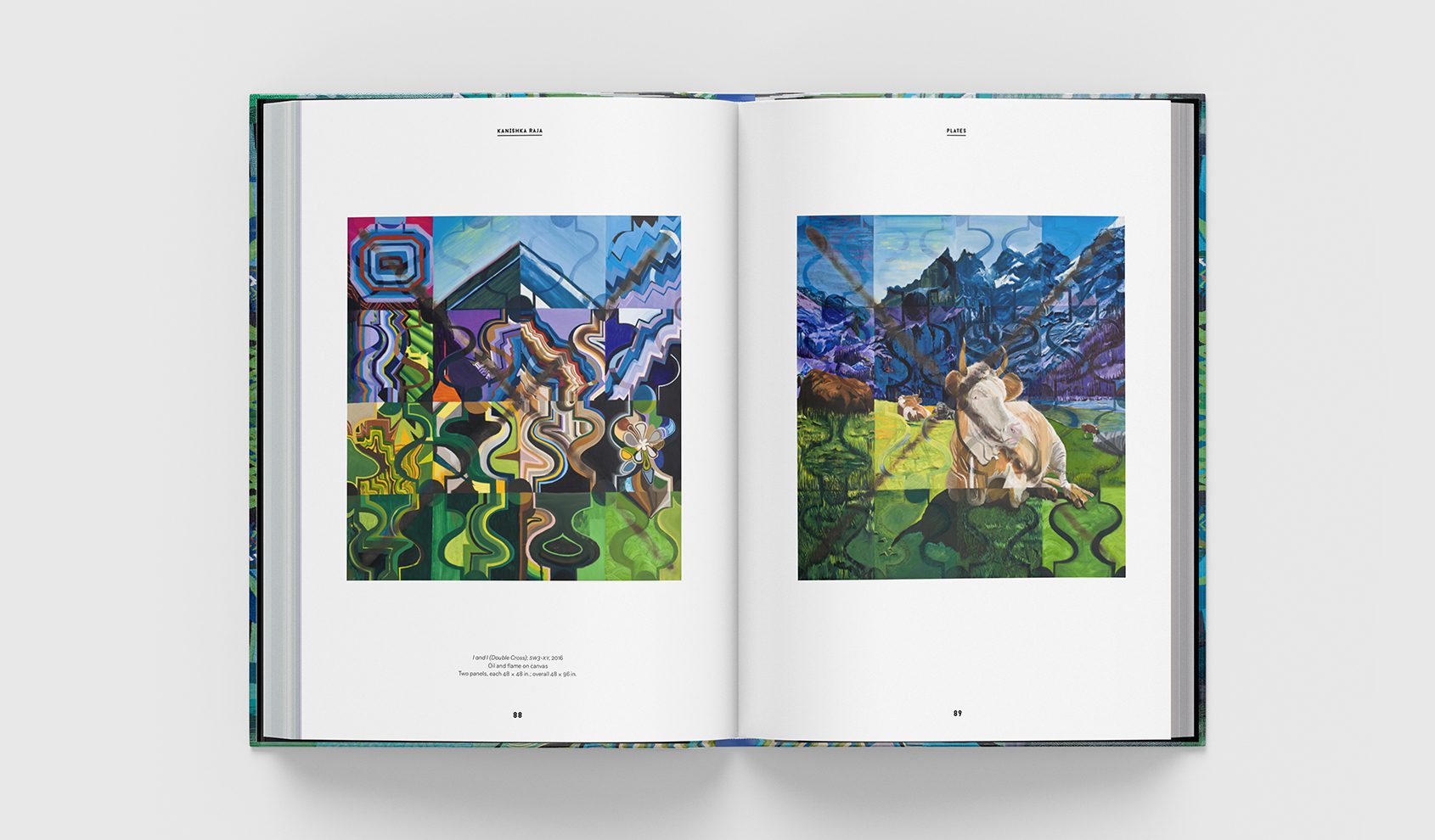
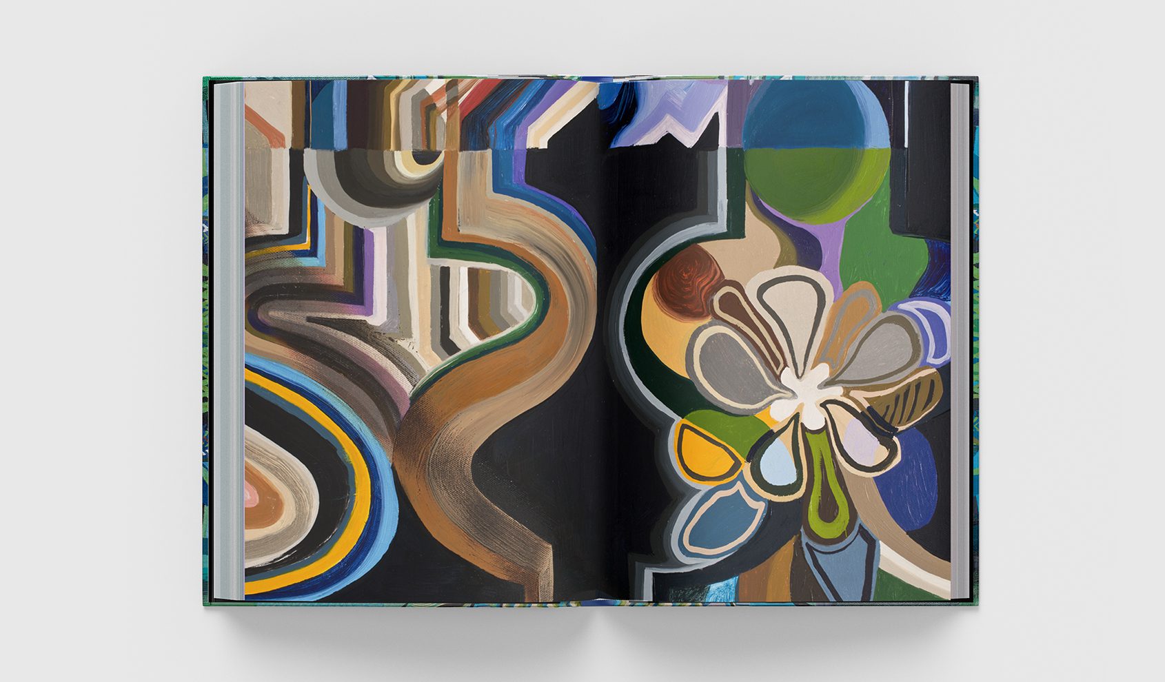
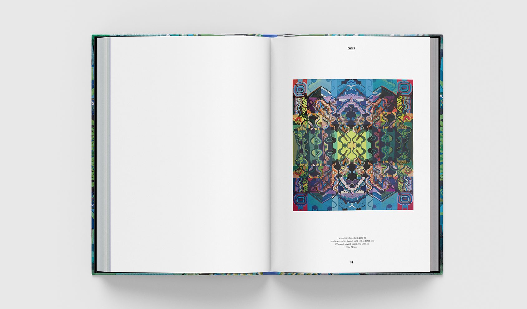
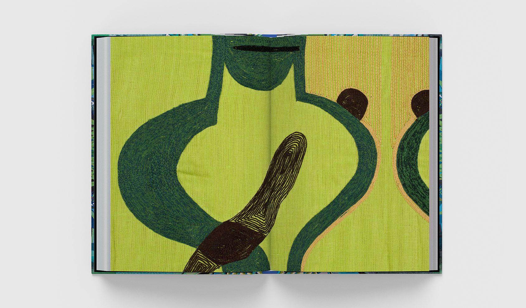
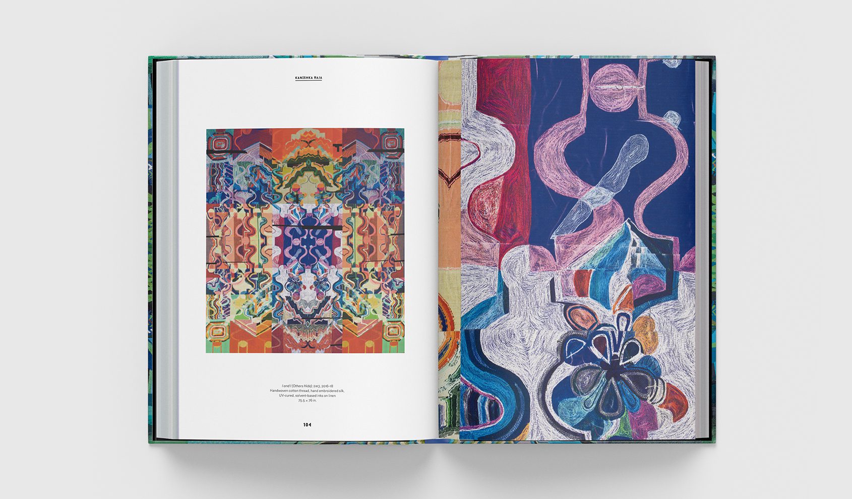
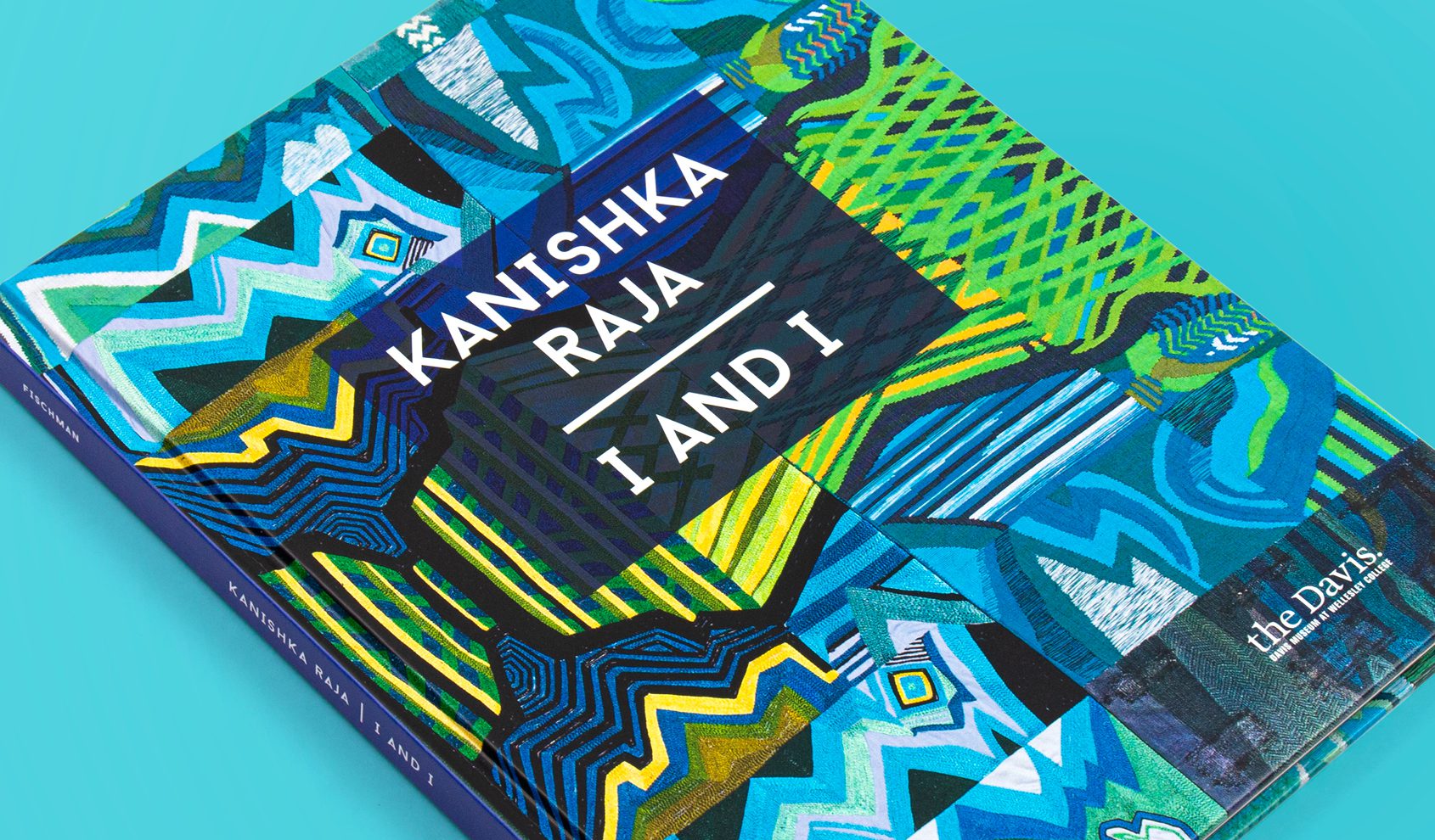
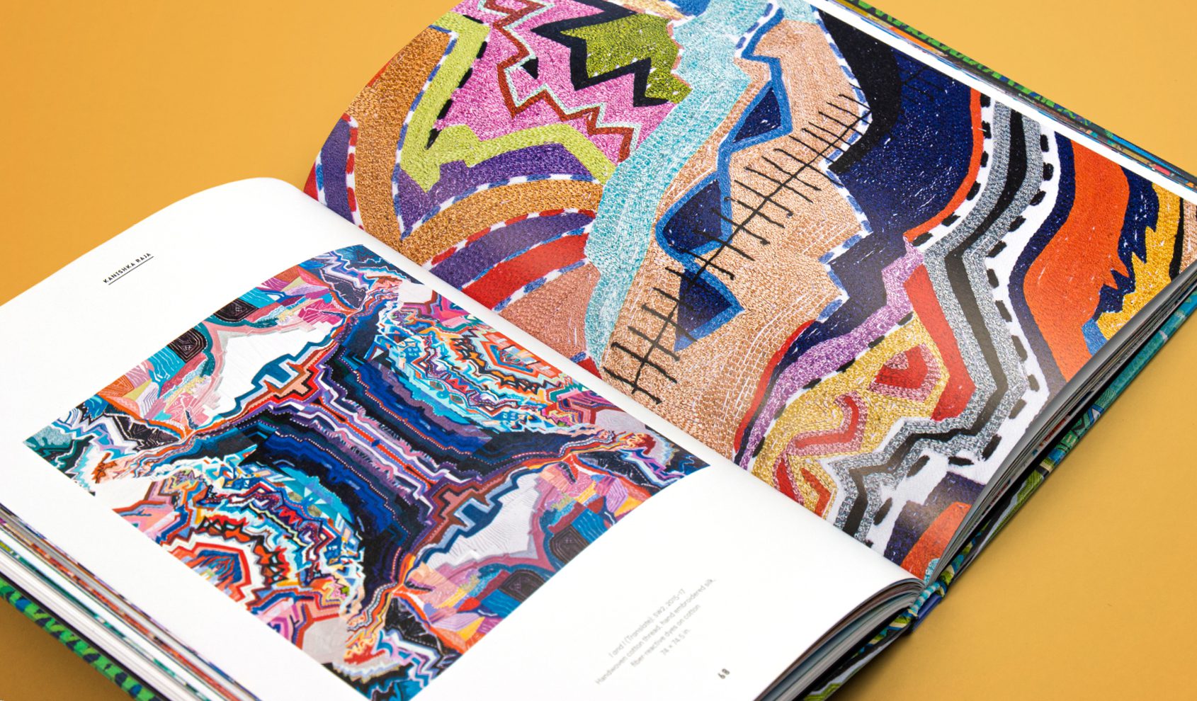
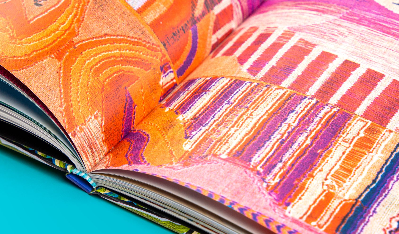
Designed in conjunction with the exhibition, Kanishka Raja: I and I celebrates the artist’s life and work. Raja’s exuberant series progress through cycles of reproduction: painting, weaving, scanning, printing, and embroidering to explore “the intersection of representation, craft, technology, and the gaps that occur in the transmission of information.”
The book’s layout reflects the symmetrical compositions of Raja’s work, while the sequence of the plates is drawn from the organization of the exhibition. Shown at a distance and in lush detail, the book captures Raja’s play with materiality.
Stoltze was honored to design the first post-humous monograph of this extraordinary artist.
Identity / Book Design / Catalog
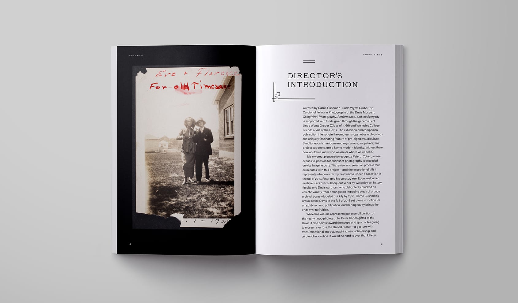
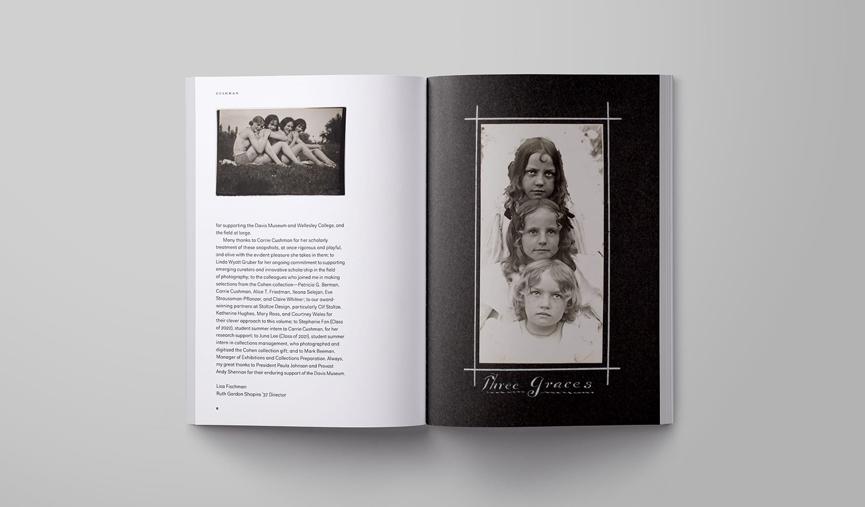
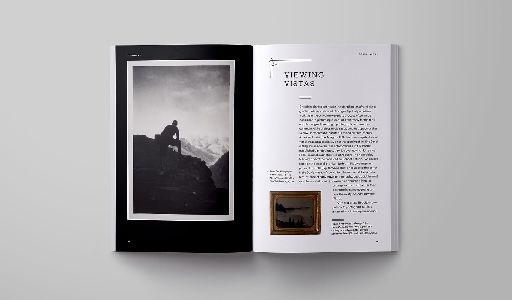
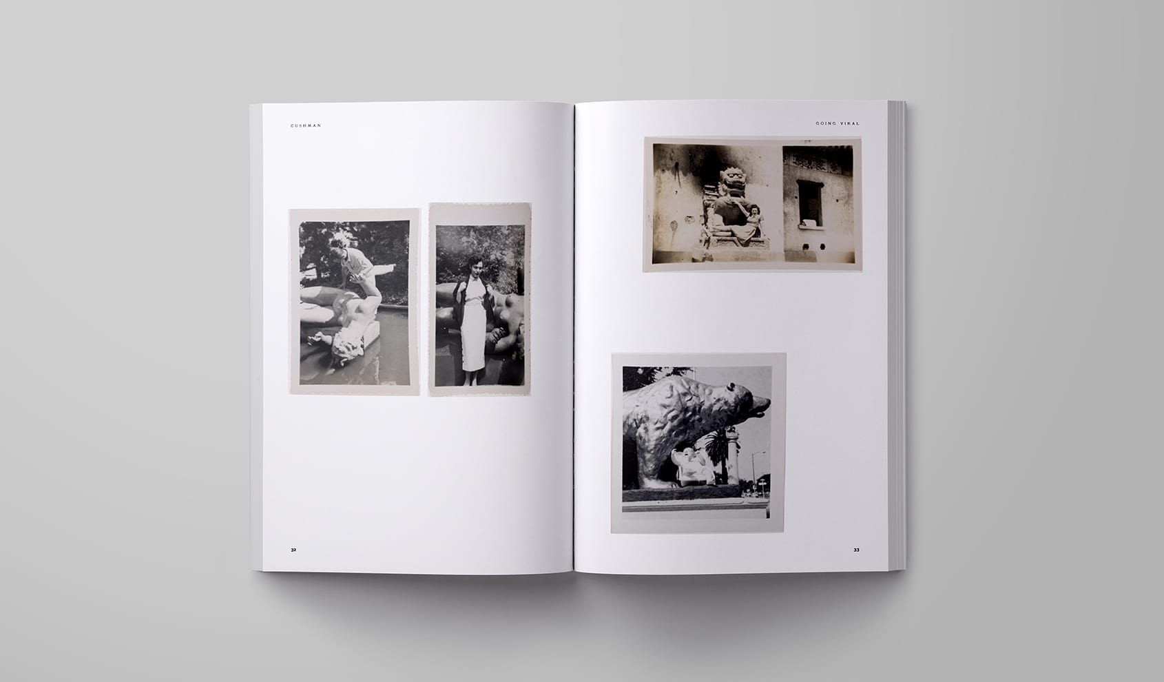
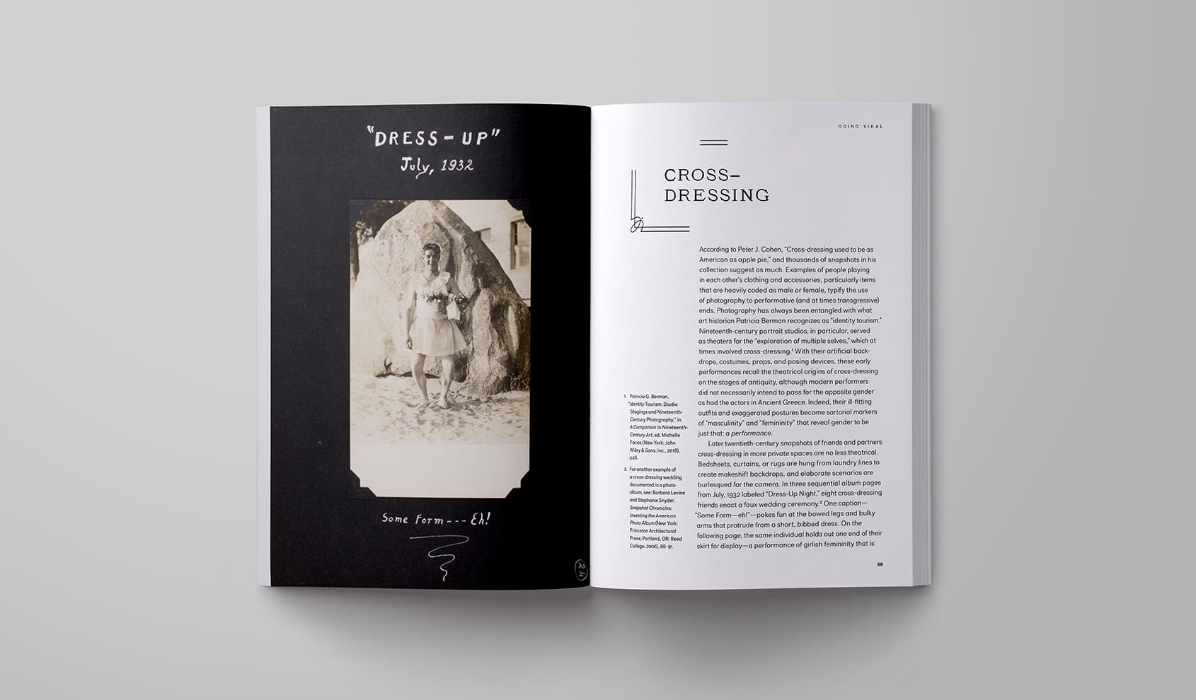
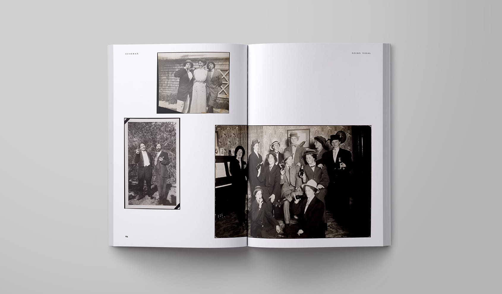
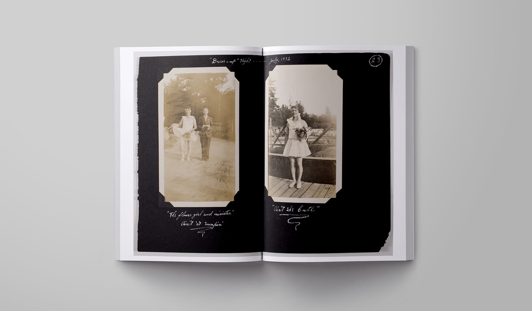
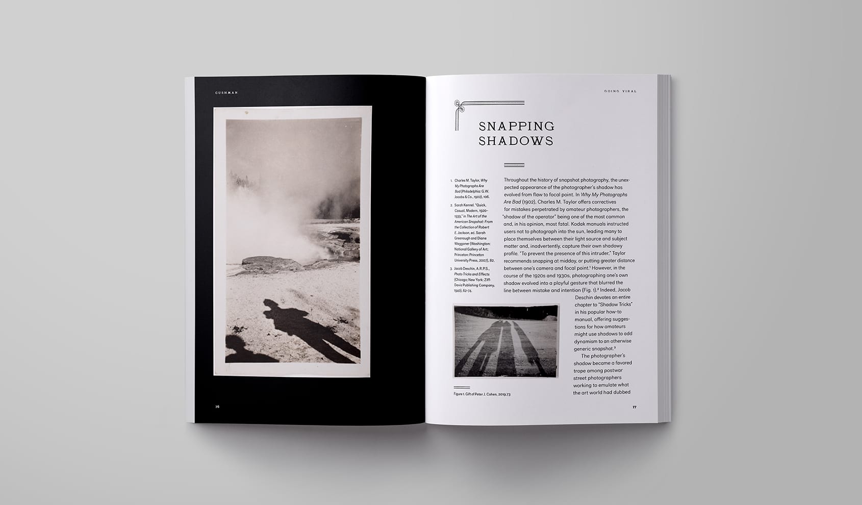
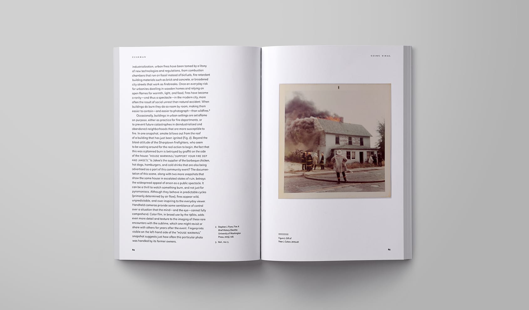
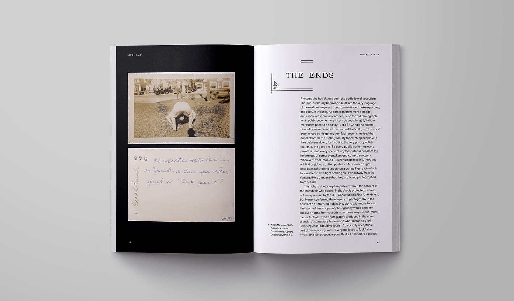
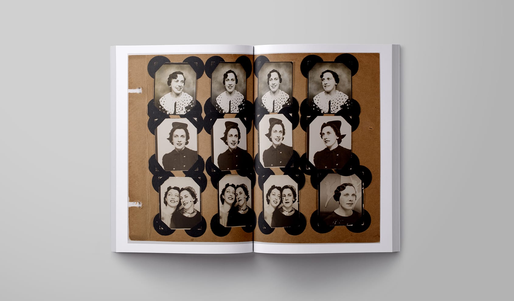
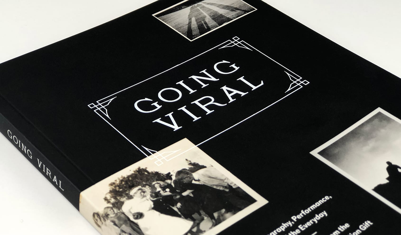
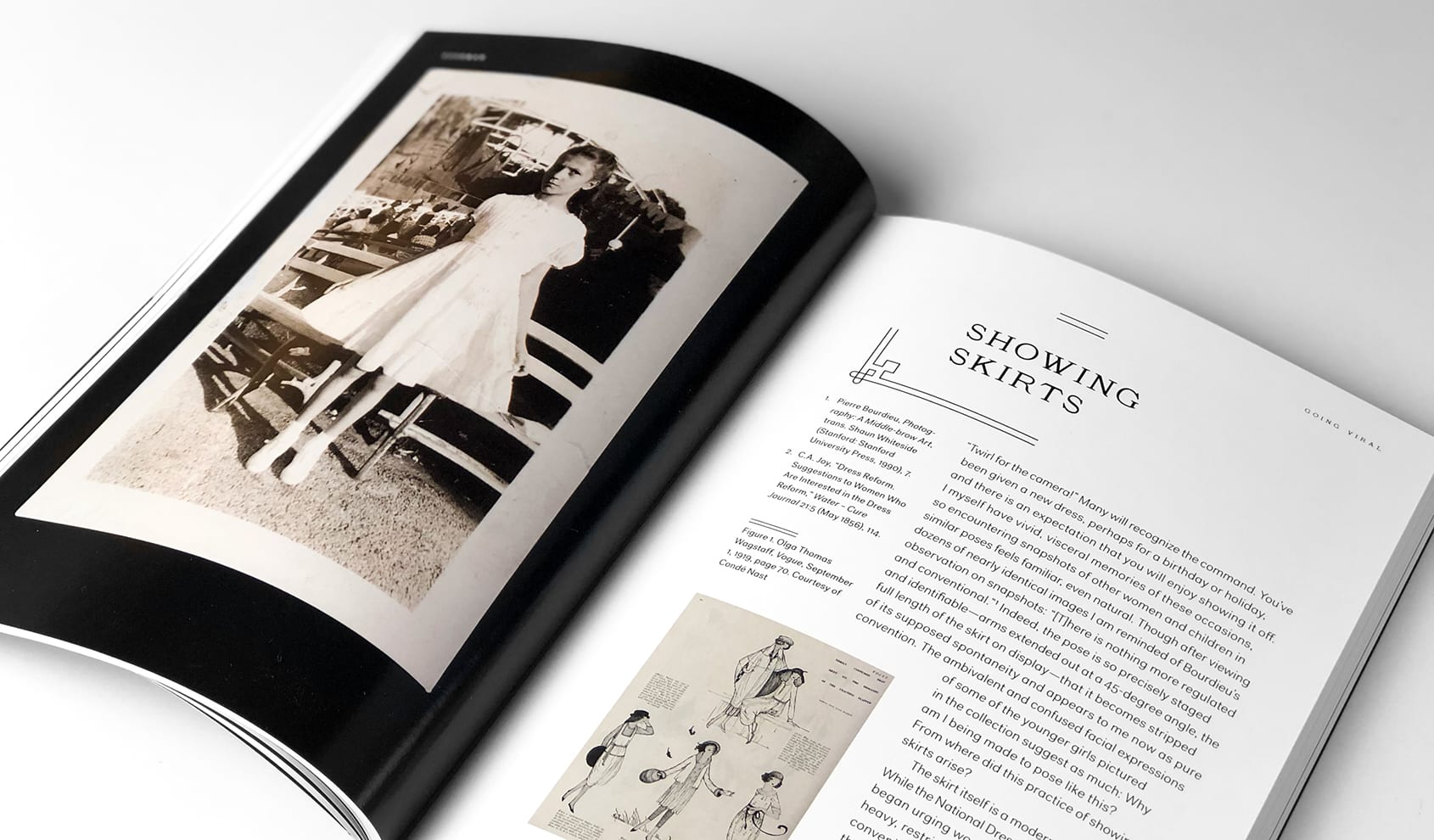
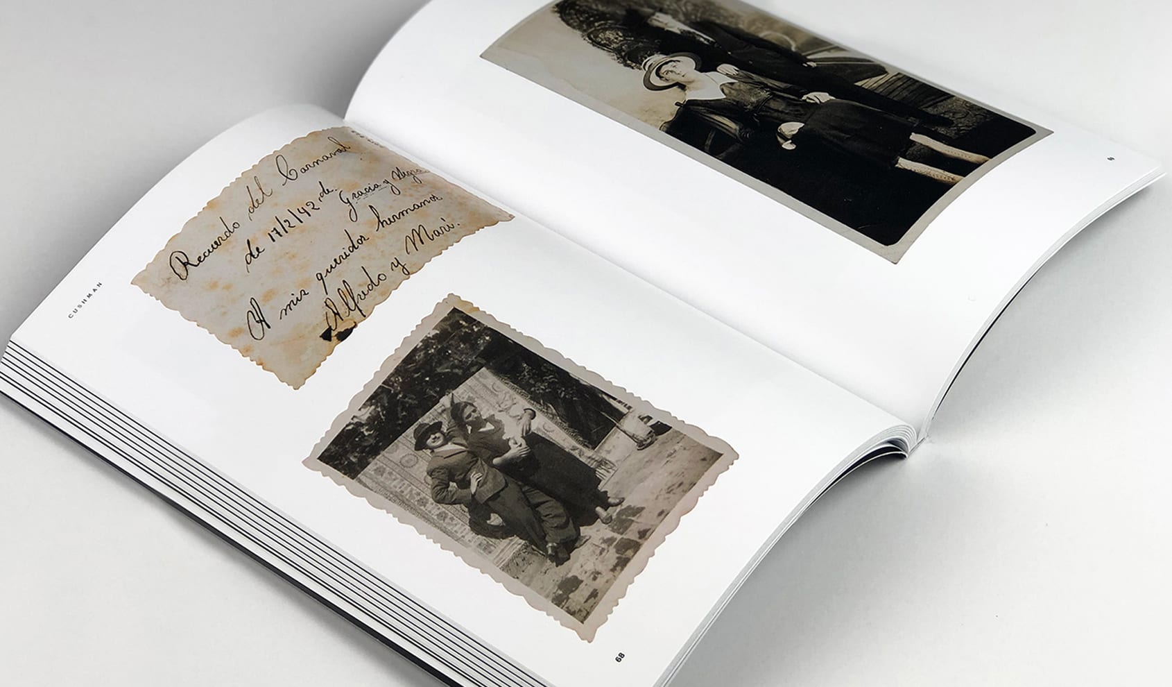
Long before the age of the selfie, the craze for candid cameras spawned innumerable tropes that snapshooters found irresistible. Going Viral: Photography, Performance, and the Everyday, an exhibition of early-twentieth-century American snapshots, considers our everyday relationship to photography: the ways in which we mediate, understand, and narrate our lives through the snapping and sharing of photographs, and how and why certain types of images become socially infectious.
One of our favorites in this ongoing series, Stoltze designed the exhibition identity and the accompanying catalogue as a small, but beautifully printed 144-page book filled with more than 150 images from the exhibition.
Identity / Book Design / Catalog
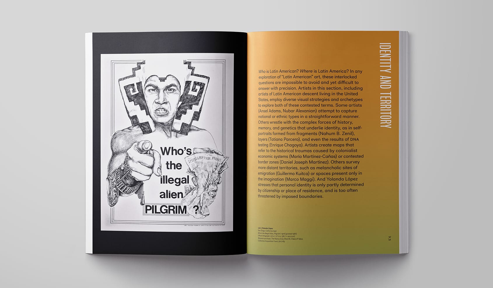
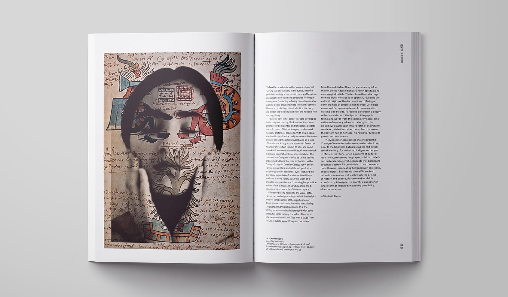
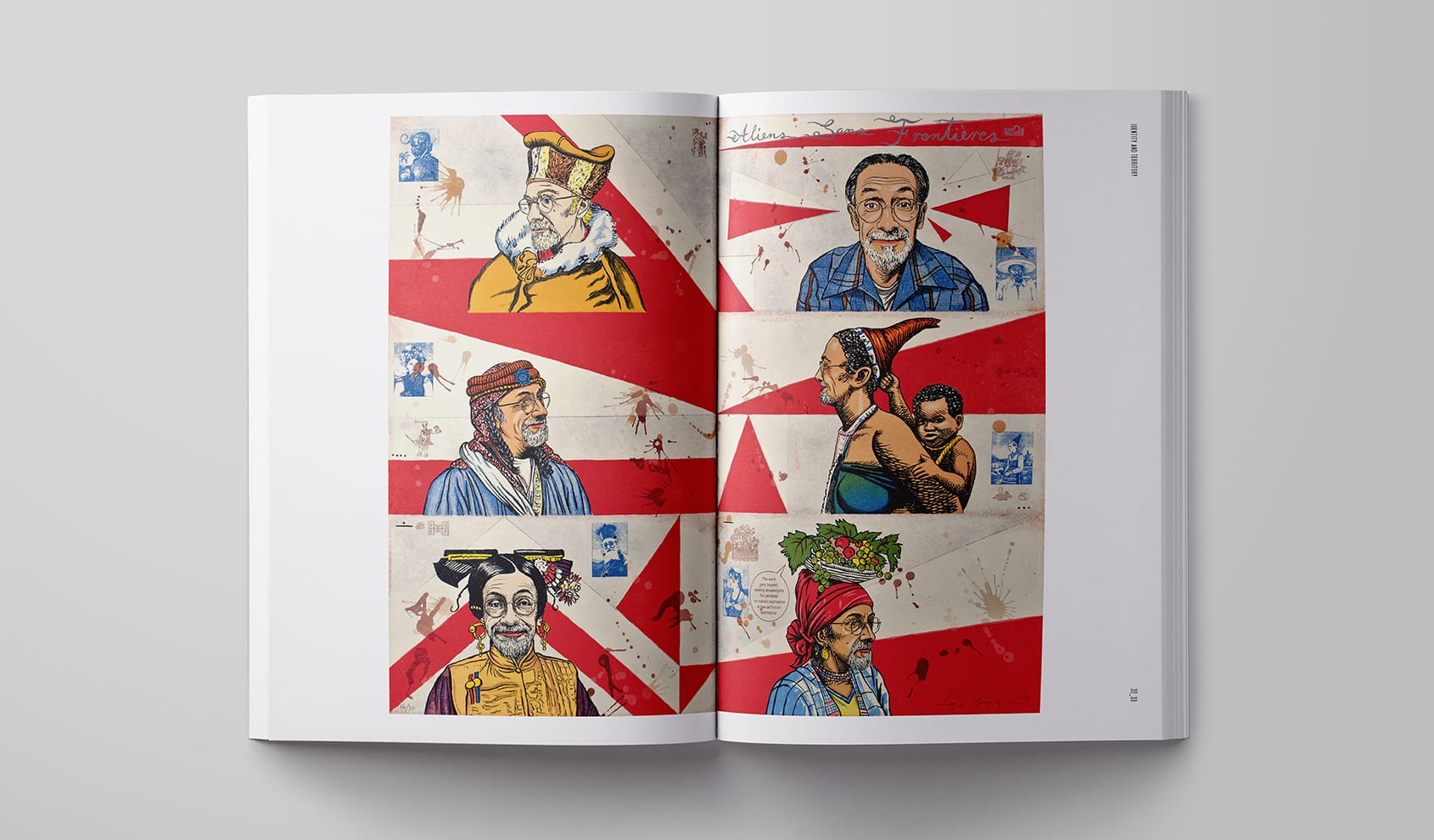
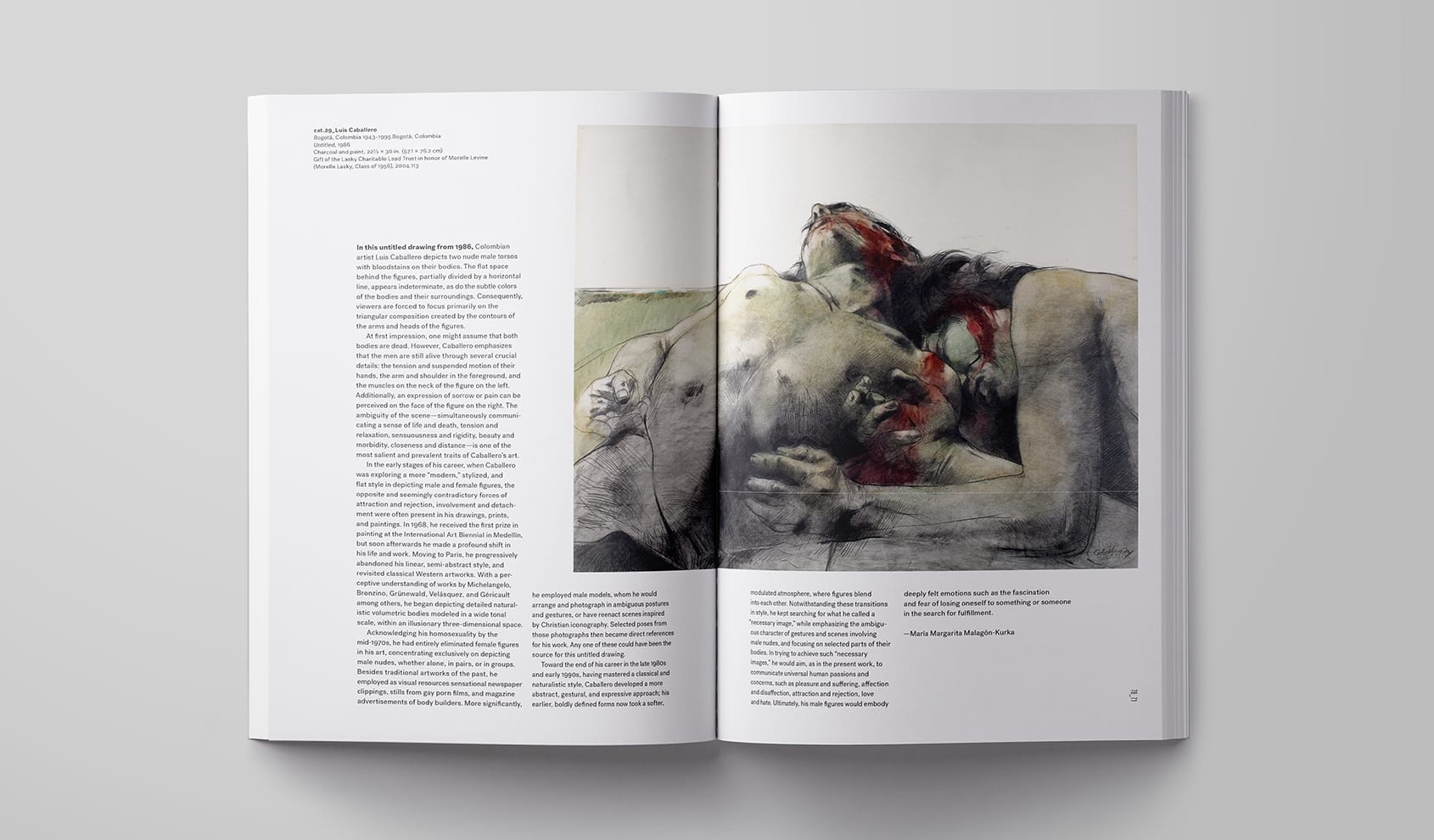
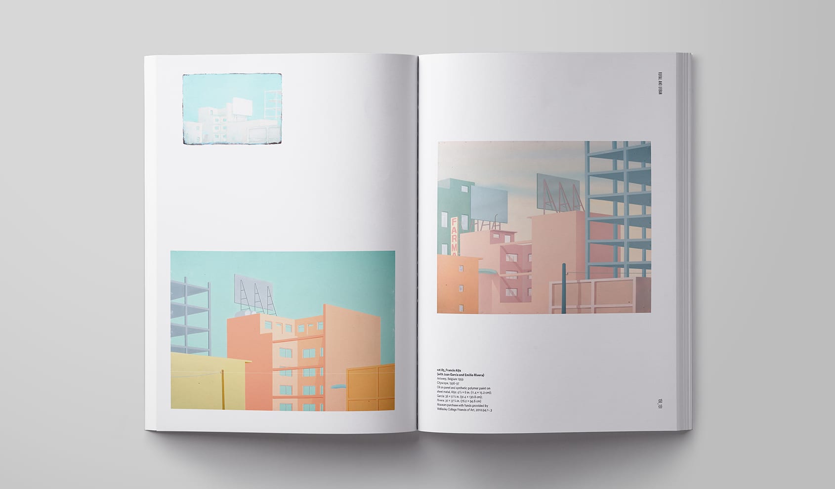
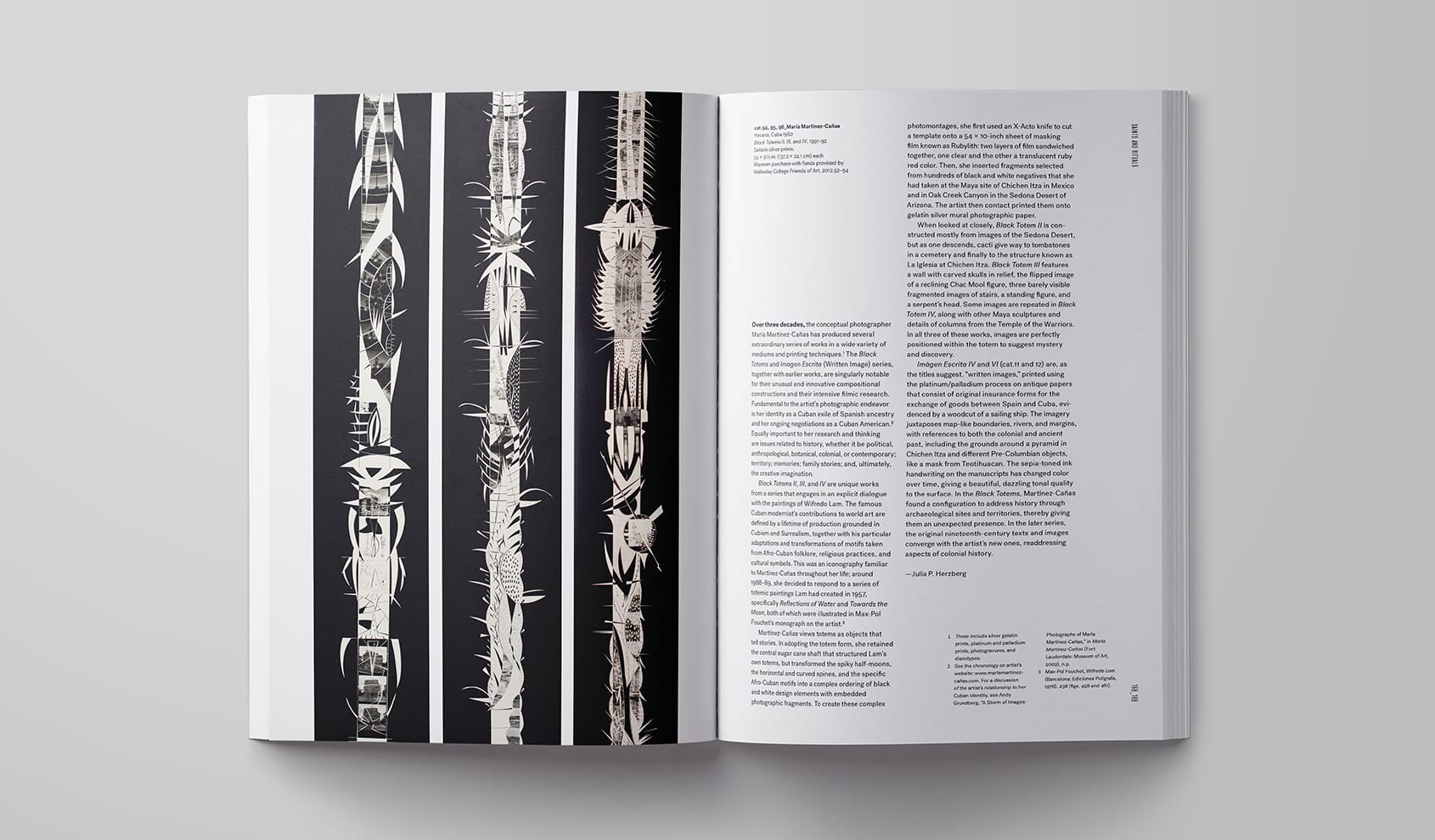
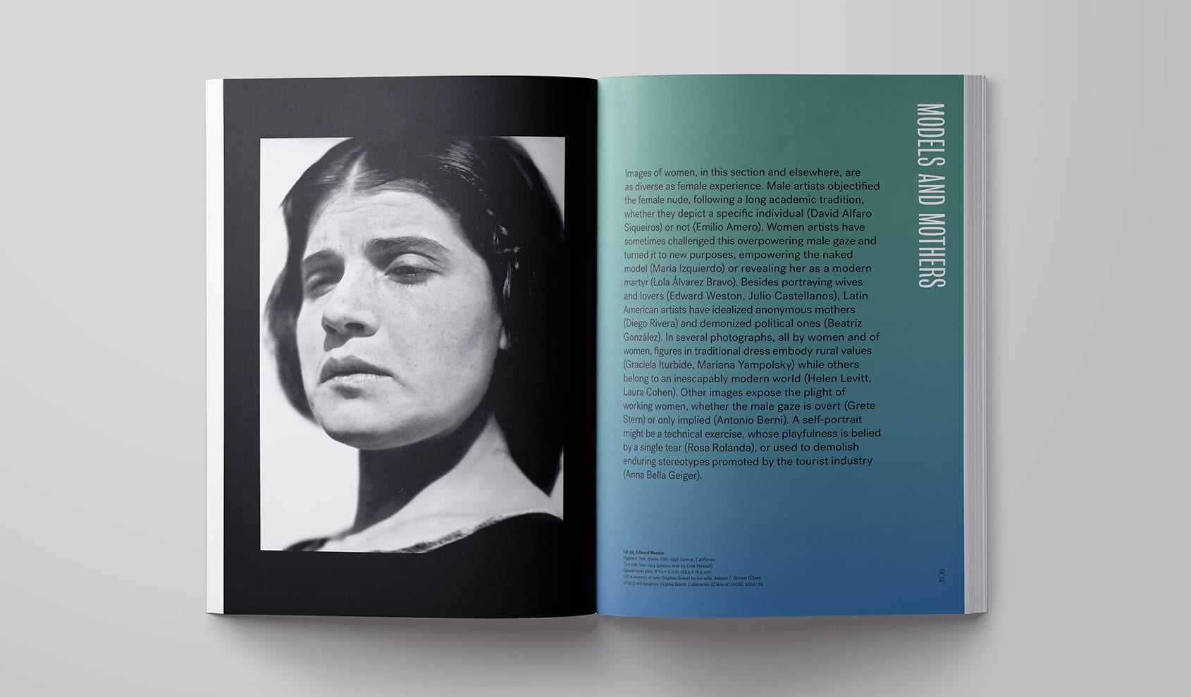
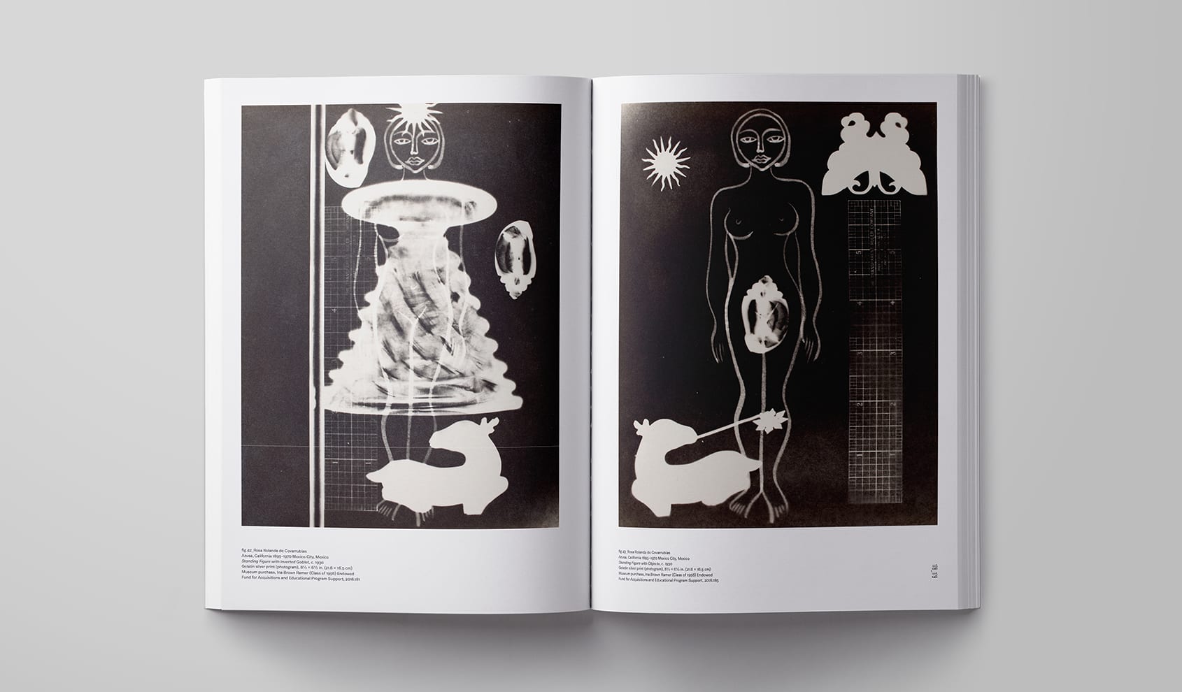
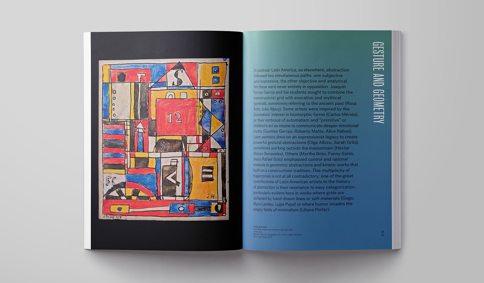
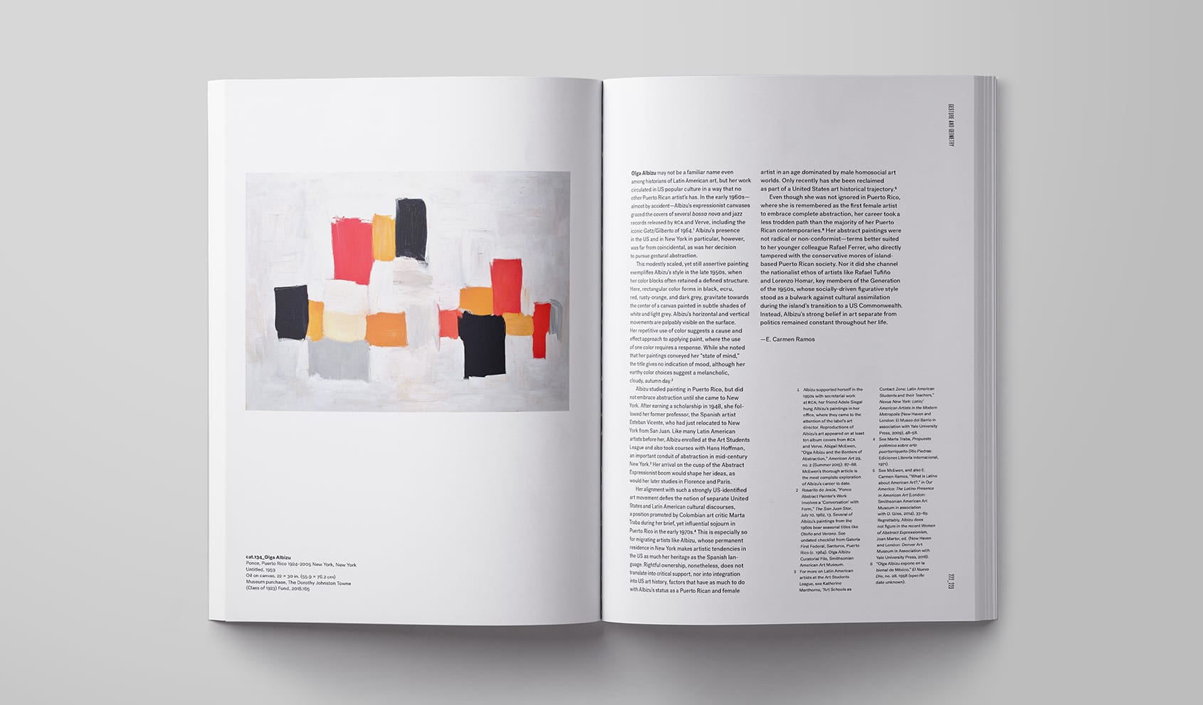
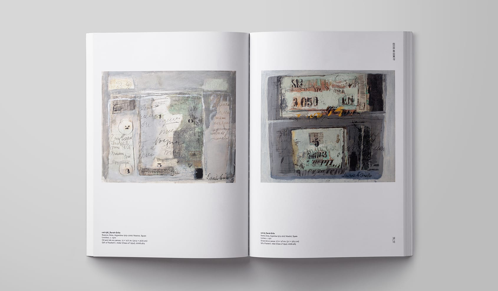
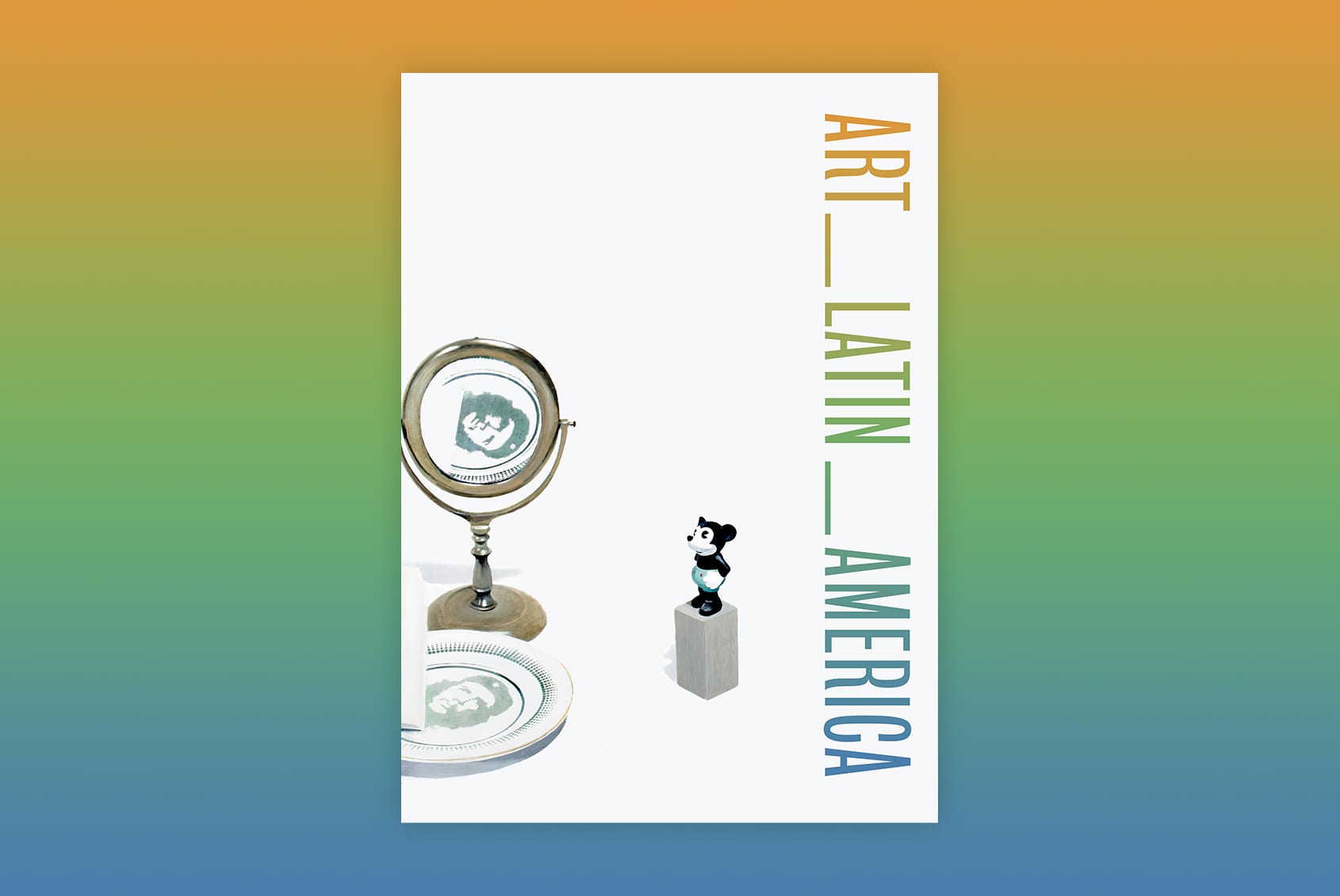
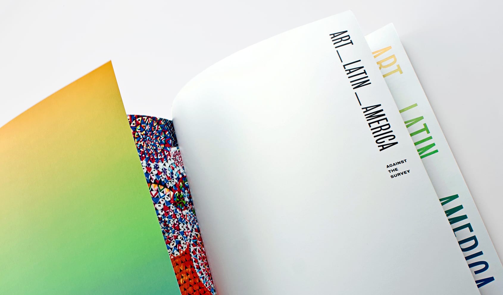
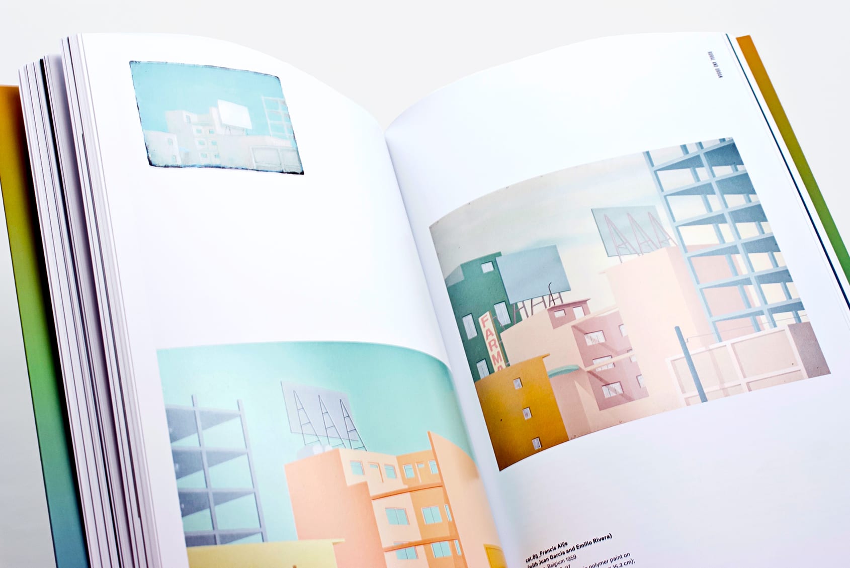
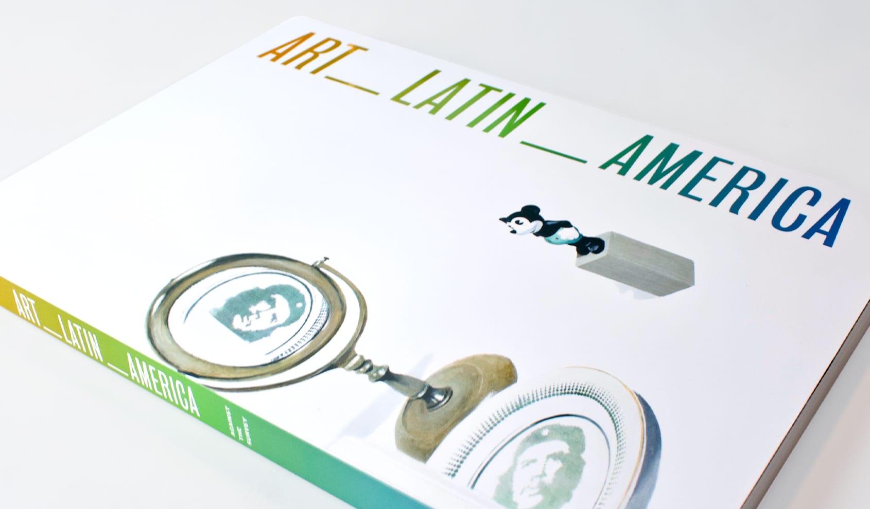
Art_Latin_America: Against the Survey highlights the Davis Museum’s extensive and diverse collection of “Latin American art,” formed over the past twenty-plus years, and features some 150 works of art by 99 artists (about a third of them women) from twelve countries, including twenty-five born in the United States. Curated by James Oles, Adjunct Curator of Latin American Art at the Davis Museum and Senior Lecturer in the Department of Art at Wellesley College, the exhibition’s thesis is expansive, an approach signaled by the underscores in the title. On one side Art, from abstract paintings to political posters and photojournalism; on the other America, understood broadly and accurately, as geography demands. Between them, the adjective Latin confronts both nouns: American works of art connected to a particular part of the Americas colonized by Spain and Portugal, whose languages are derived from Latin.
More than any recent exhibition of its type, Art_Latin_America embraces diversity—aesthetic, of course, but also in terms of the artists’ background, experience, residence, and point of view—thereby pushing the concept of “Latin American art” almost to its conceptual limits. This 256-page illustrated volume, containing over 200 color illustrations and contributions from 41 authors, launches a rich, broad gem of a collection into the public sphere for the first time.
Identity / Book Design / Catalog
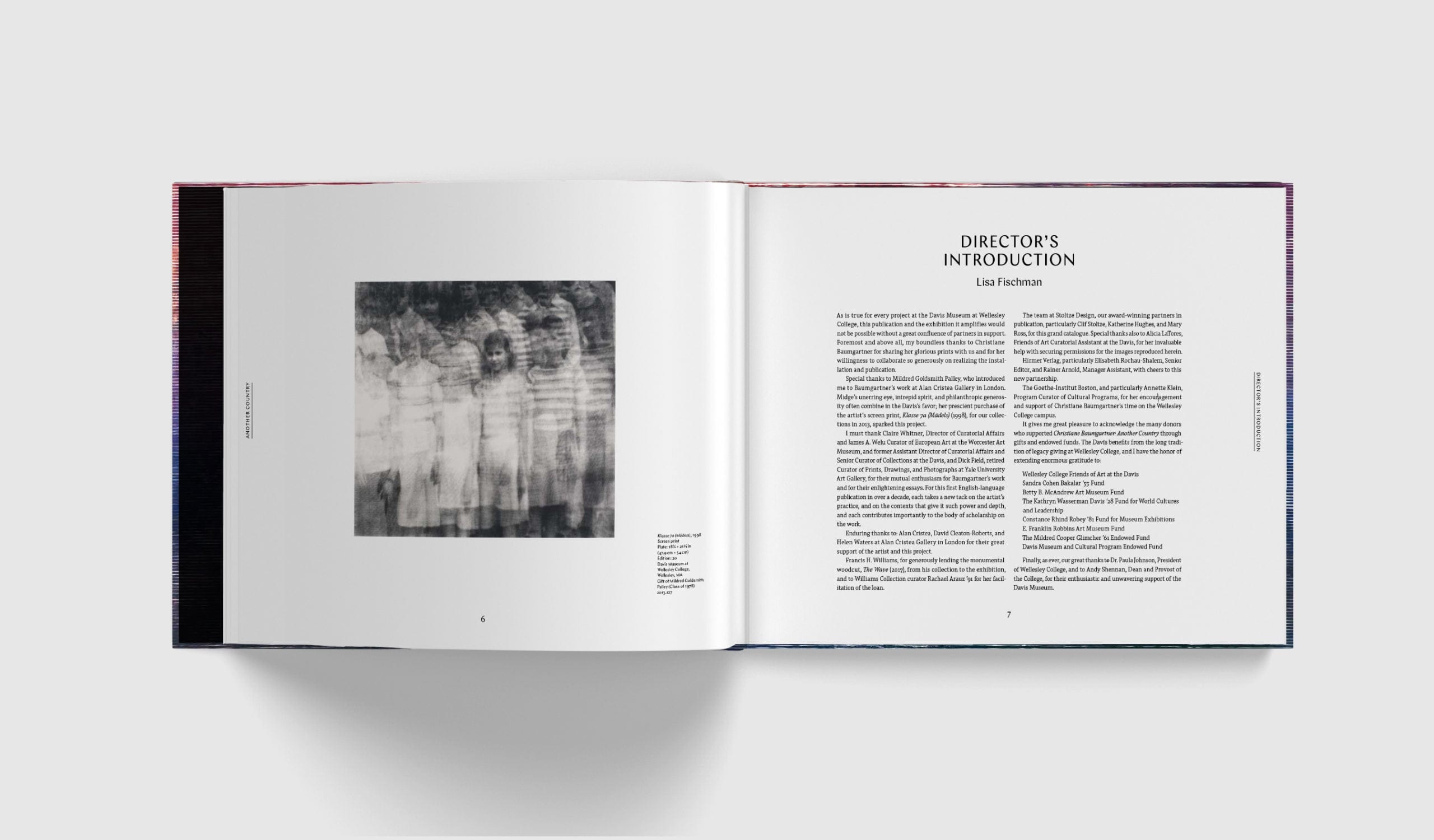
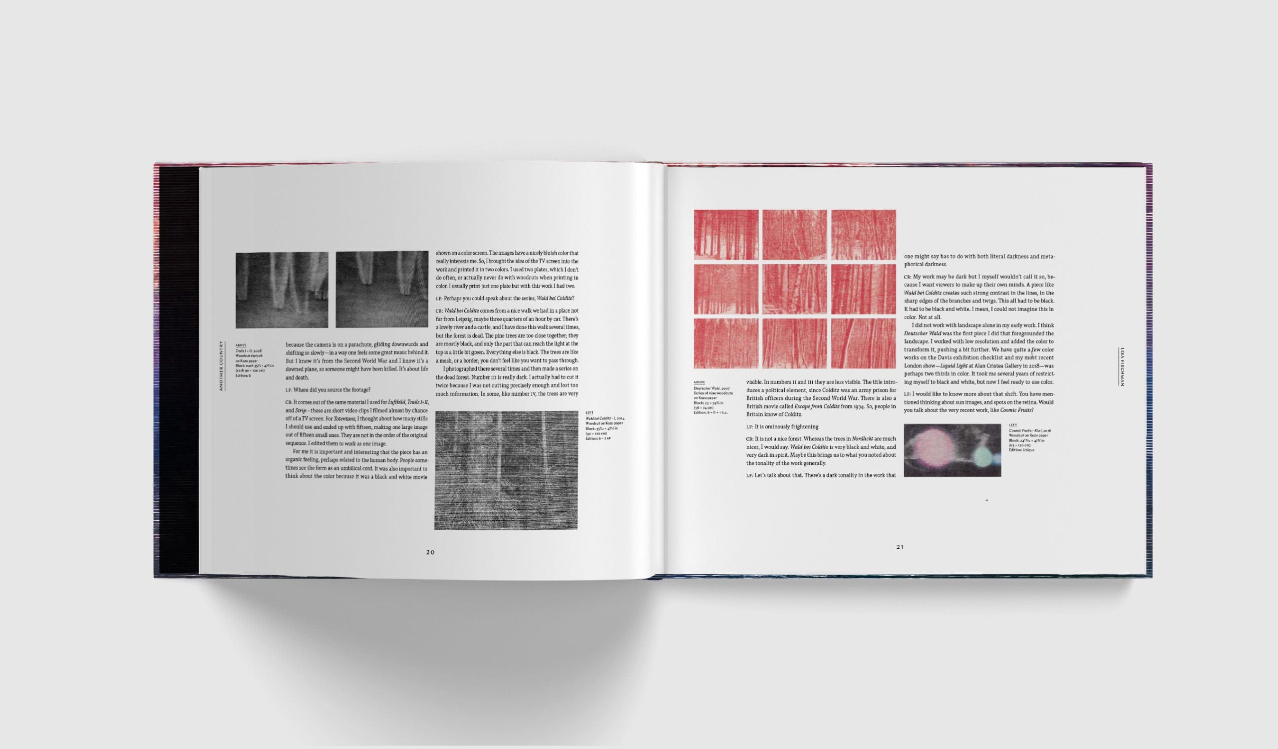
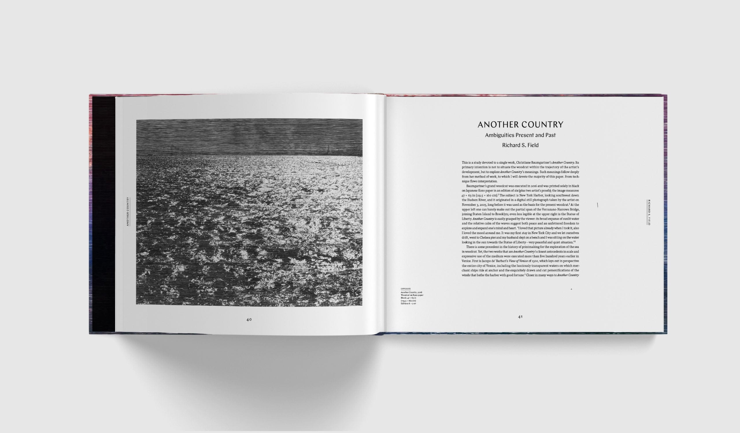
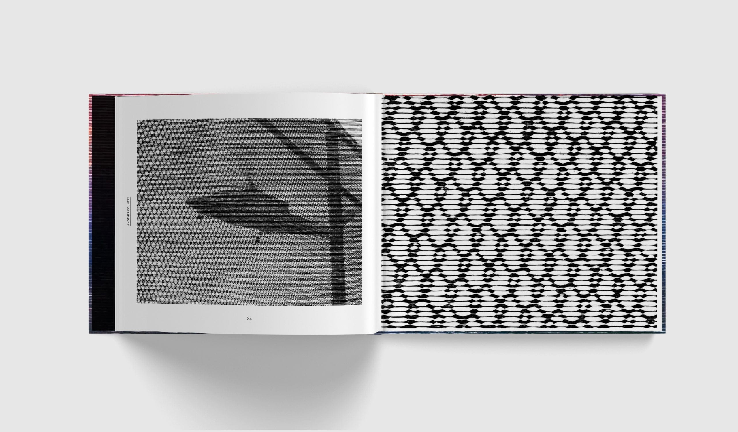
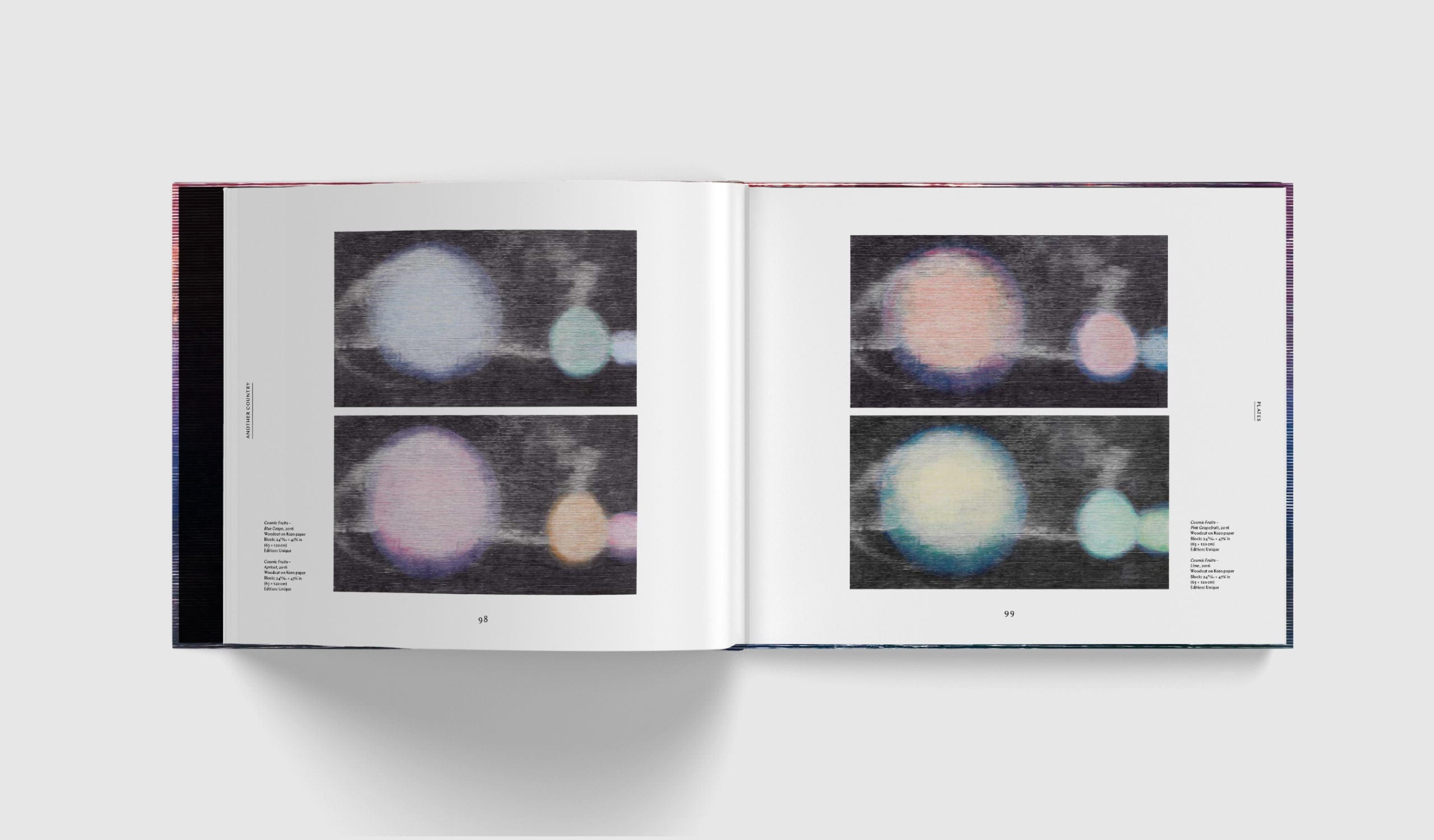
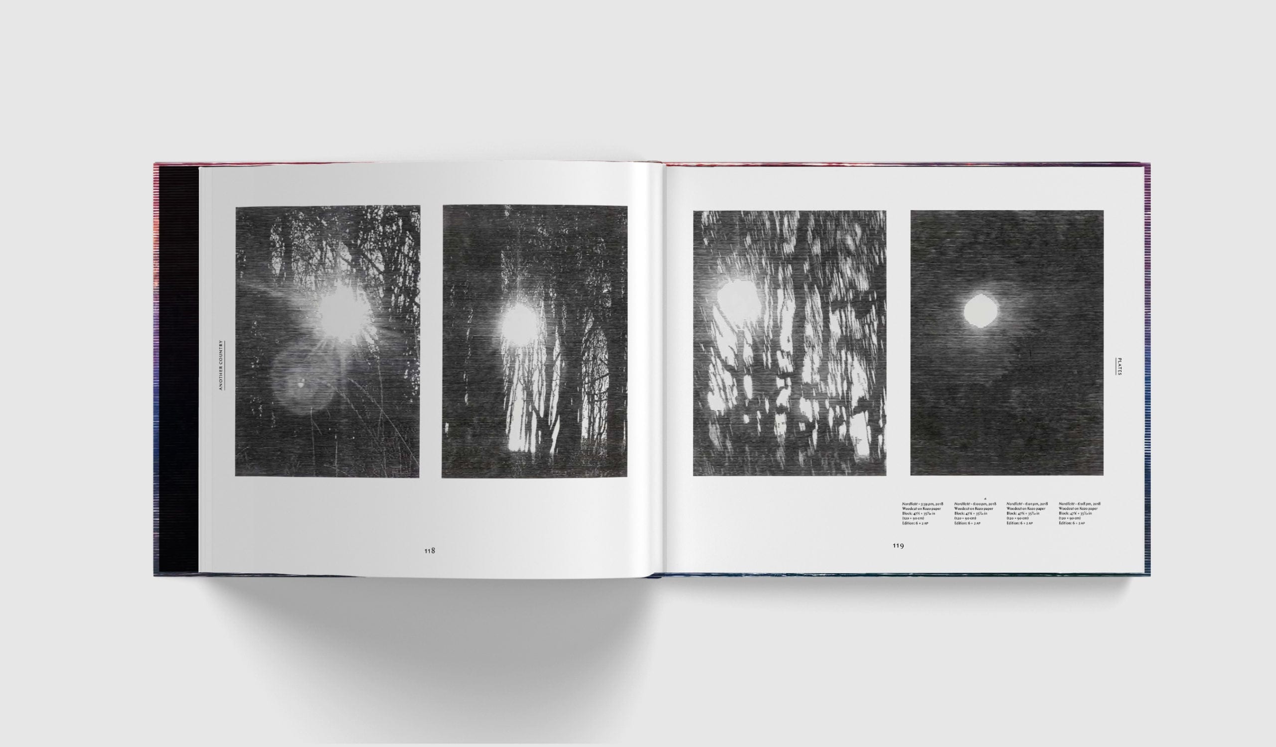
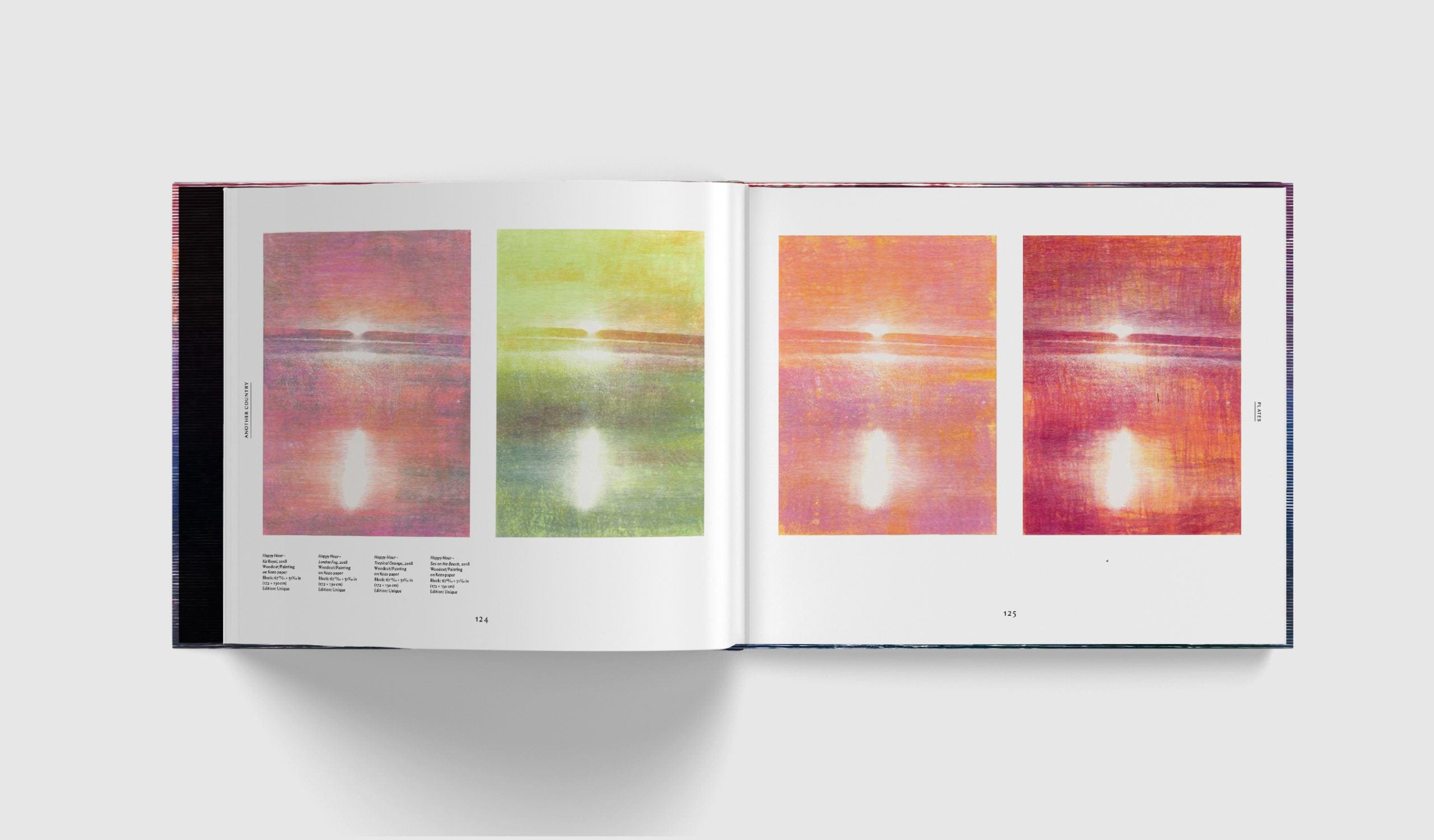
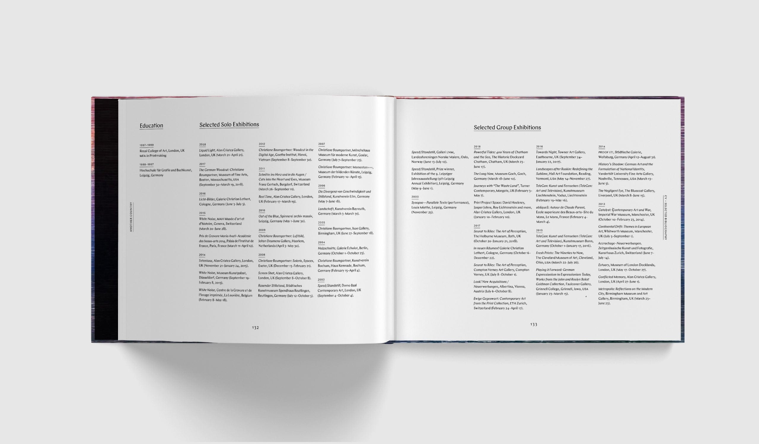
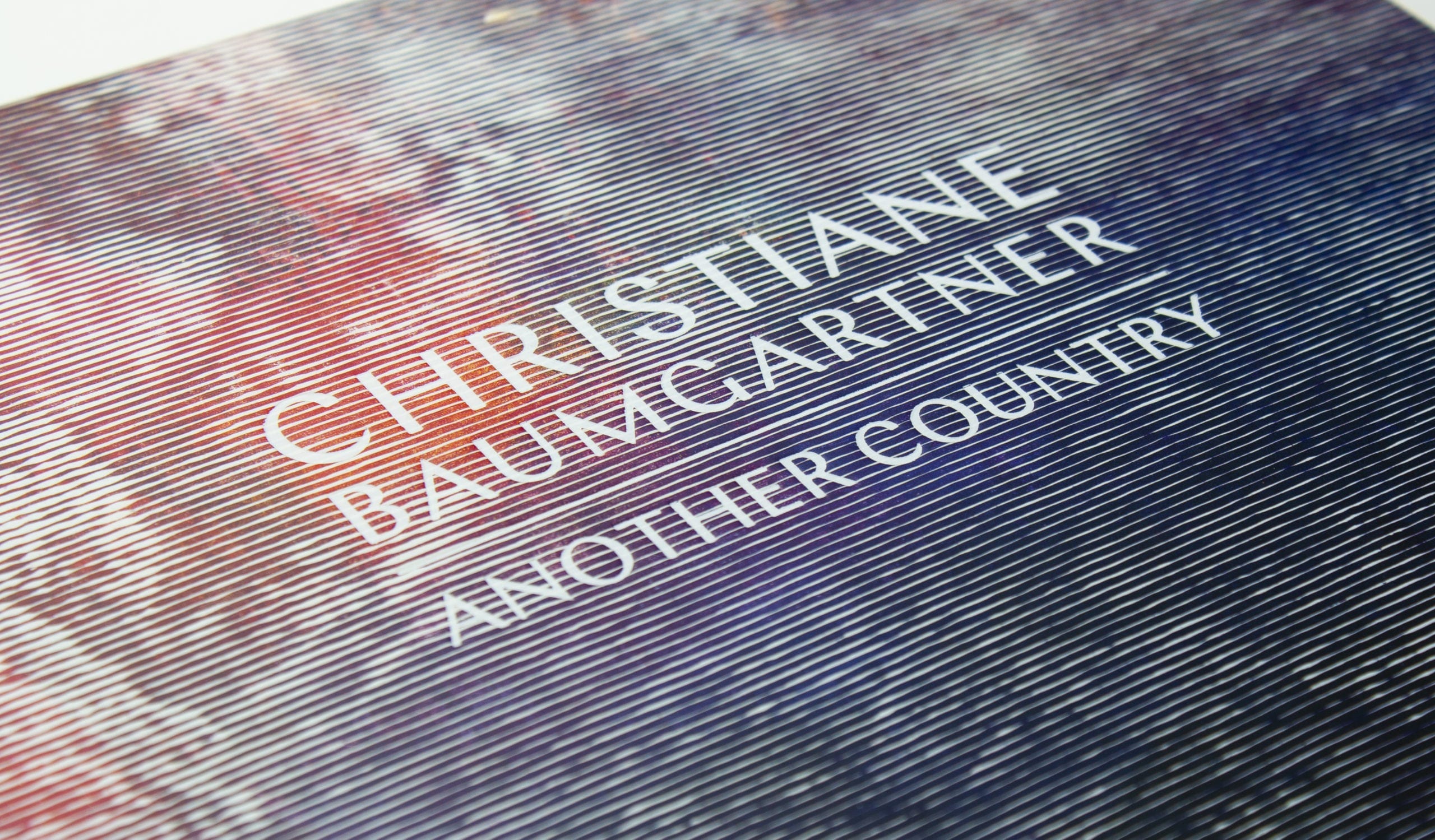
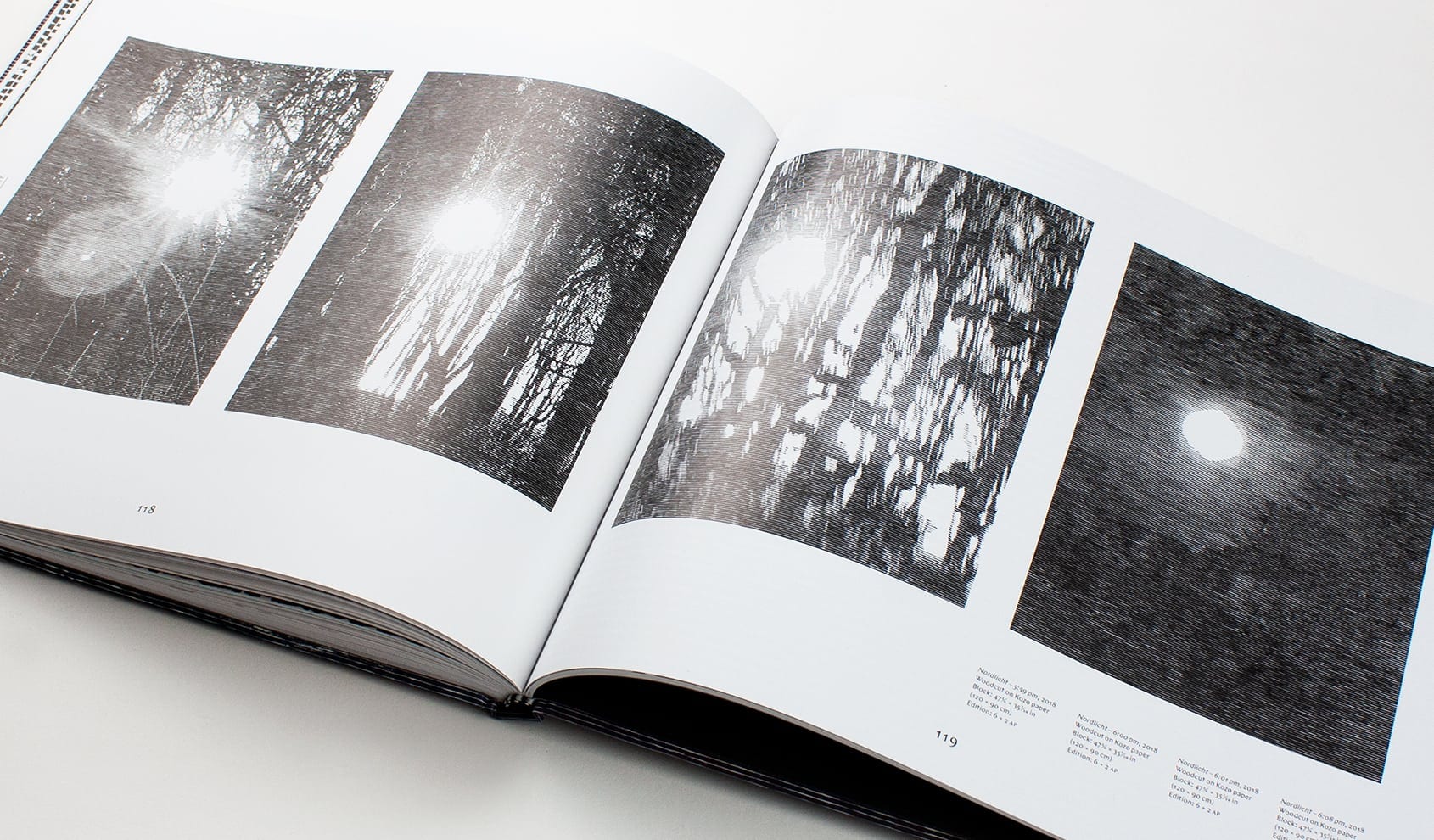
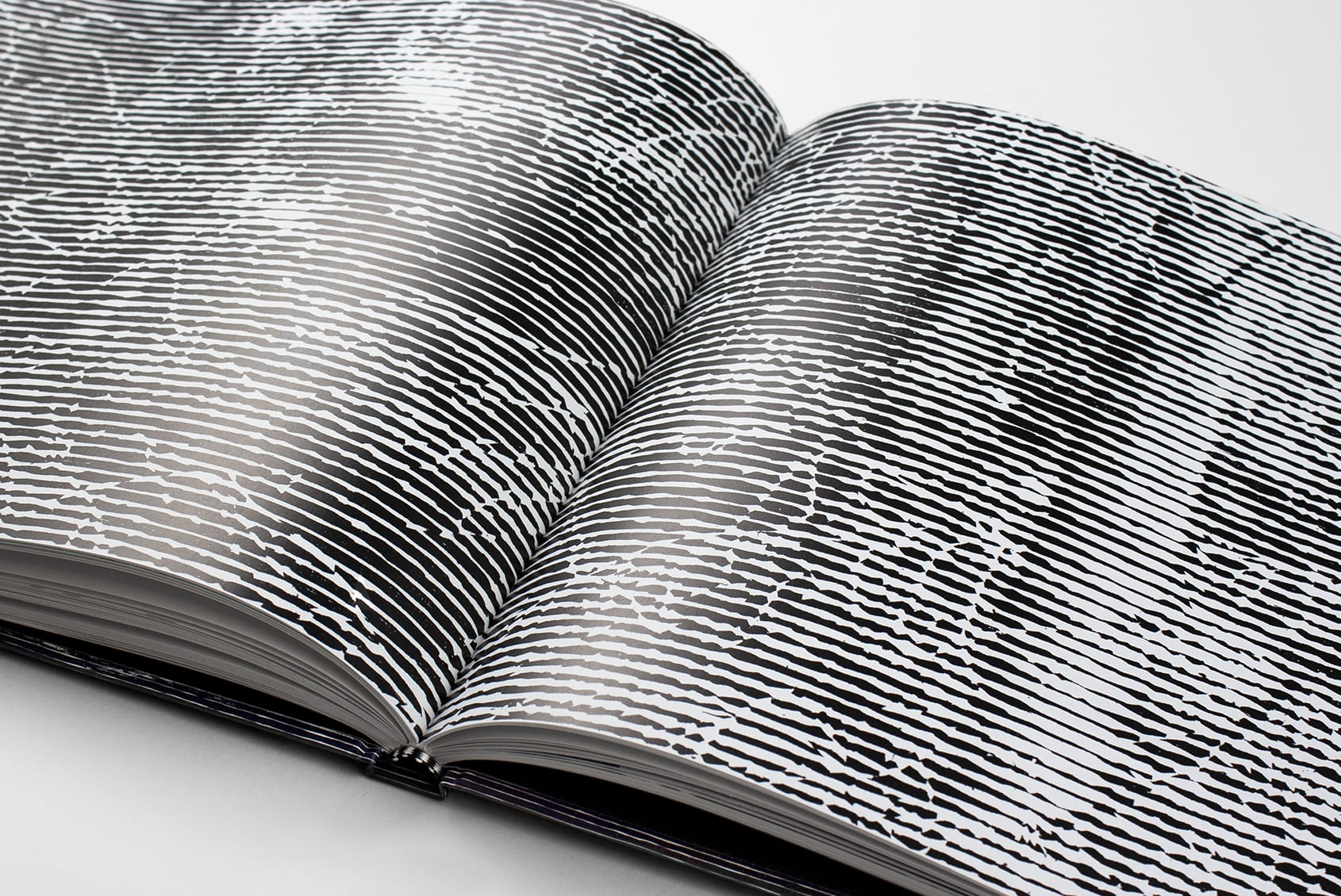
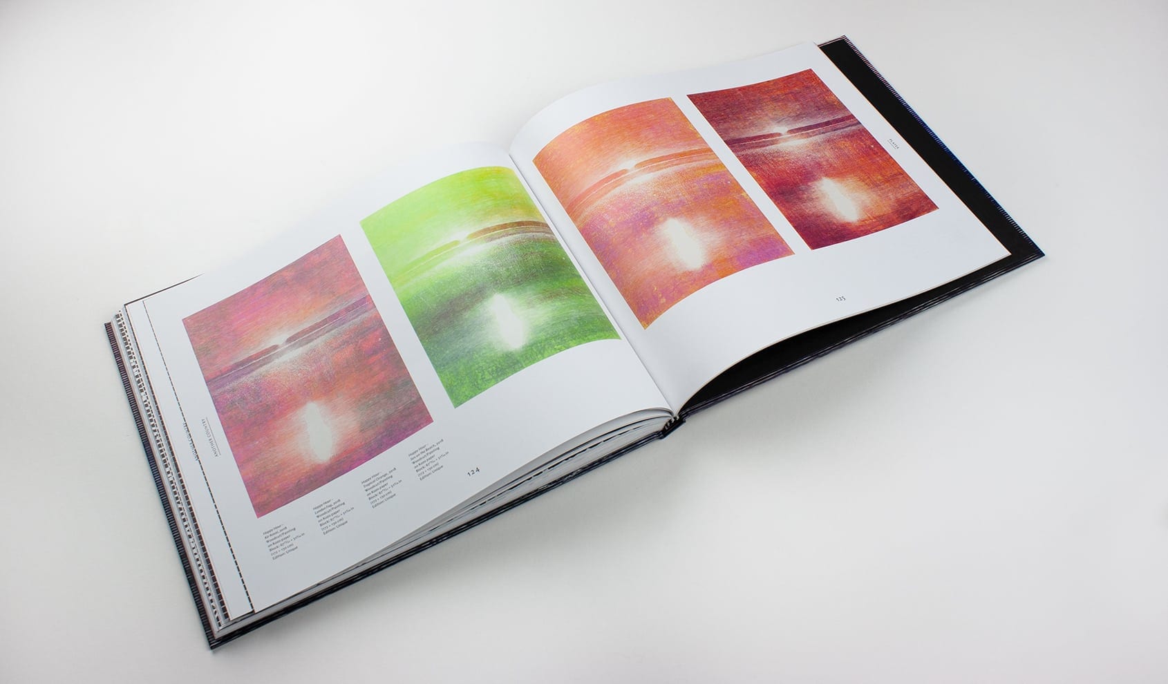
While Baumgartner’s woodcuts have been widely collected, Another Country marks her first major monographic museum exhibition in the United States. We researched deeply to find a contemporary German typeface that reflected the technique and chamfered edges of Baumgartner’s work. While often justi-phobic, we set aligned columns of text to mimic the rectangular print area and meticulous, modulated lines that define her images. To convey the massive scale of her work, we included extreme details that fill pages with abstracted forms, captured digitally, and carved in wood with a kitchen knife.
Publication Recognition: PRINT 2019 RDA Award
Identity / Packaging / Portfolio / Postcards / Poster
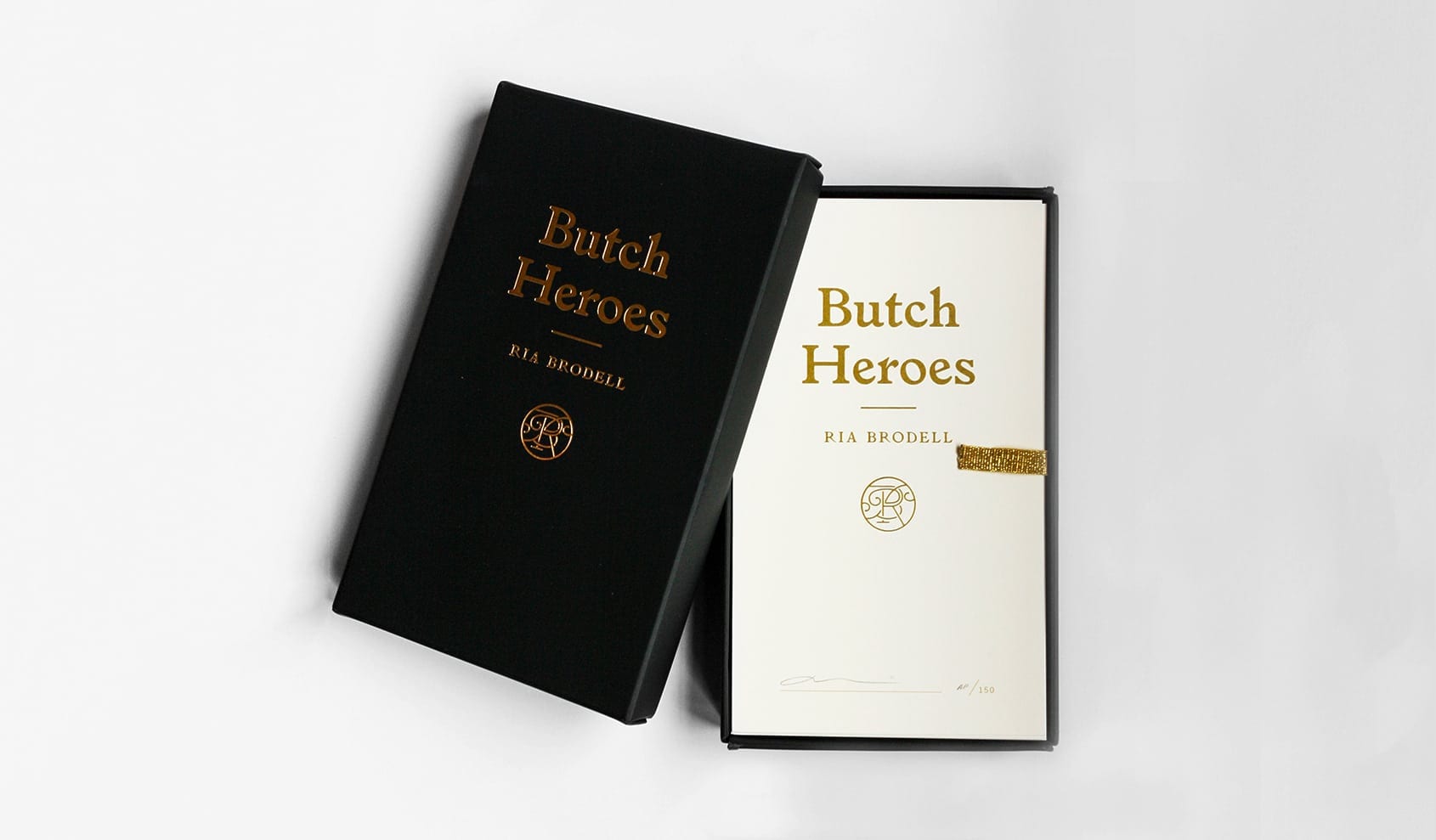
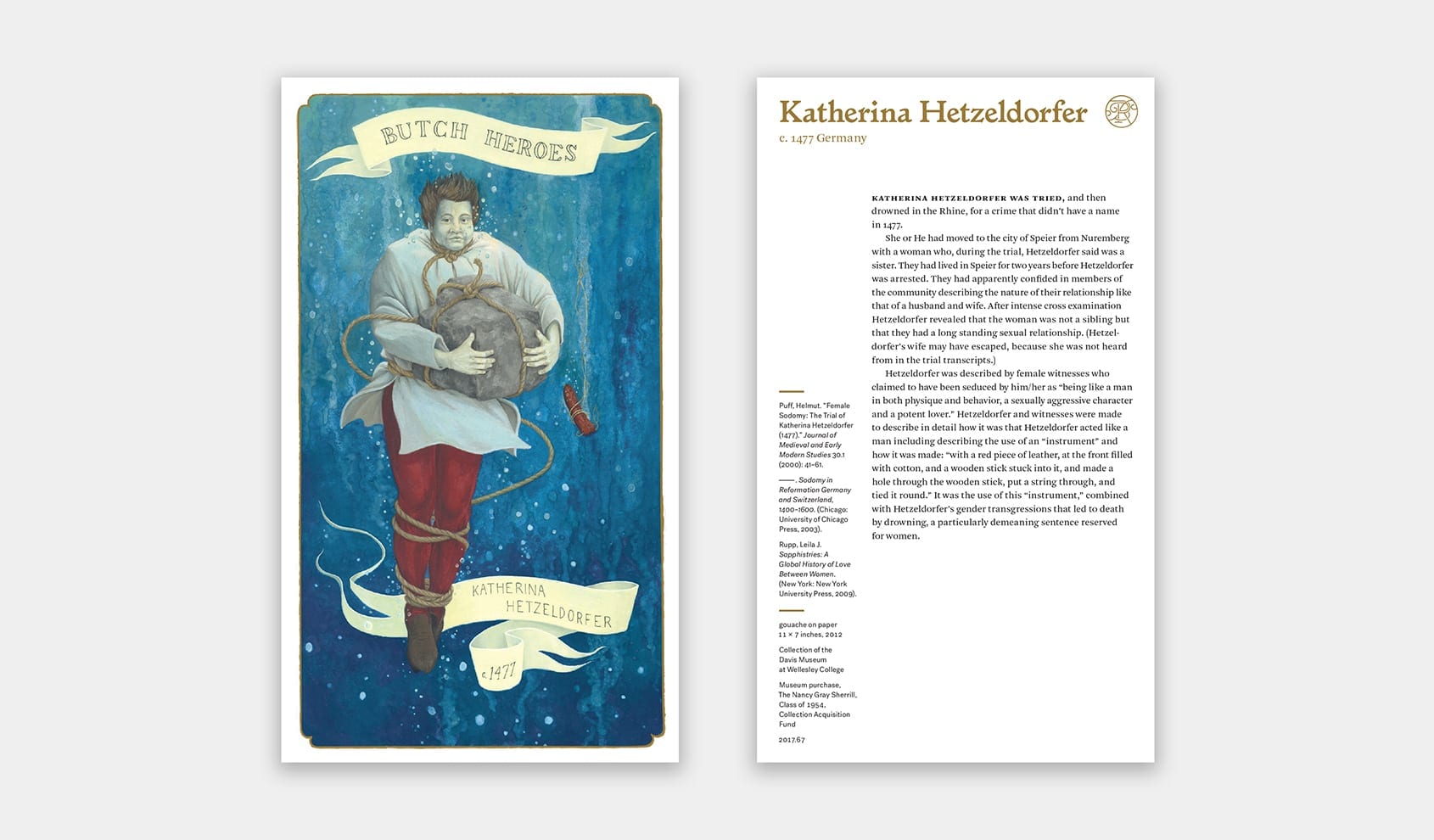
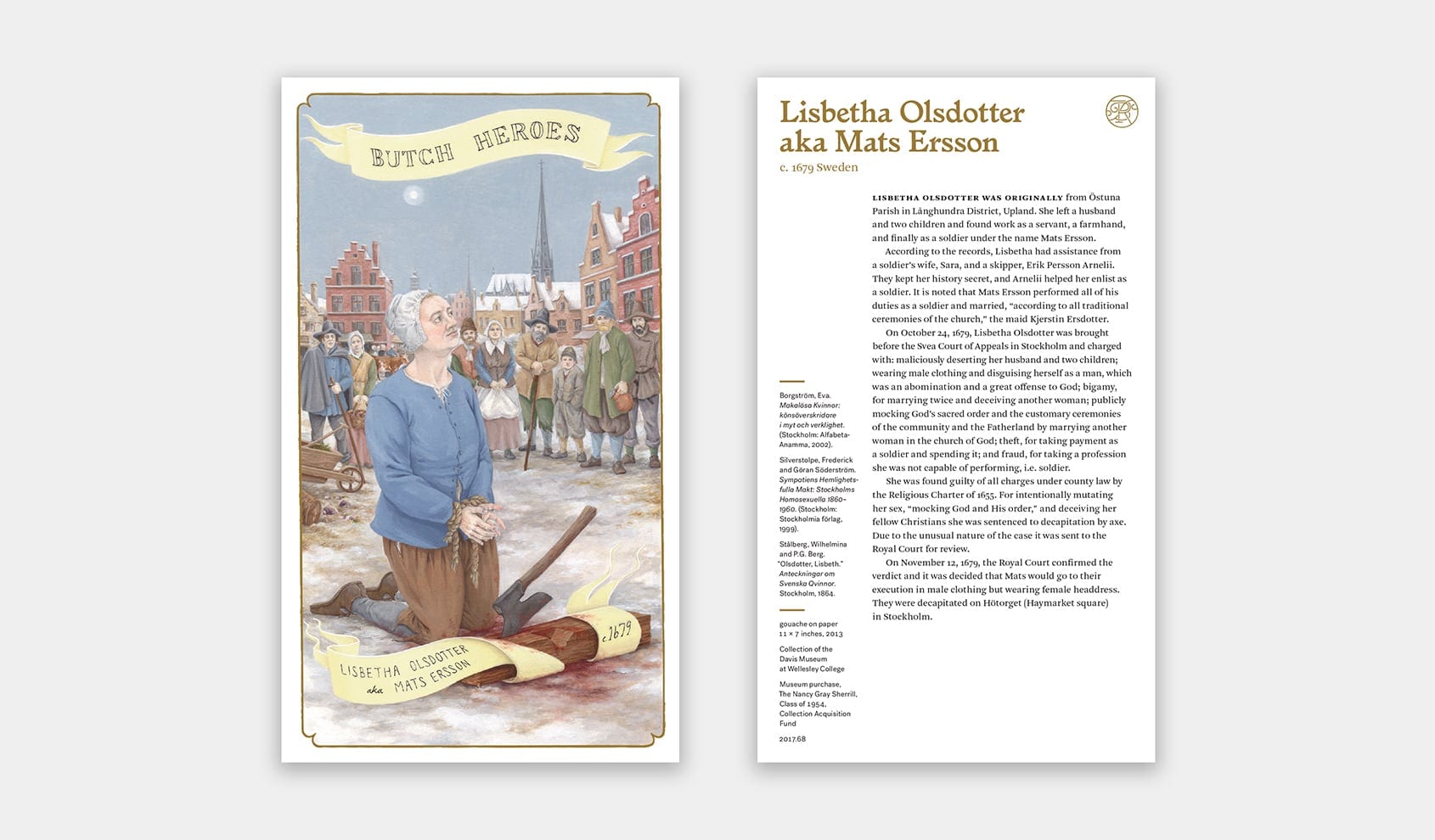
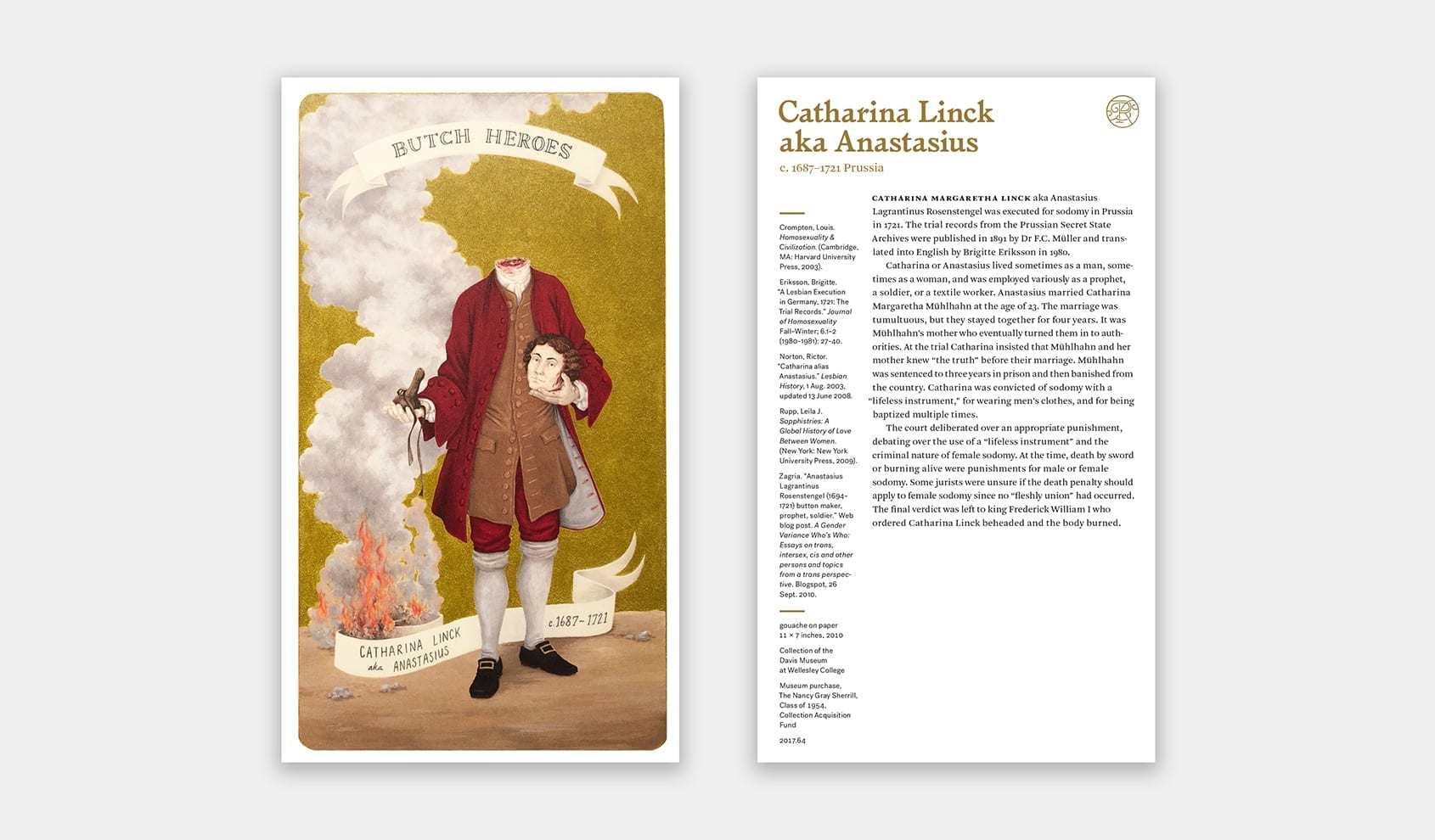
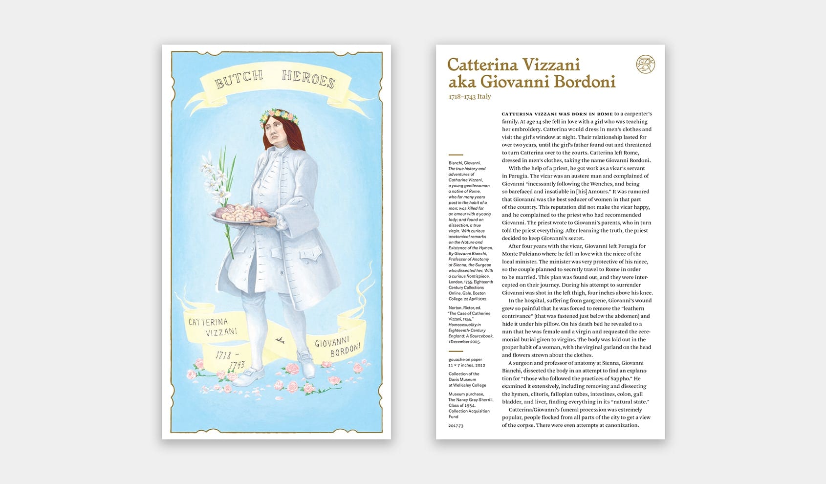
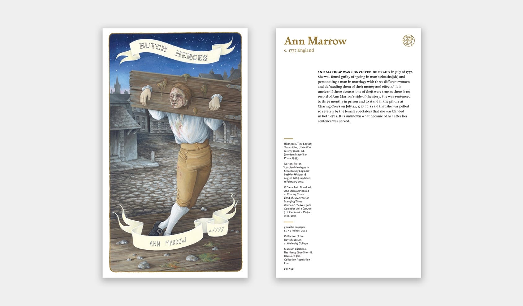
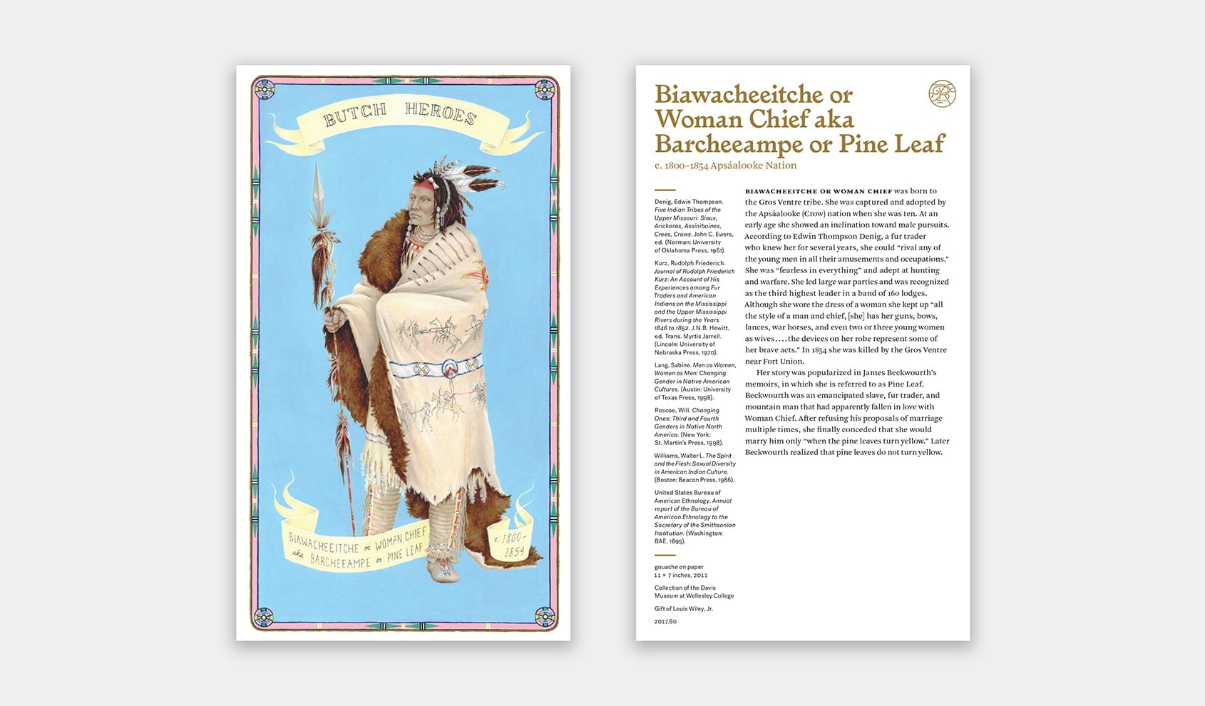
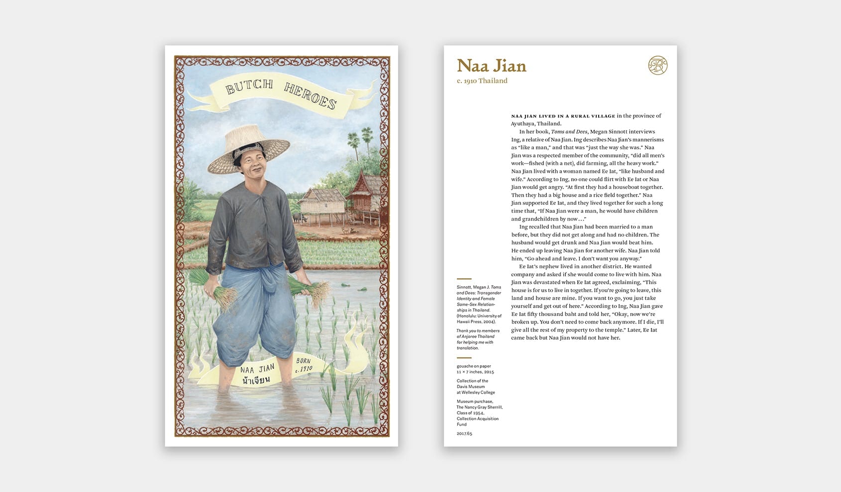
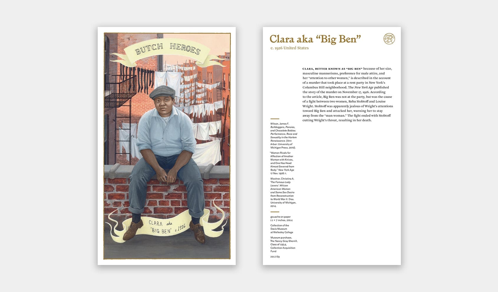
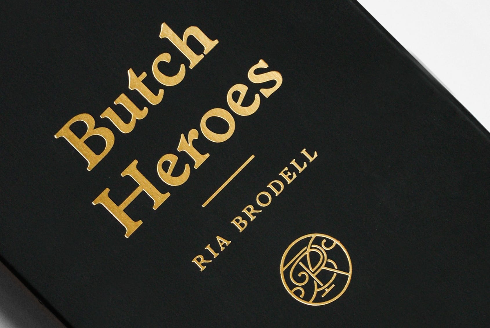
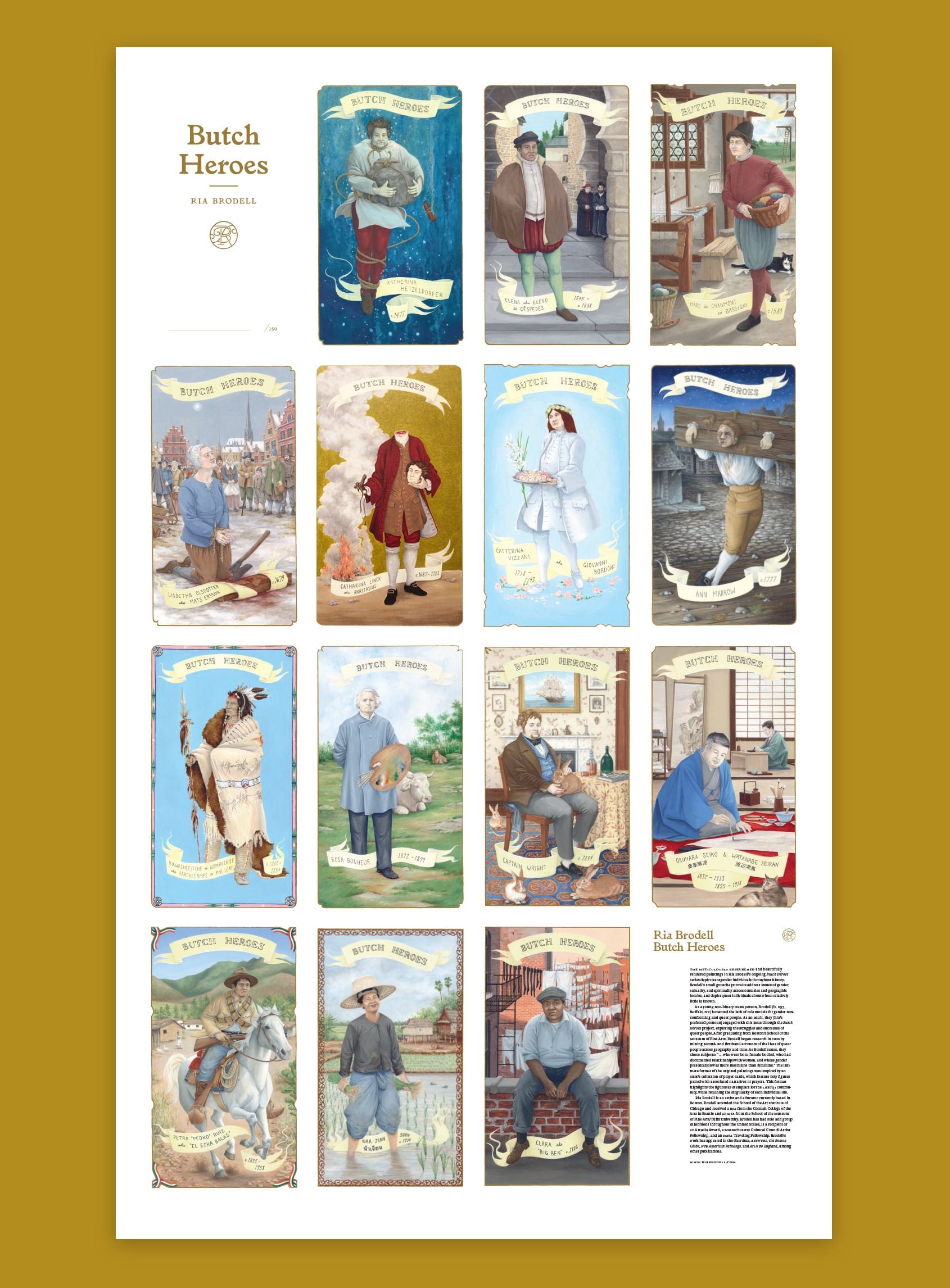
Stoltze created a signed boxed set of Brodell’s paintings in the Davis Museum’s collection. Fourteen Butch Heroes—meticulous gouache renderings of gender nonconforming historical figures—are reproduced in the manner of Catholic holy cards, with a deeply researched description typeset on the verso side. We designed an R/B monogram to unify the container and its contents, and lend the piece a historic formality. The custom matte black box, gold foil, and grosgrain ribbon combine to make the limited edition a luxurious, tactile experience.
Identity / Book Design / Catalog / Poster
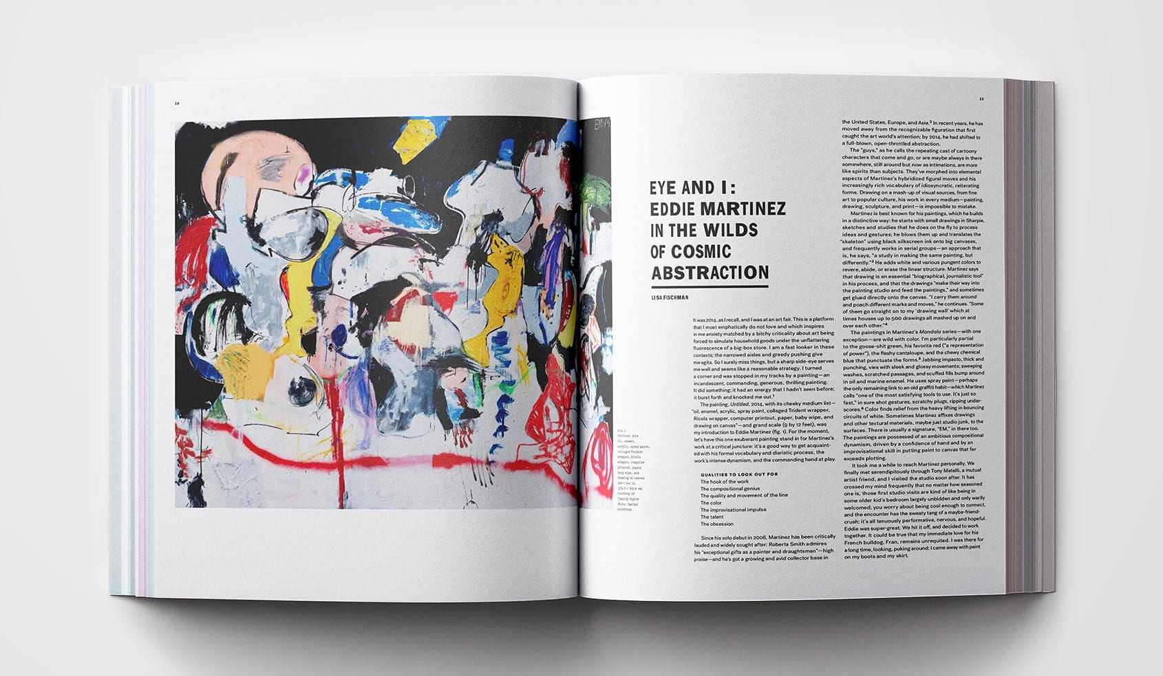
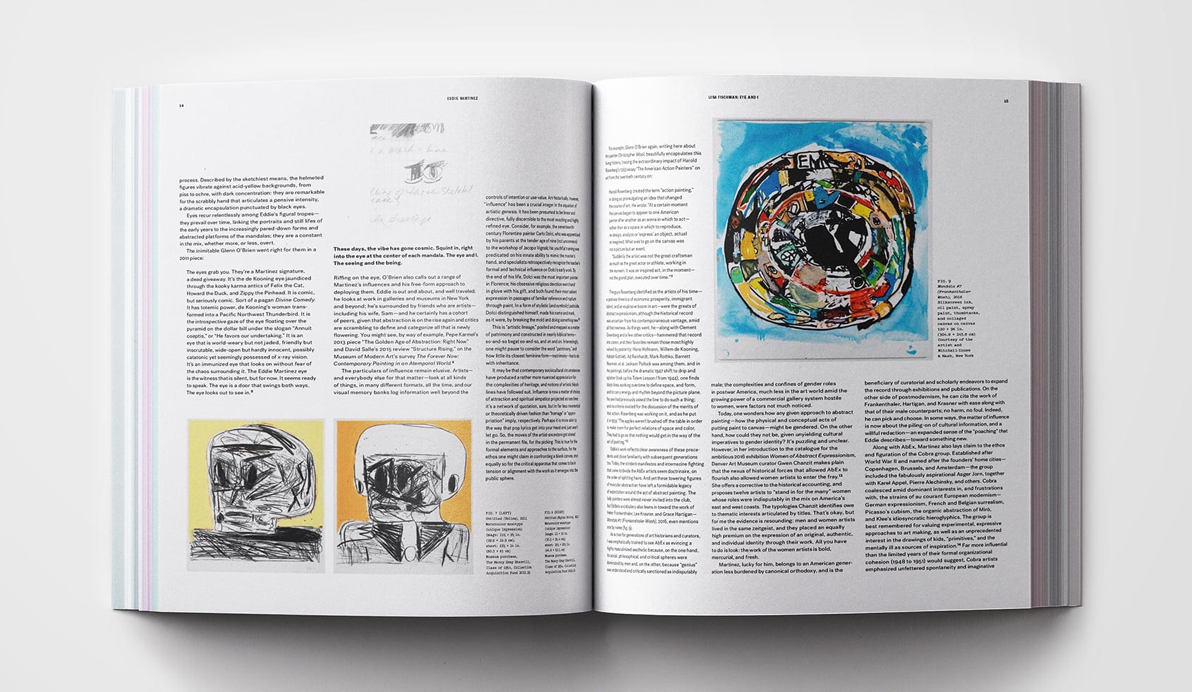
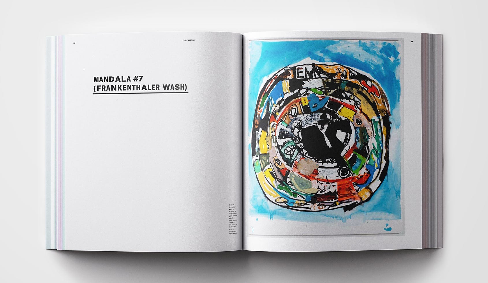
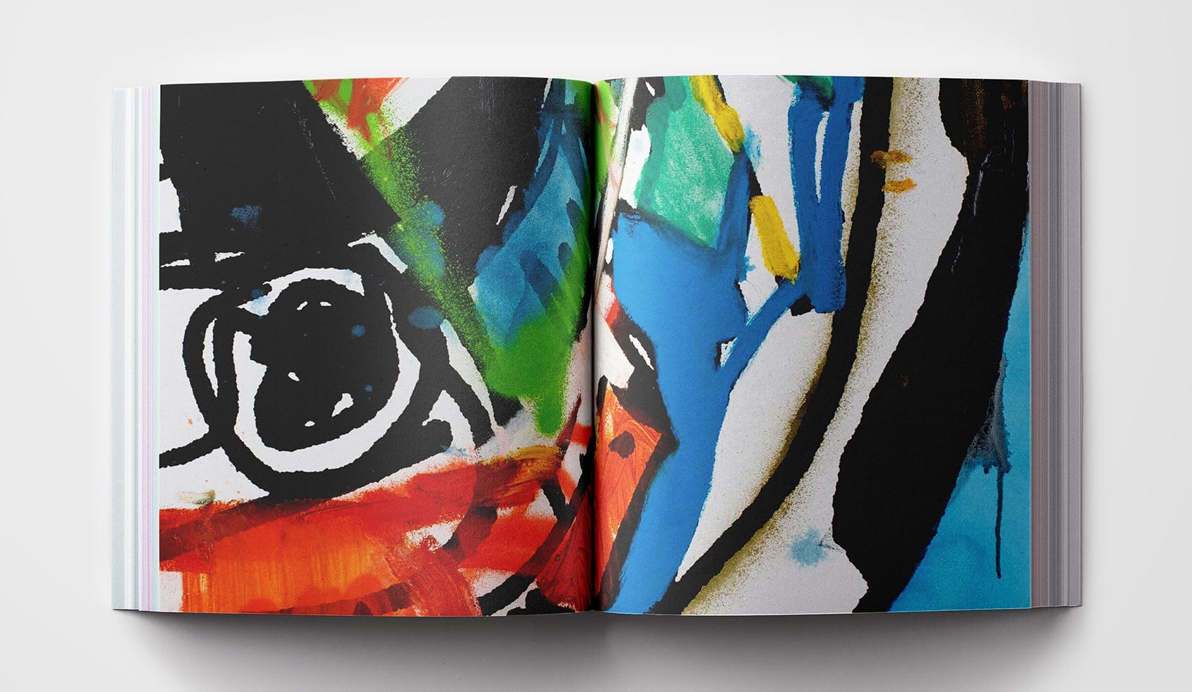
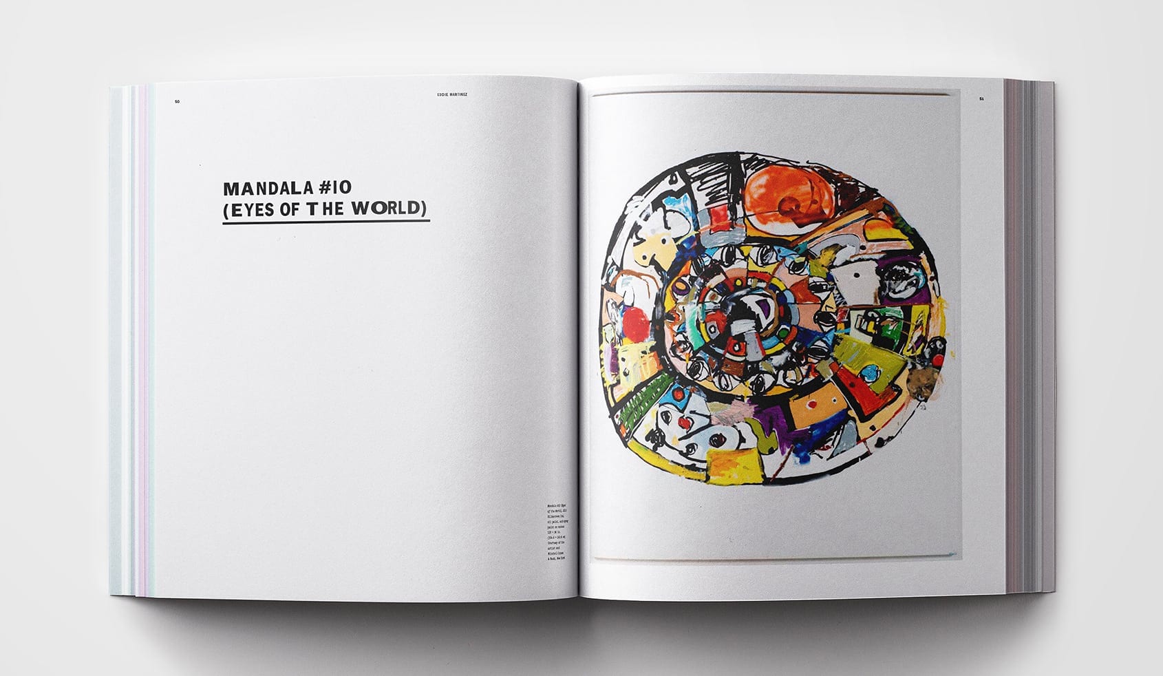
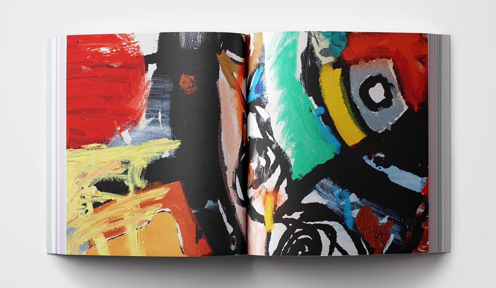
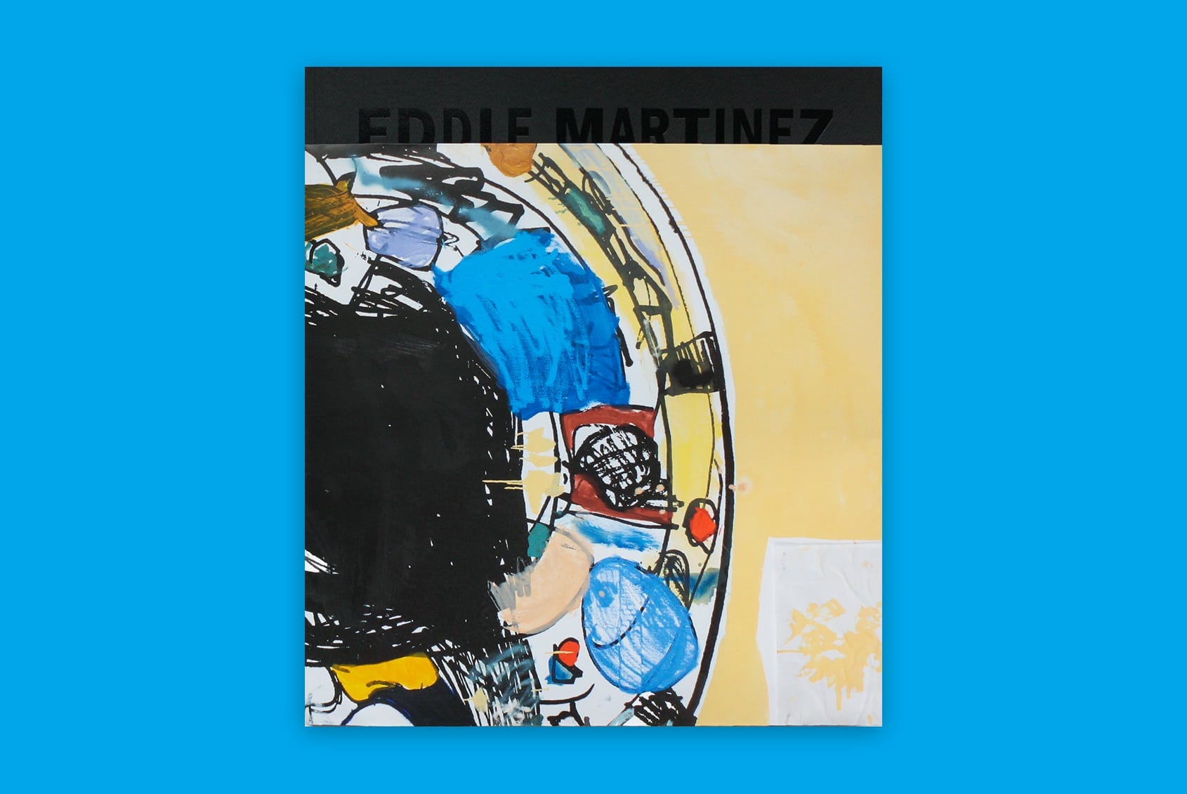
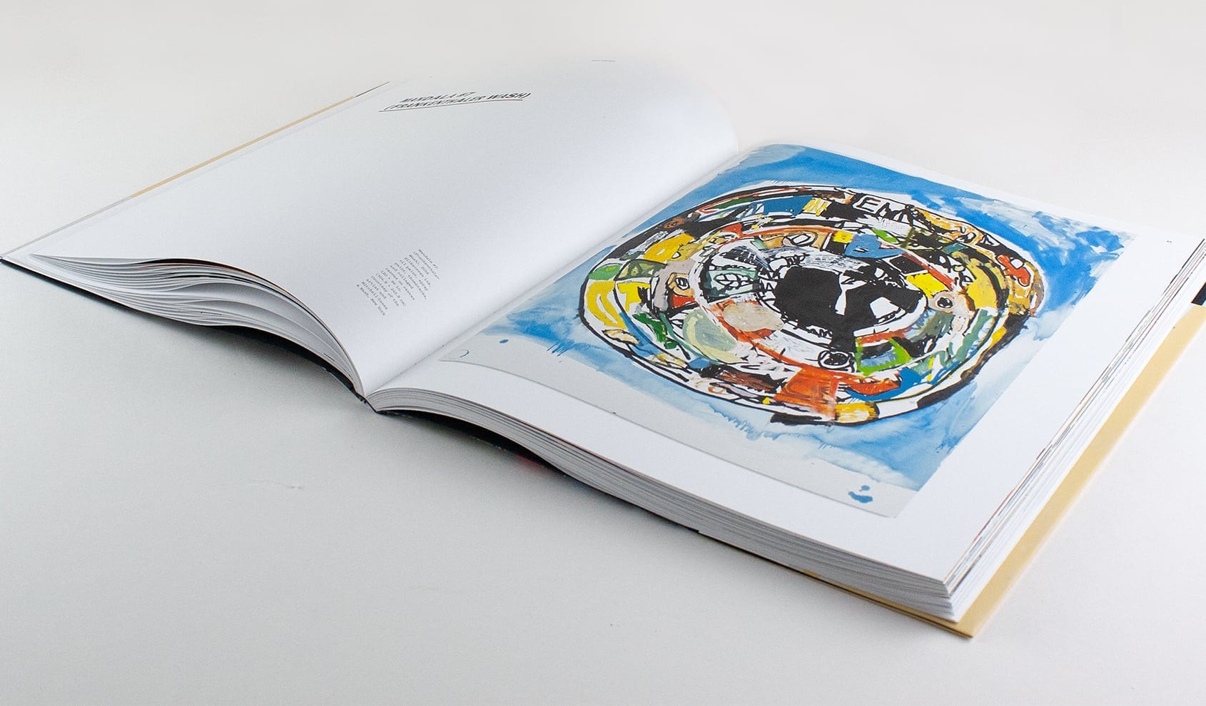
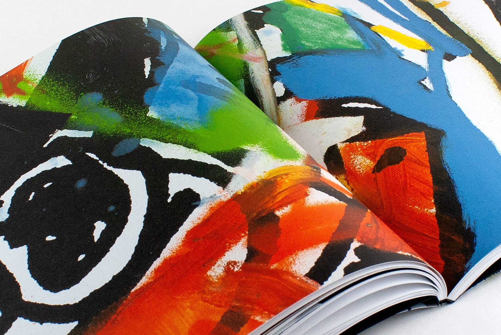
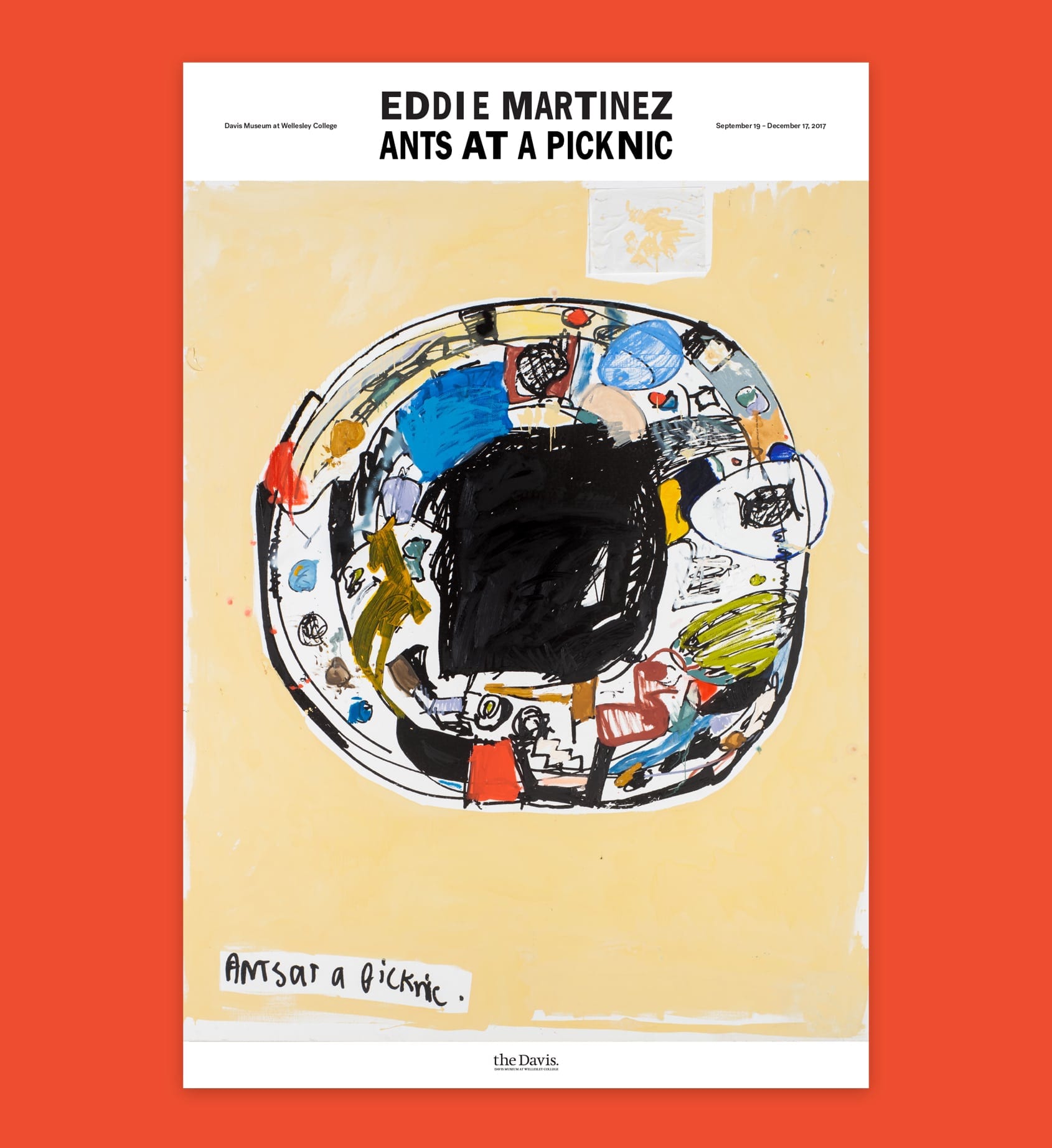
Eddie Martinez: Ants at a Picknic is an oversized volume that showcases seven monumental paintings and 17 sculptures from the Davis’ 2017 exhibit. To reflect the scale, technique, and materiality of the work, we included each painting in its entirety, followed by two full-bleed, close-cropped details. These enlargements capture spray-painted lines, impasto smears, pushpins, and even baby wipes attached to the canvases. To further express detail, tactility, and scale shift, we wrapped the black-on-black foil-stamped cover with a folded poster of the exhibition’s eponymous painting. For the headlines, we used “Big Ed”—a typeface that is appropriately loose and off-kilter.
Recognition: Type Directors Club, Print Regional Design Awards Best of Region, UCDA Excellence Award, American Alliance of Museums
Identity / Book Design / Catalog
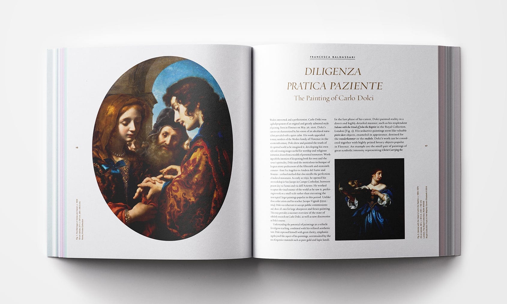
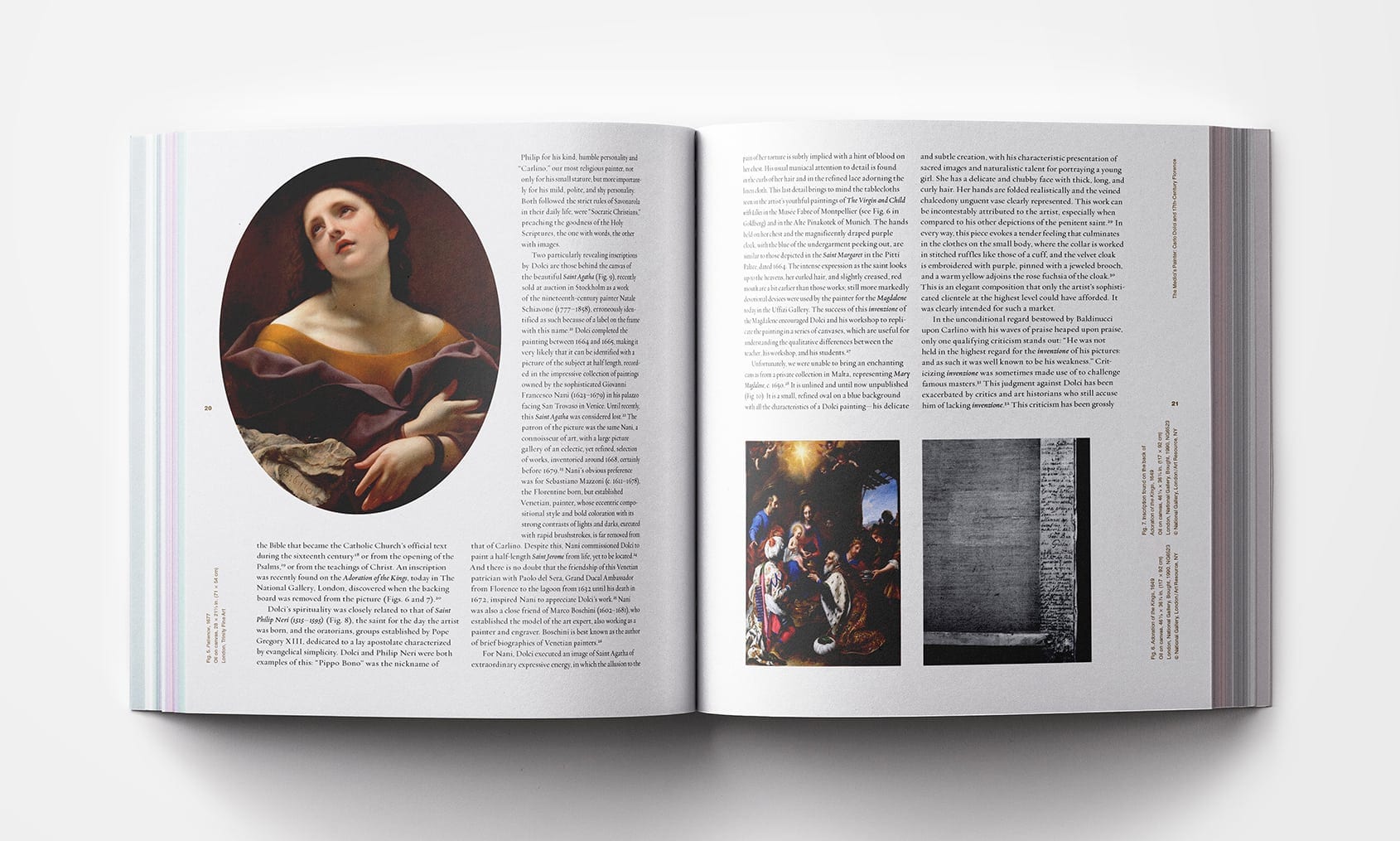
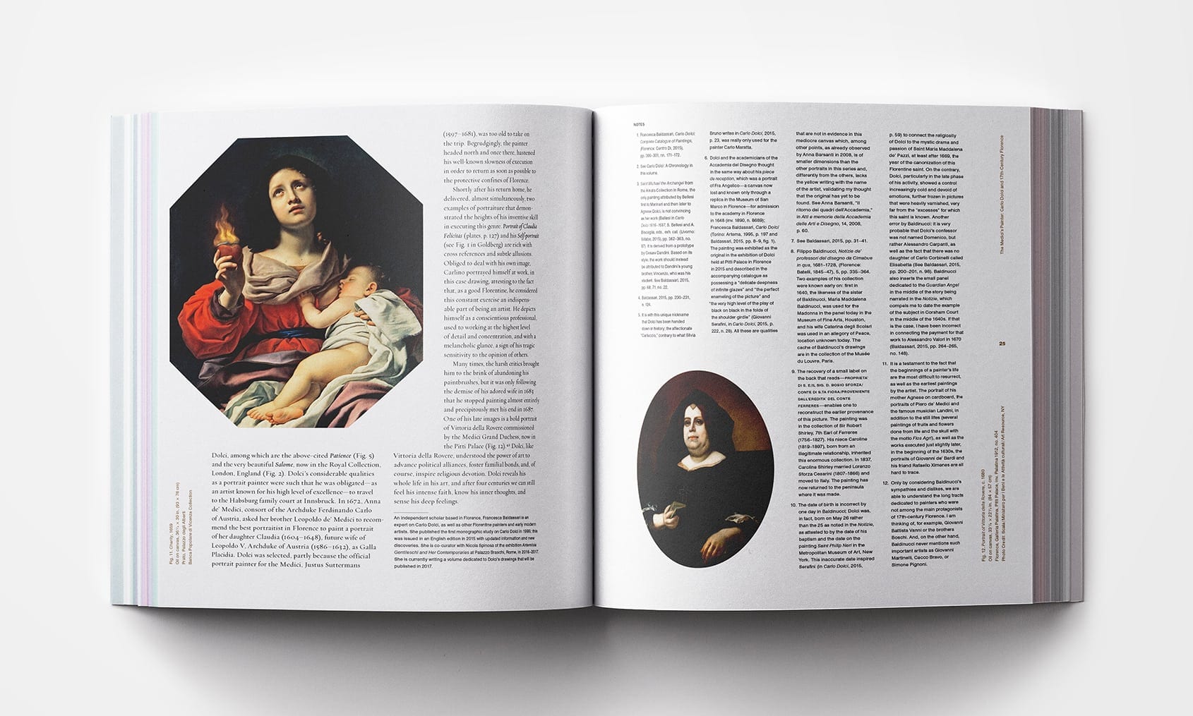
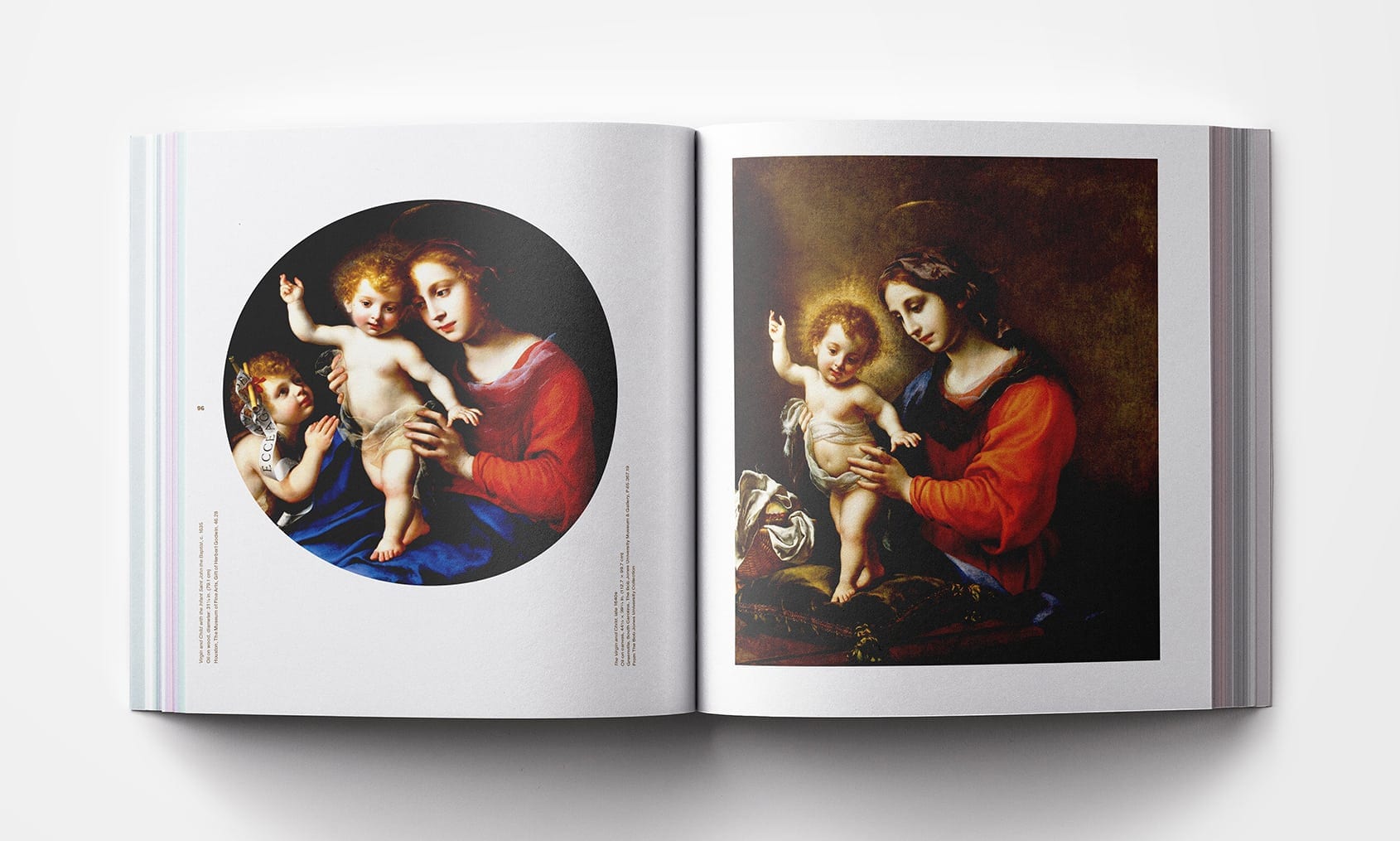
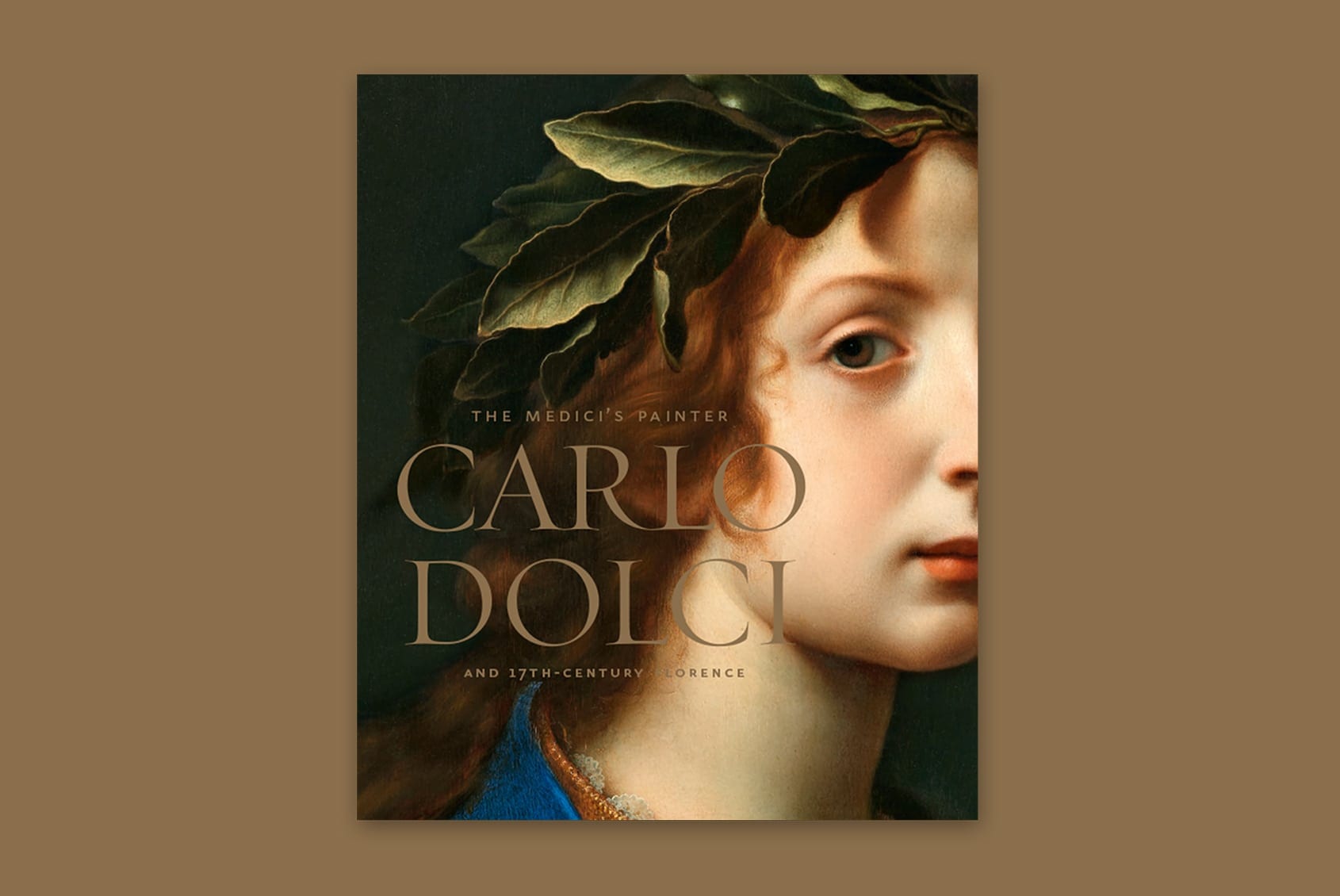
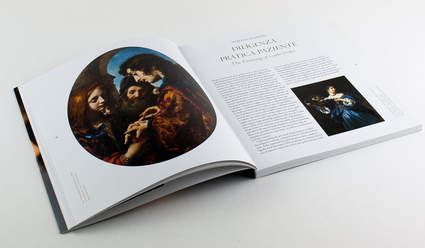
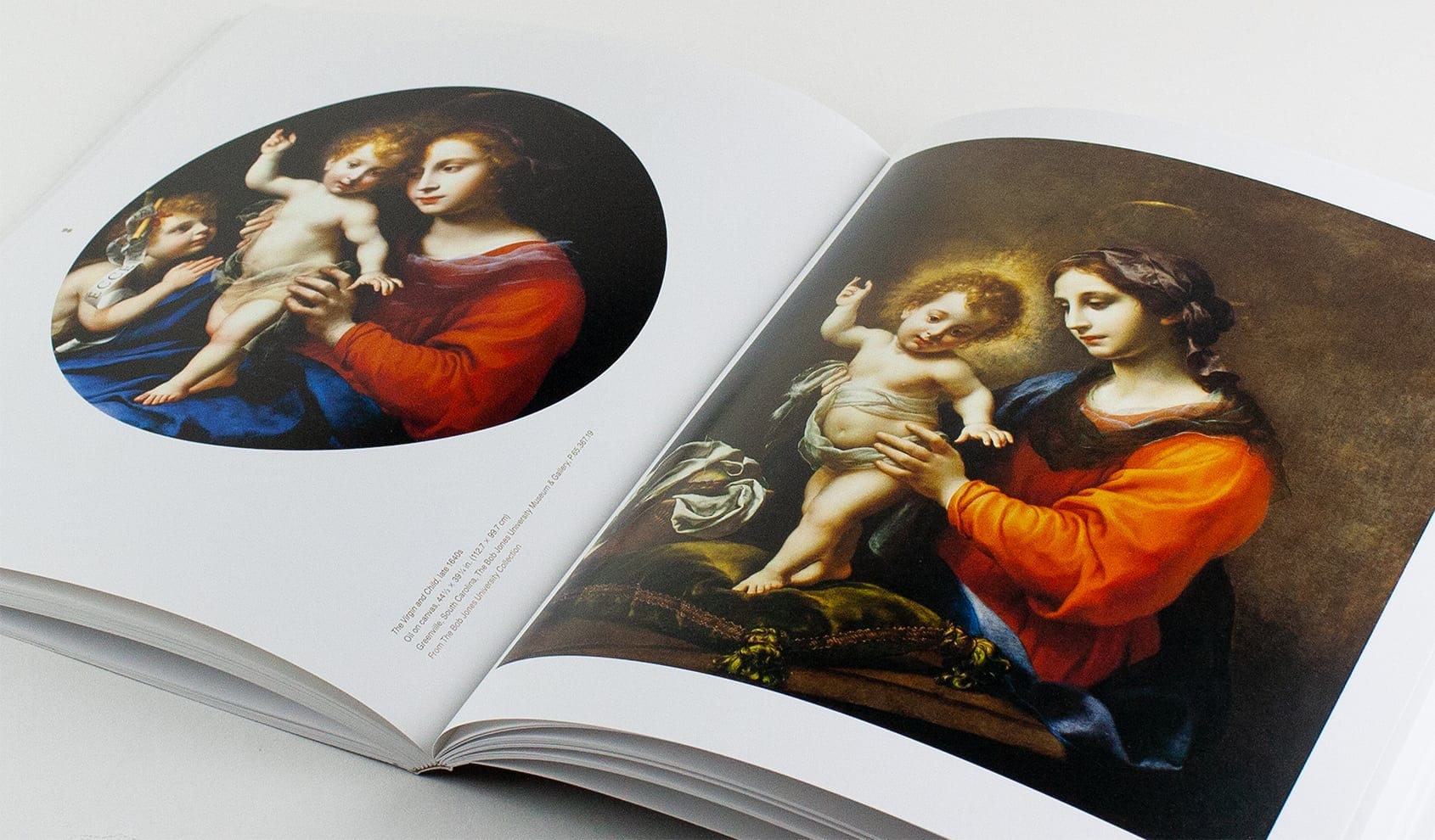
The Medici’s Painter: Carlo Dolci and 17th-Century Florence is a catalog that showcases the impressive body of work in the 2017 exhibit of the same name. We sought out era-appropriate typefaces, and framed them with the Davis’ Swiss font, just as Dolci’s baroque art was shown in a clean, modern space. The captions run vertically, pulling the viewer’s eye up the page—not unlike many of the subjects of Dolci’s devotional paintings. The artist often used gold dust to make his work shimmer, so we took his cue and used a metallic gold ink for the secondary text.
Recognition: Graphis Typography Annual Gold Award
Identity / Catalog
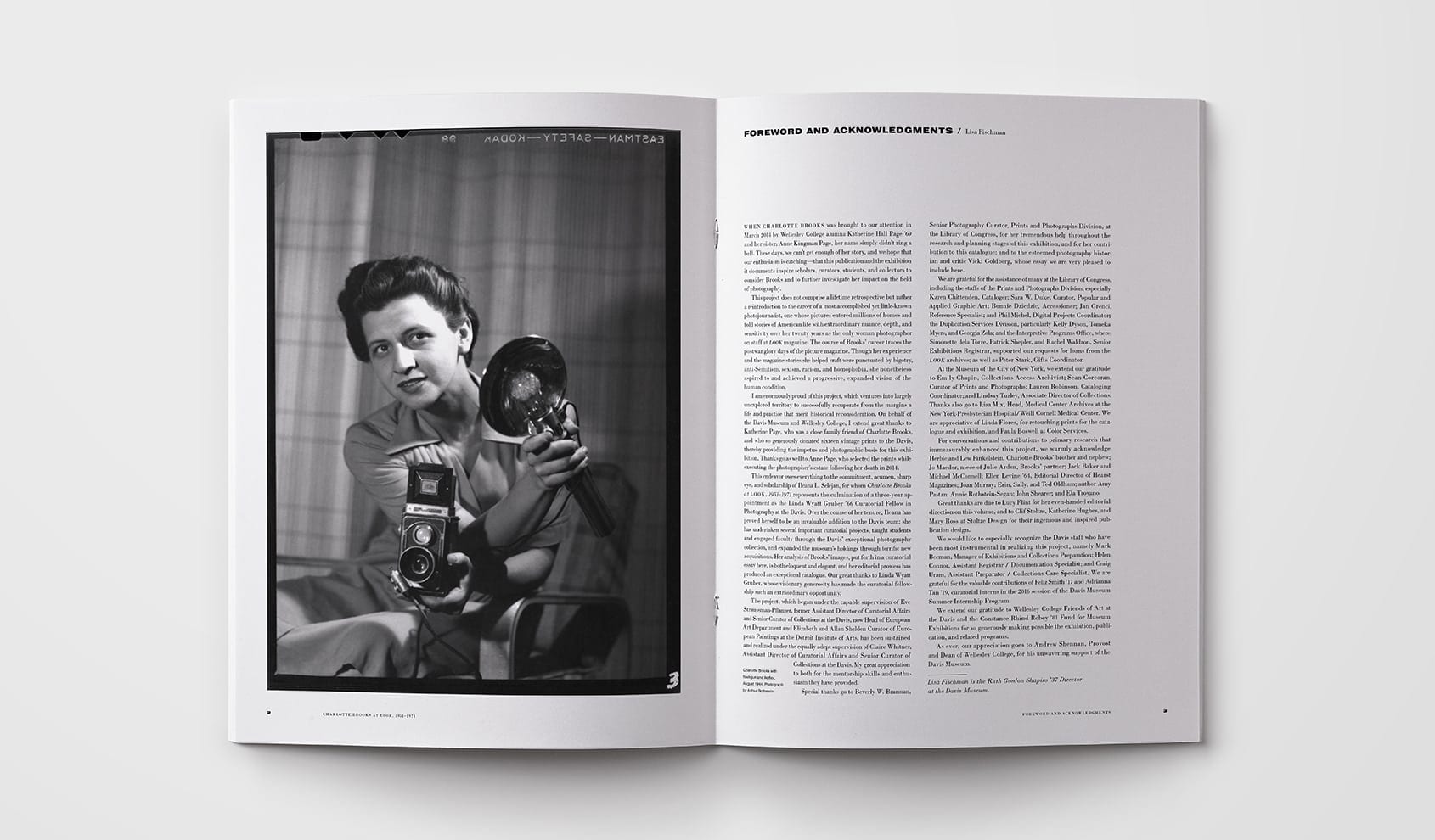
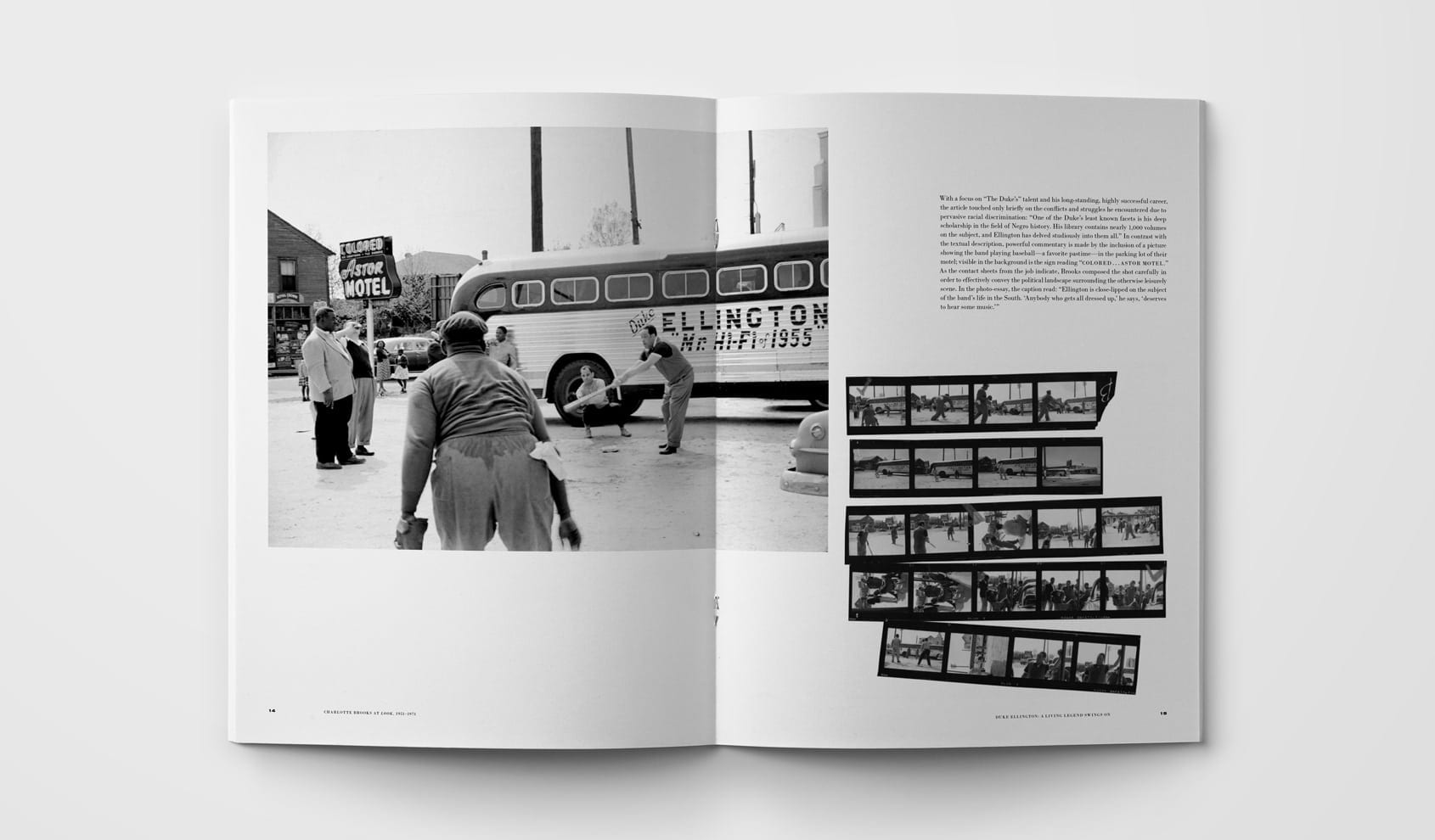
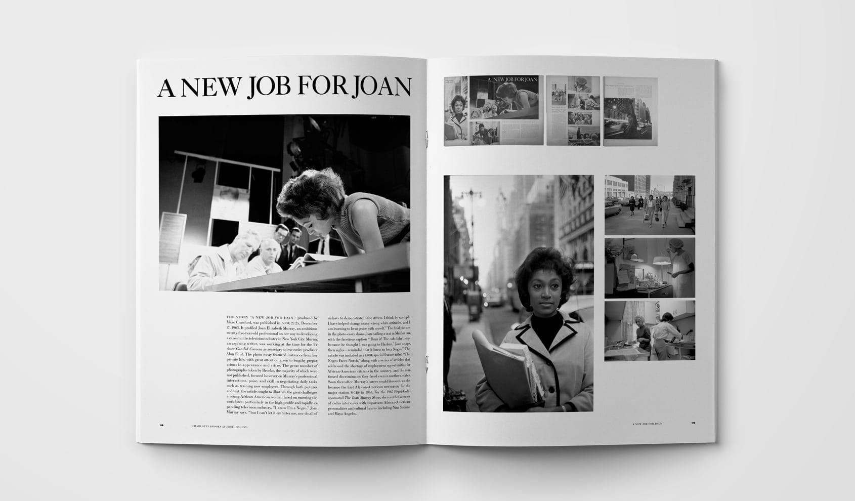
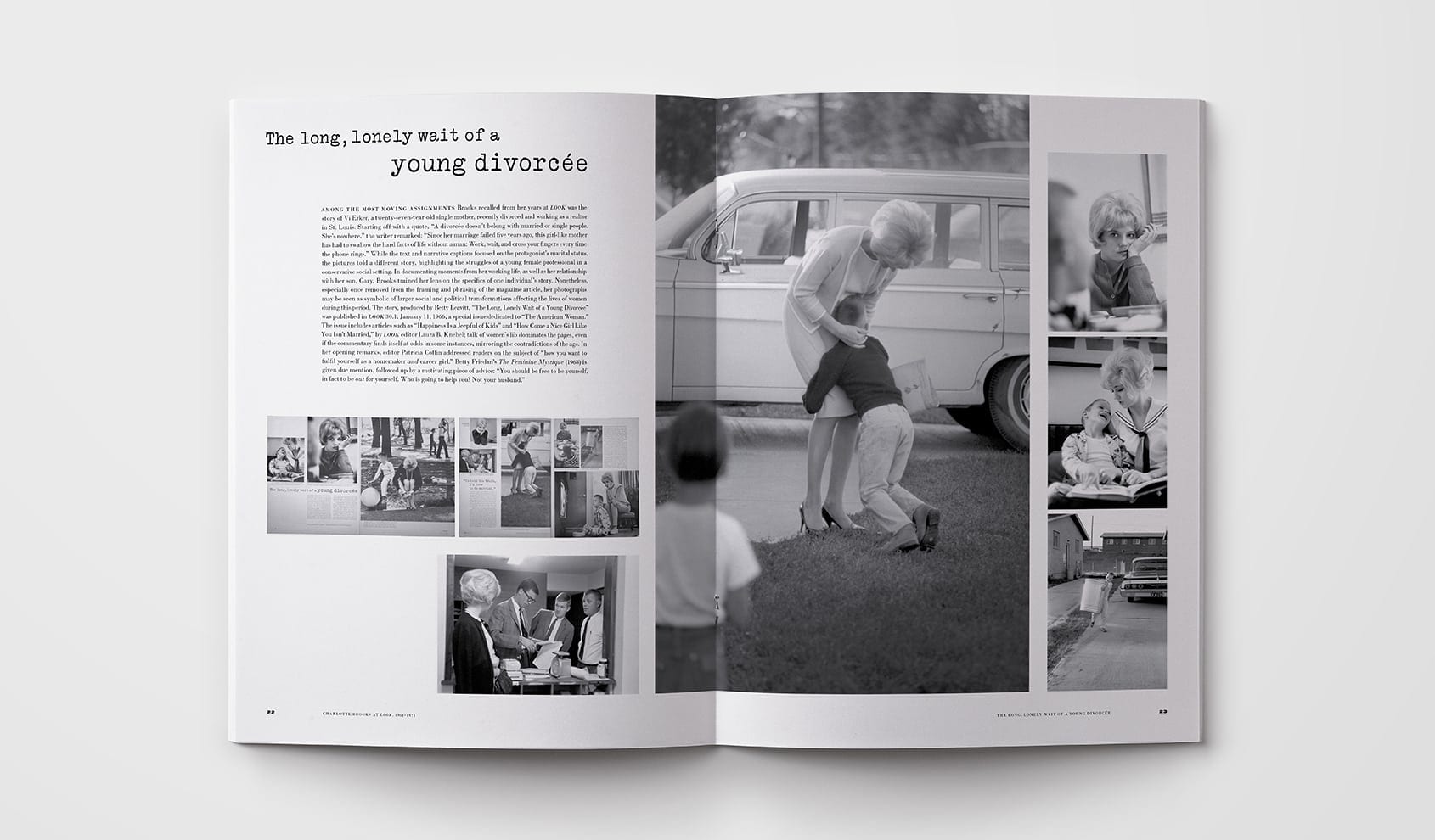
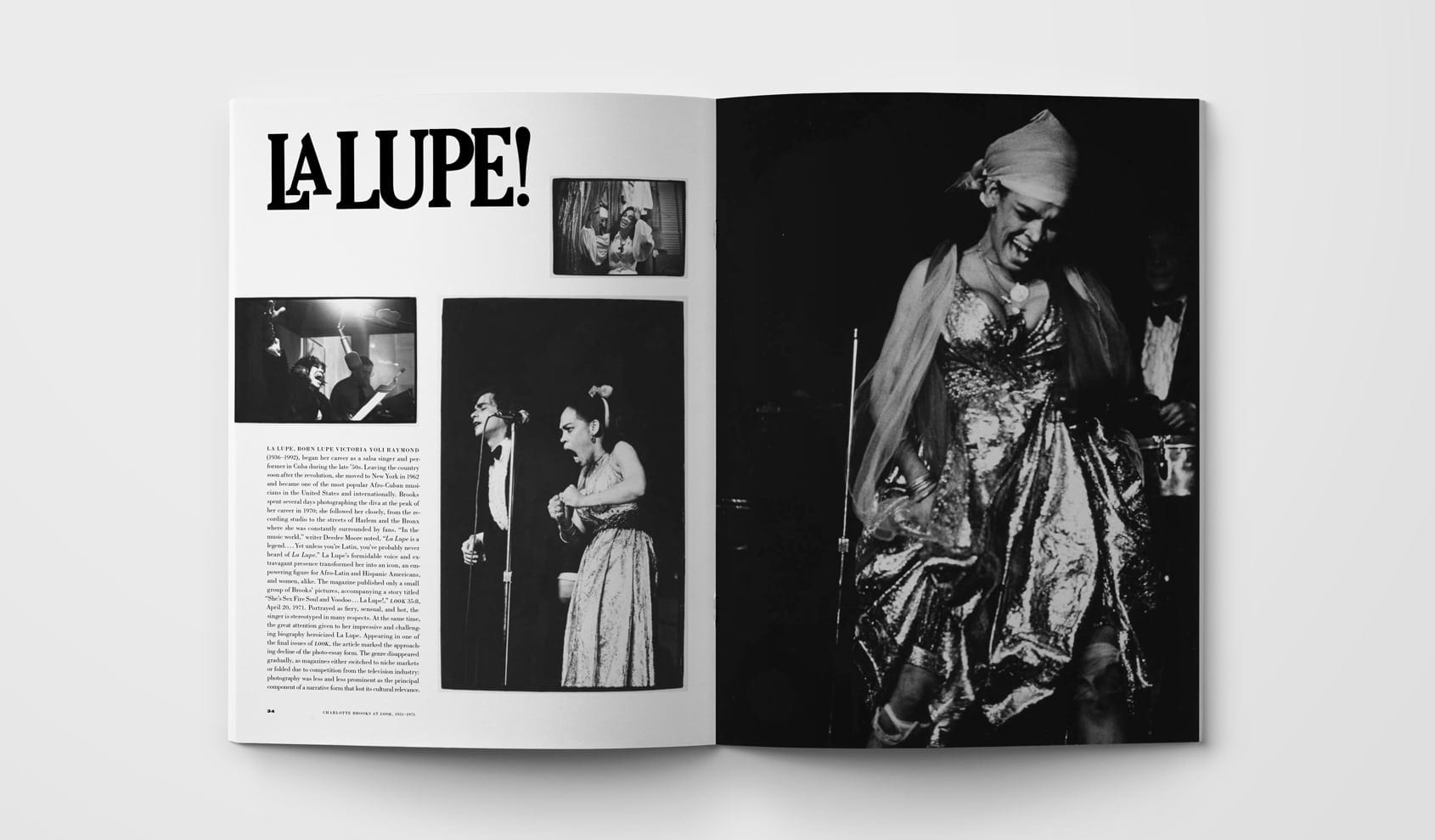
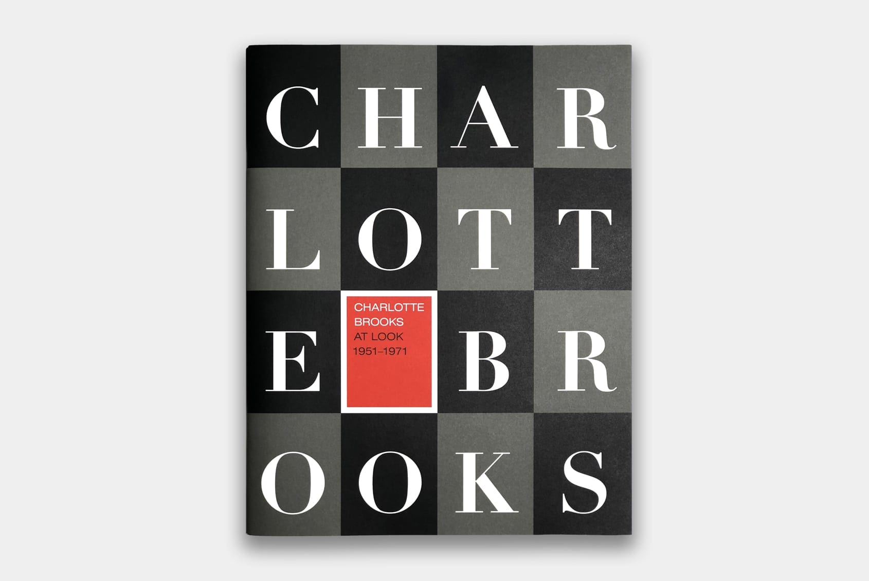
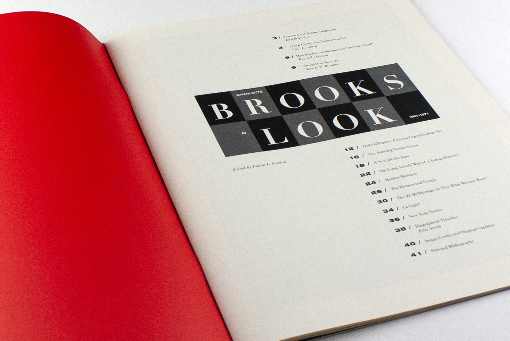
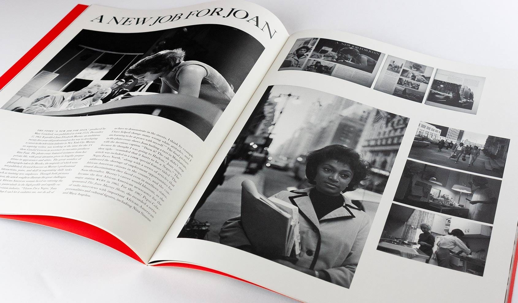
Charlotte Brooks at LOOK is an oversized saddle-stitched catalog that references the format, typography, and layouts of LOOK magazine, where Brooks was the first female staff photographer. We incorporated the original type treatments of the story titles into the pages, and used a justified, modern typeface to evoke mid-century layouts. By contrasting Brooks’ uncropped, original photographs and contact sheets with thumbnails of the magazine layouts, the catalog captures Brooks at the vanguard of her generation, curtailed to fit into a general interest magazine. We were thrilled to honor this legend.
Recognition: Type Directors Club, Communication Arts Design Annual, Graphis Typography Annual Silver Award, UCDA Excellence Award
Identity / Book Design / Catalog
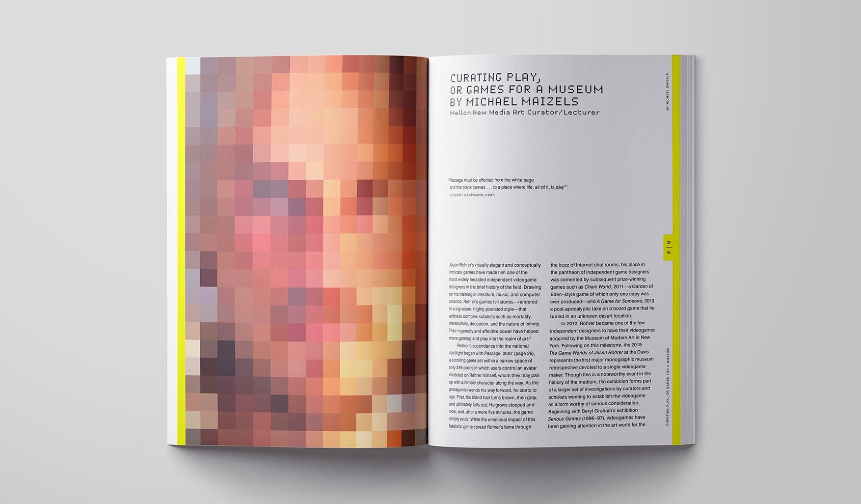
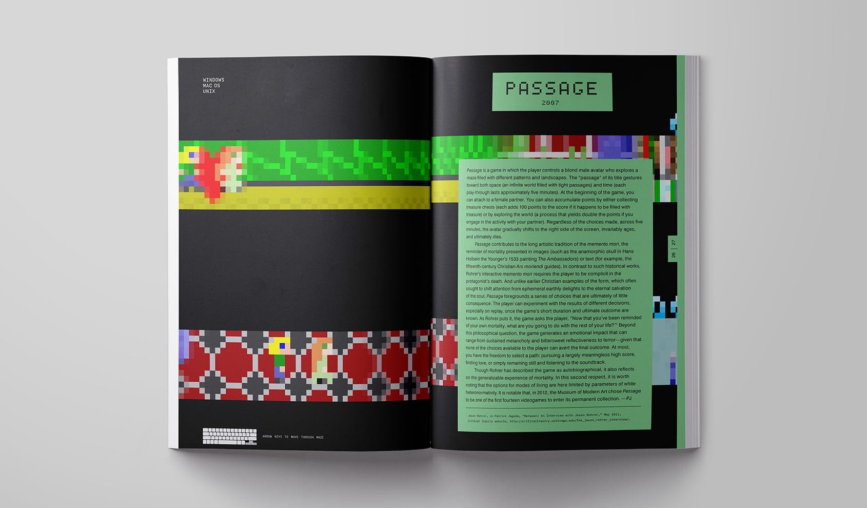
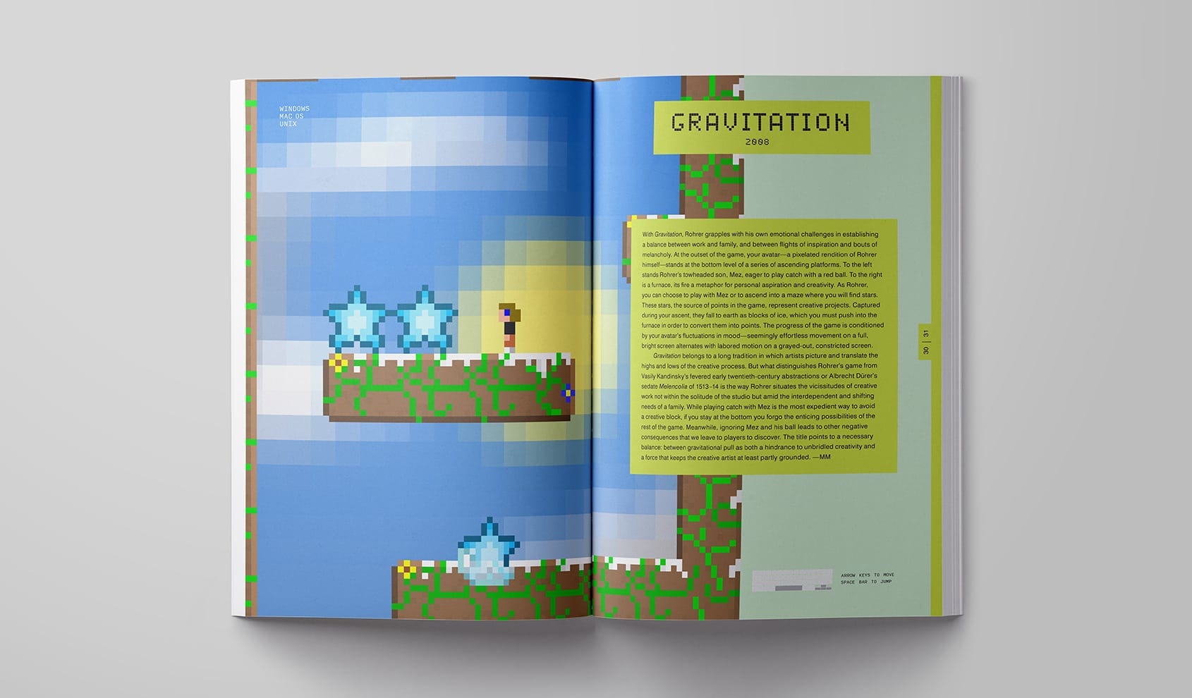
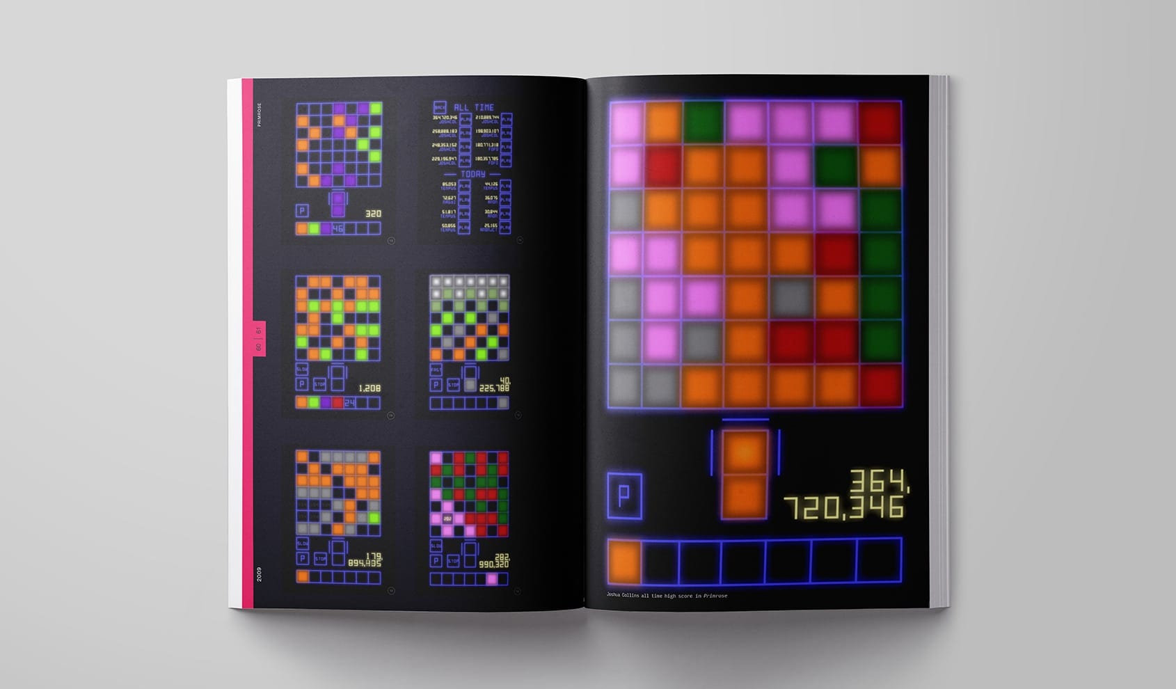
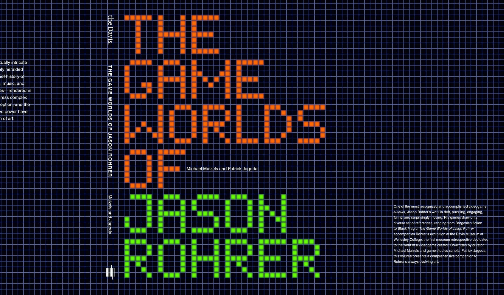
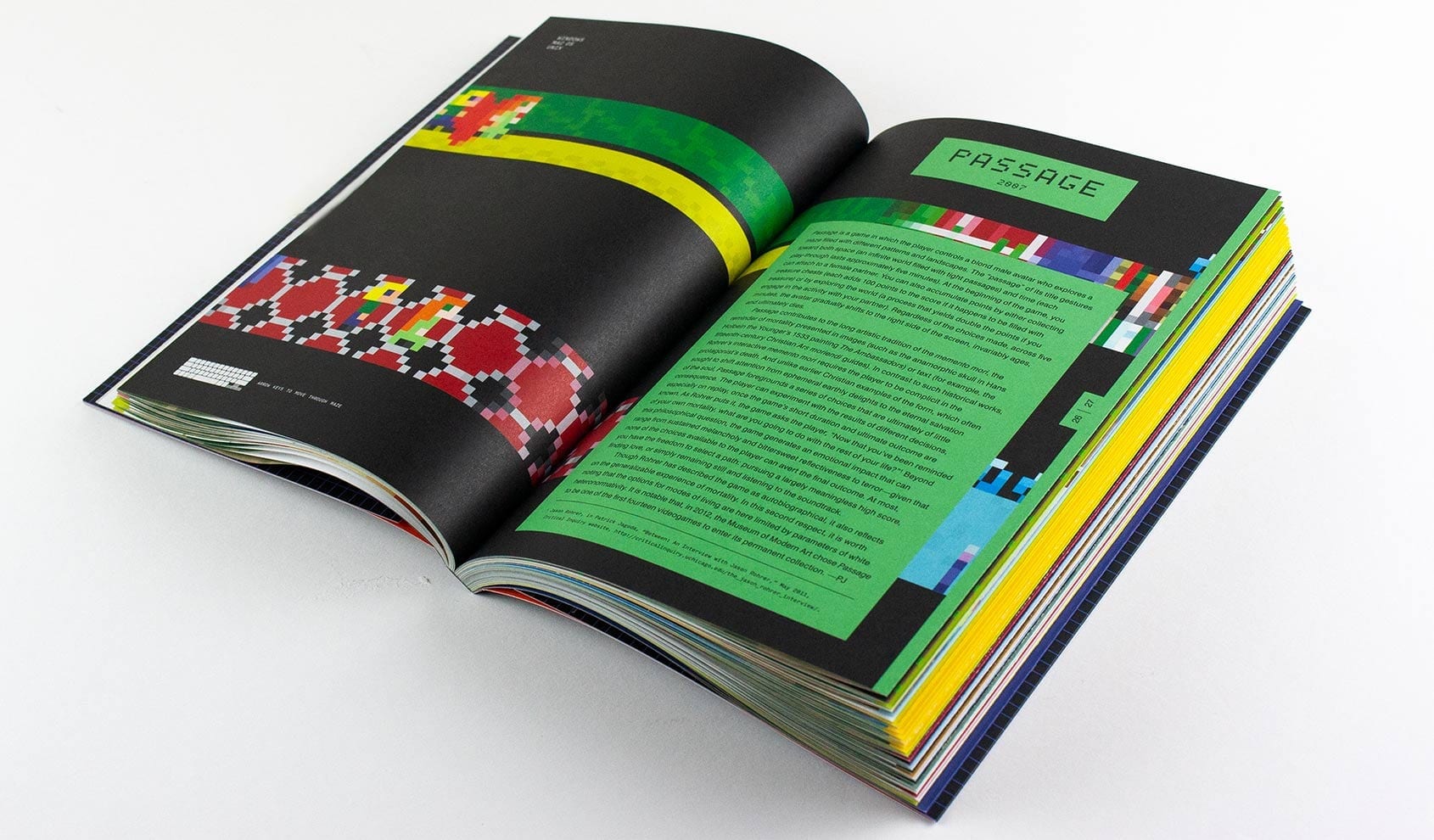
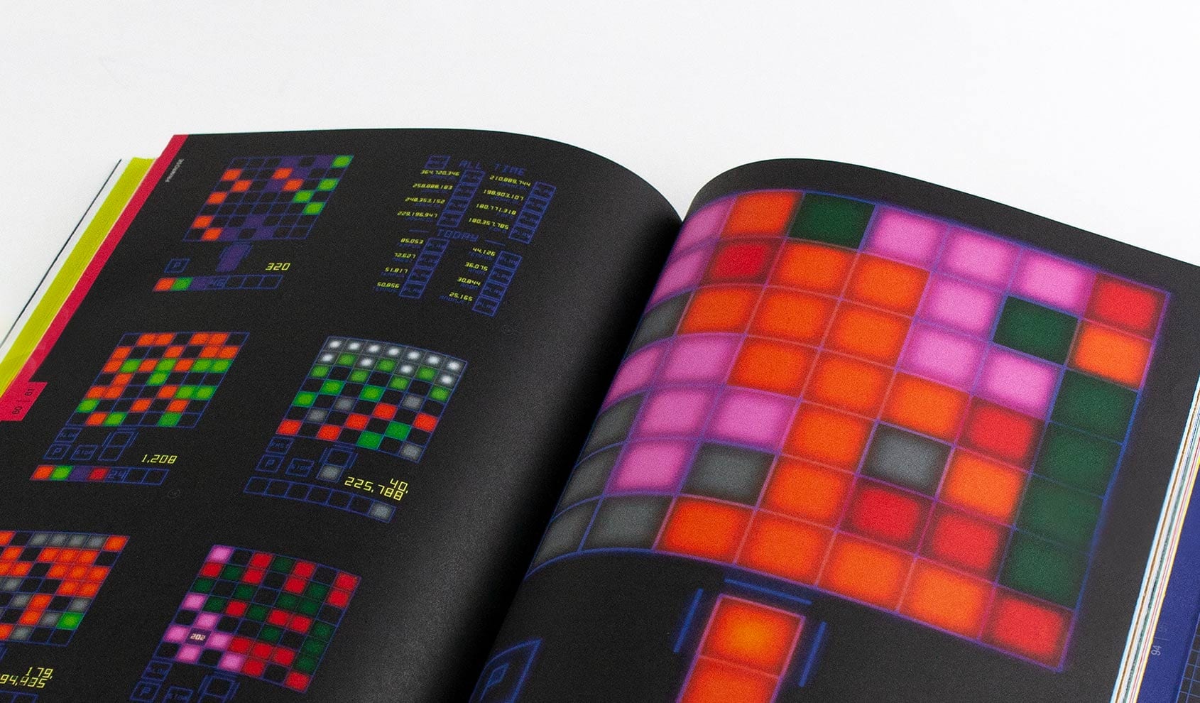
The Game Worlds of Jason Rohrer was co-published with MIT Press as a companion to the exhibit of seventeen art games designed by the artist. We worked with Rohrer and the curators to leverage the book’s physical properties, much as the games reflect the distinct media in which they were designed. The resulting book has French-fold pages with a map hidden on the inner surfaces, and the vivid, low-fi quality of many of Rohrer’s pieces. We were delighted that the Wall Street Journal listed it in its 2016 article “Must-Read Books for Geeks.”
Recognition: AIGA 50 Books / 50 Covers, Communication Arts Design Annual
Identity / Book Design / Catalog
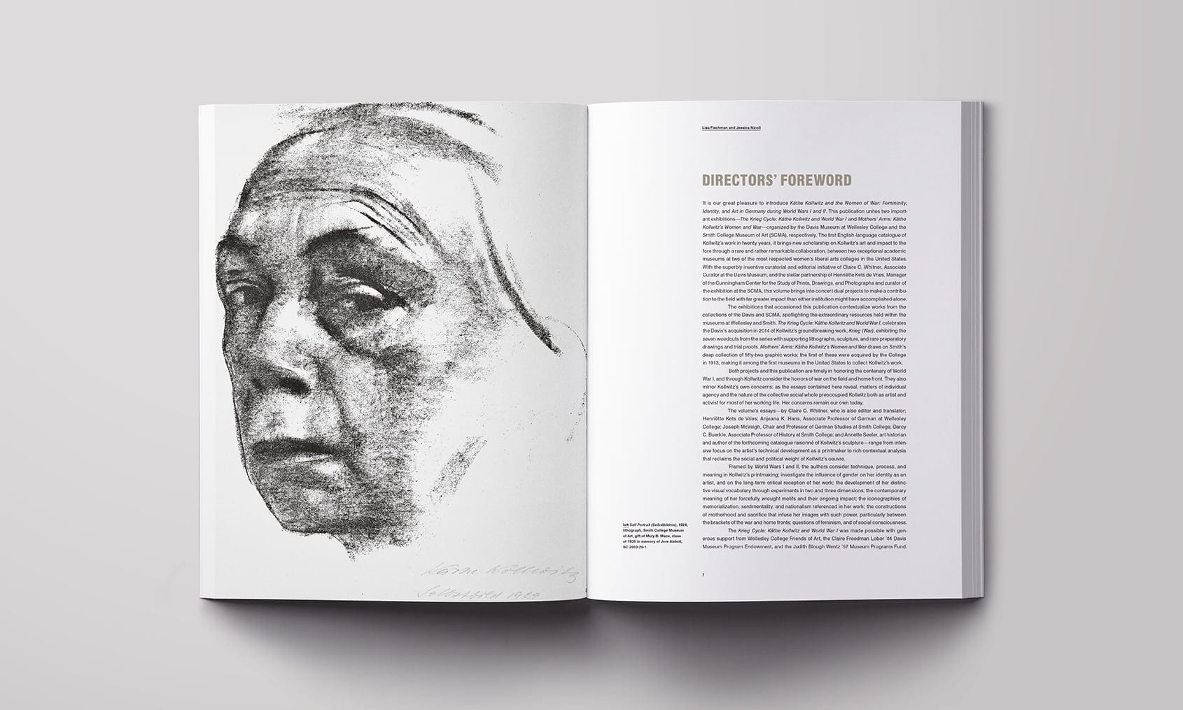
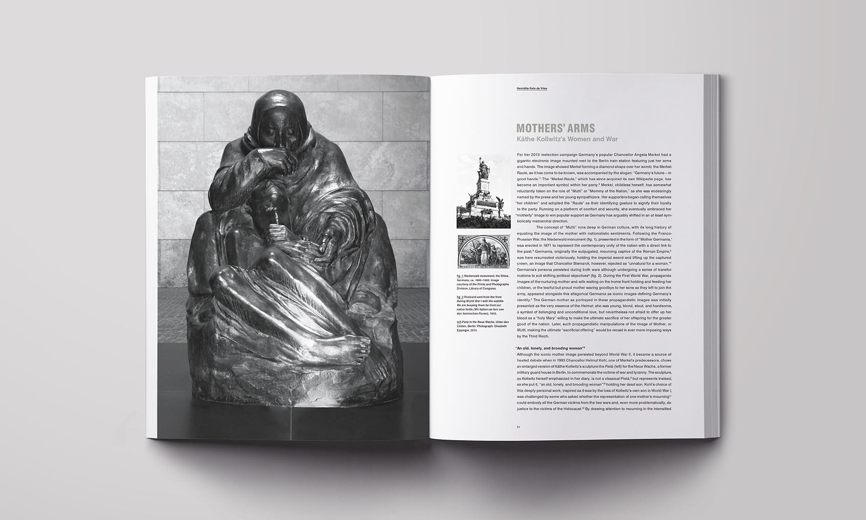
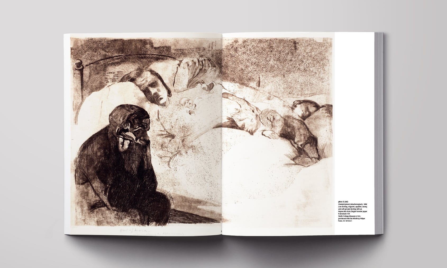
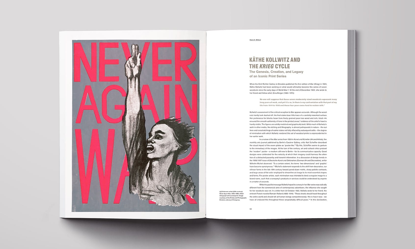
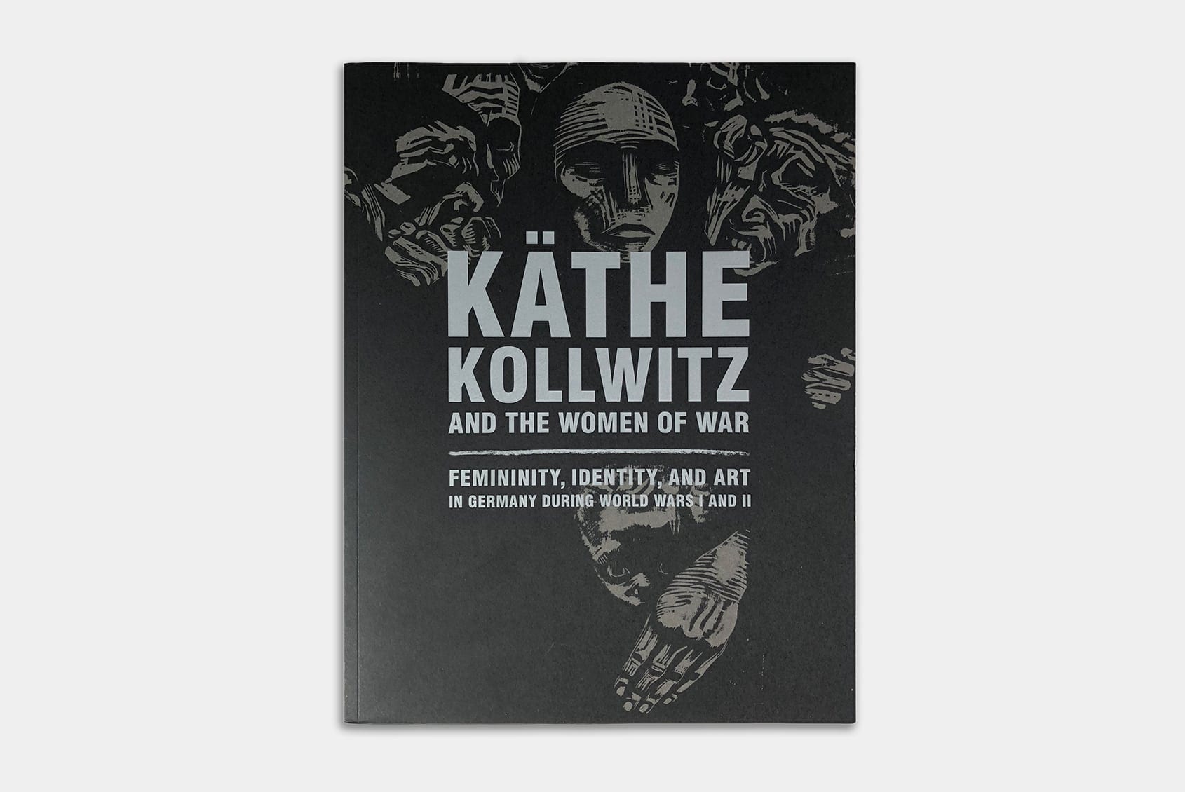
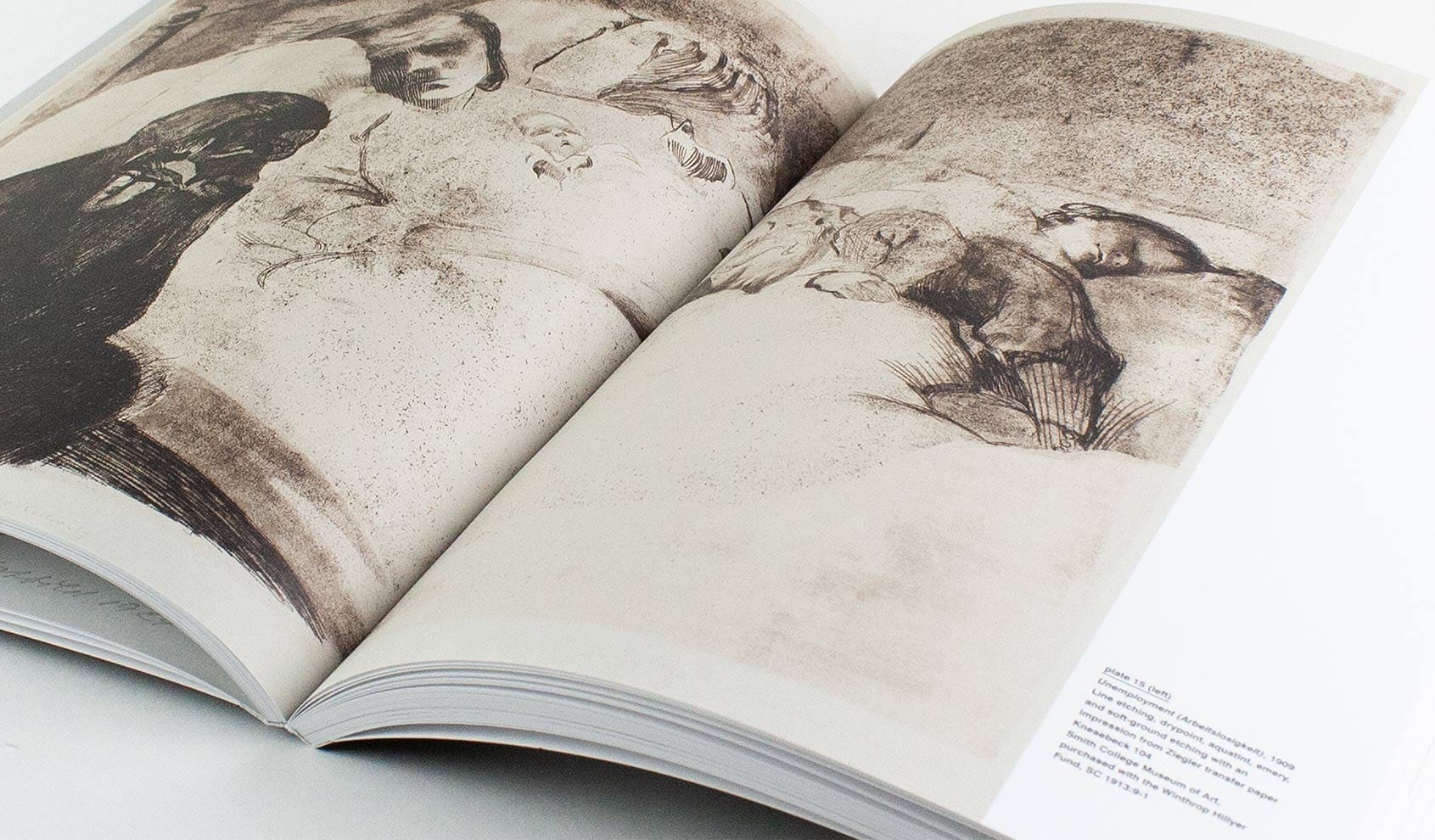
The first English-language catalog on Kollwitz in more than two decades, Kathe Kollwitz and the Women of War was co-published with Yale University Press to mark the Davis’ acquisition and exhibition of the woodcut series Krieg (War). The work is set in the context of history, craft, and Kollwitz’s oeuvre. To showcase the prints and honor the era, we kept the layout clean, open, and mechanical in tone. A spot gray, justified blocks of type, and an ample asymmetrical margin run throughout the book. The plates section directly compares multiple states of the woodcuts, and pairs preparatory drawings with final prints. The book is now in academic libraries around the world.
Recognition: AIGA 50 Books / 50 Covers
Book Design / Catalog
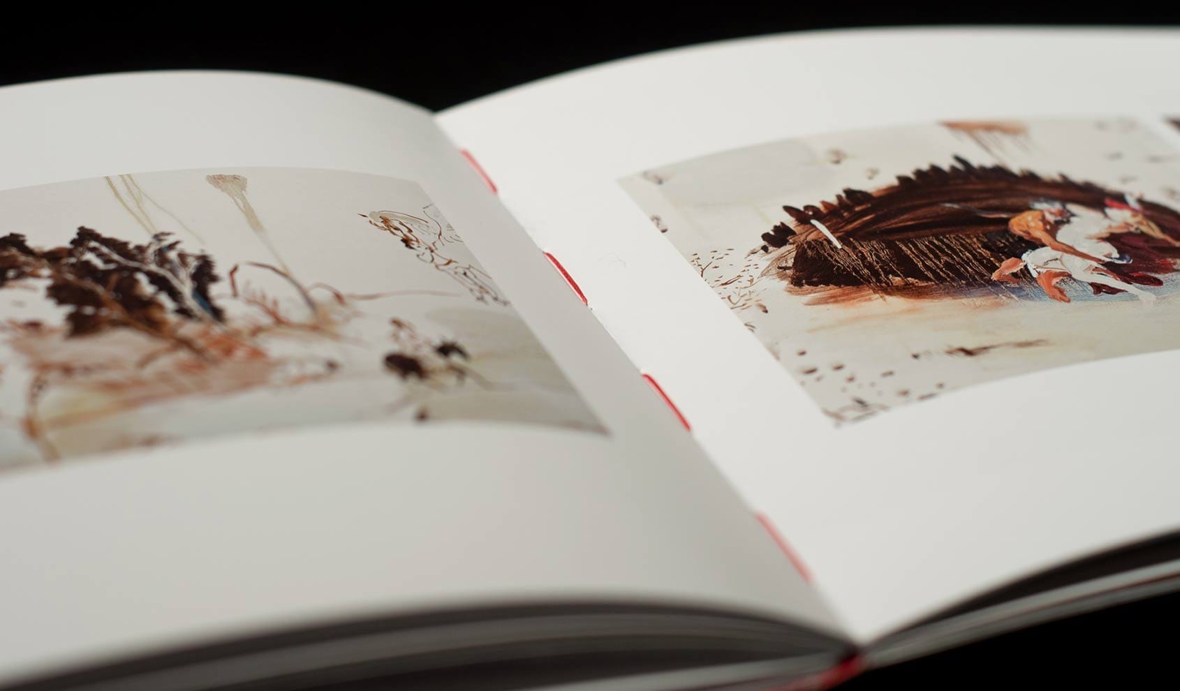
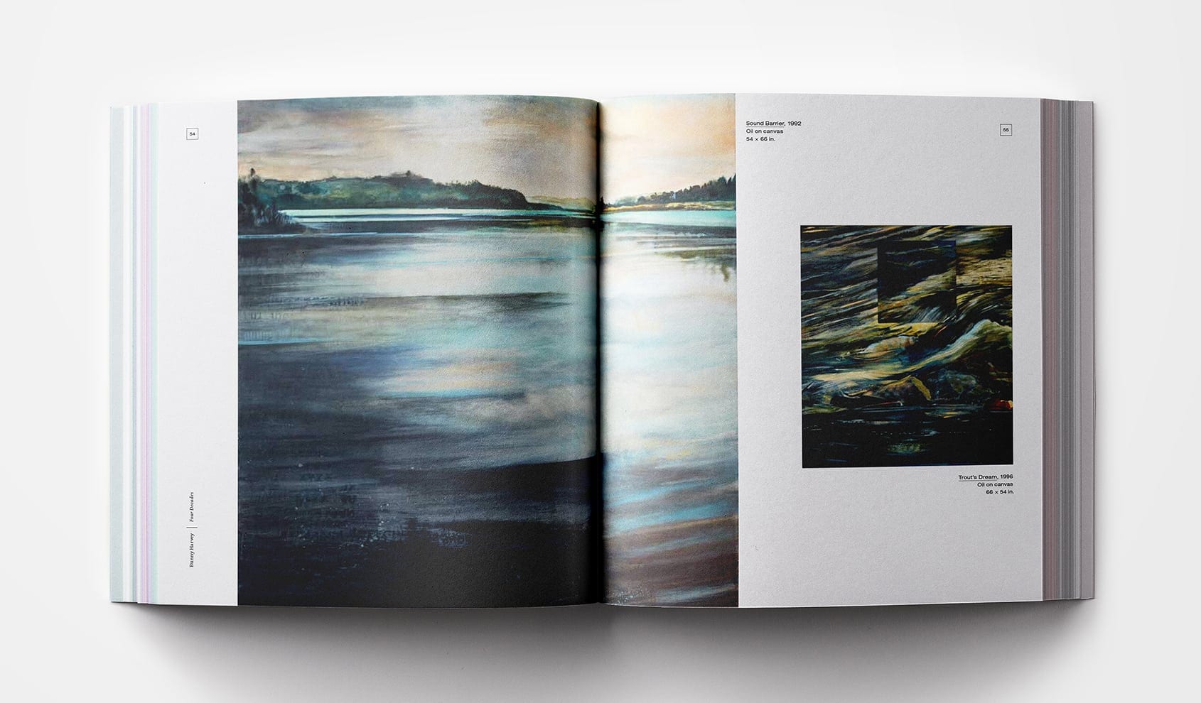
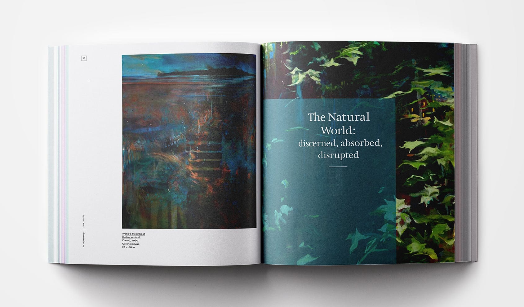
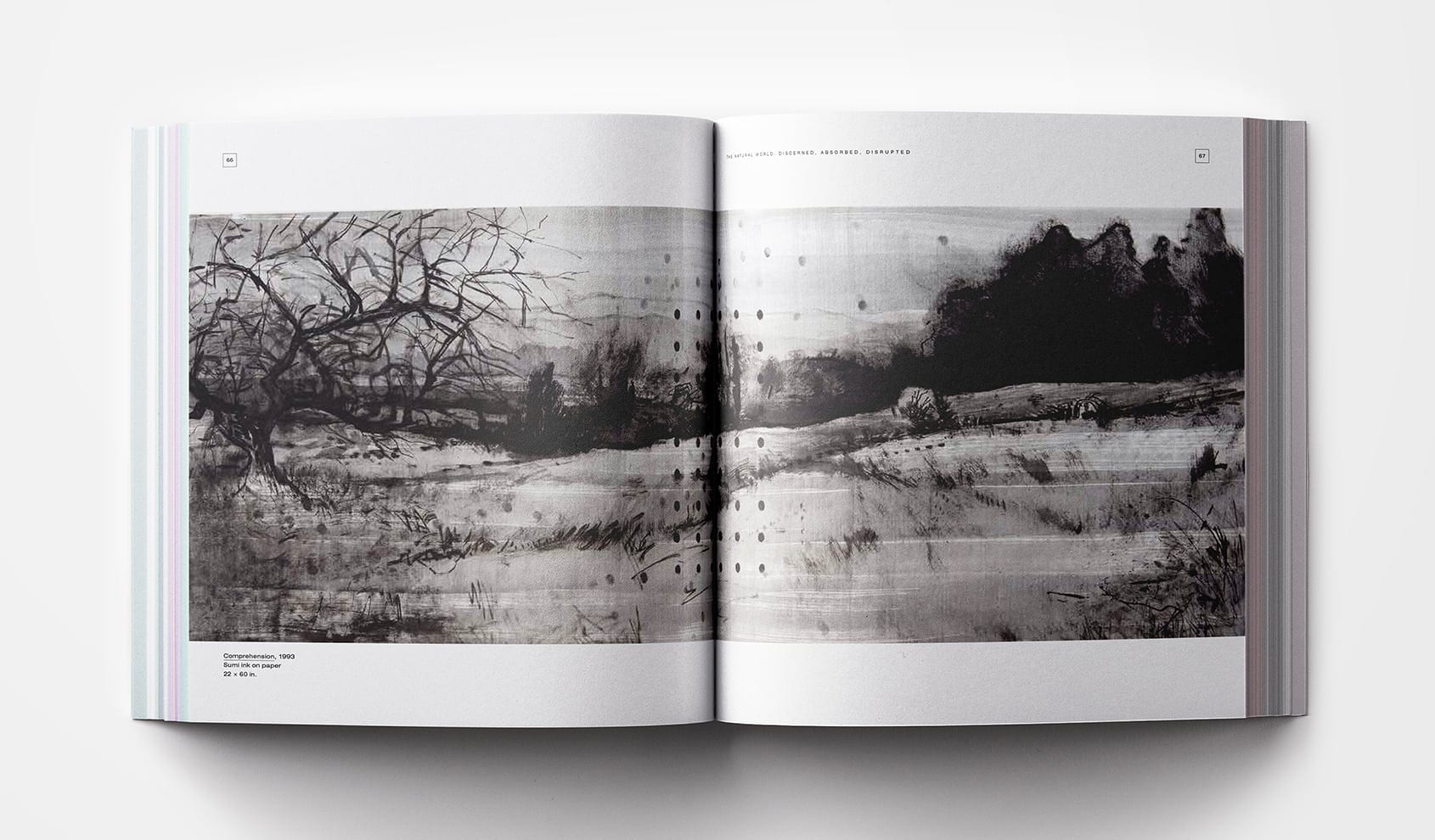
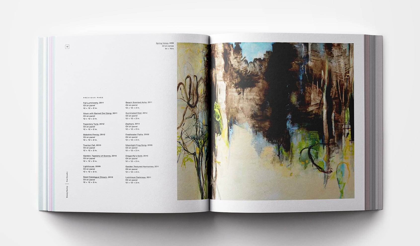
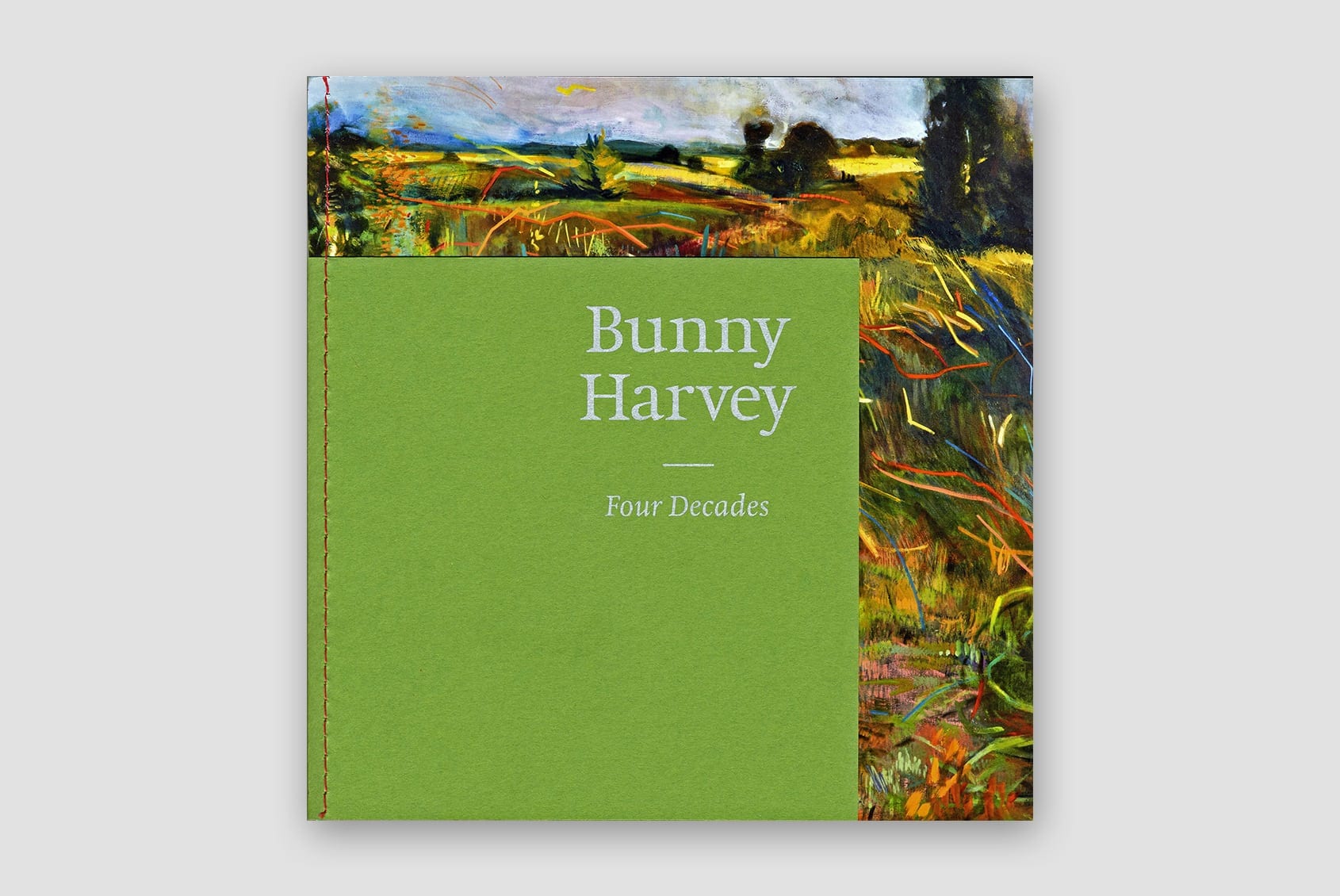
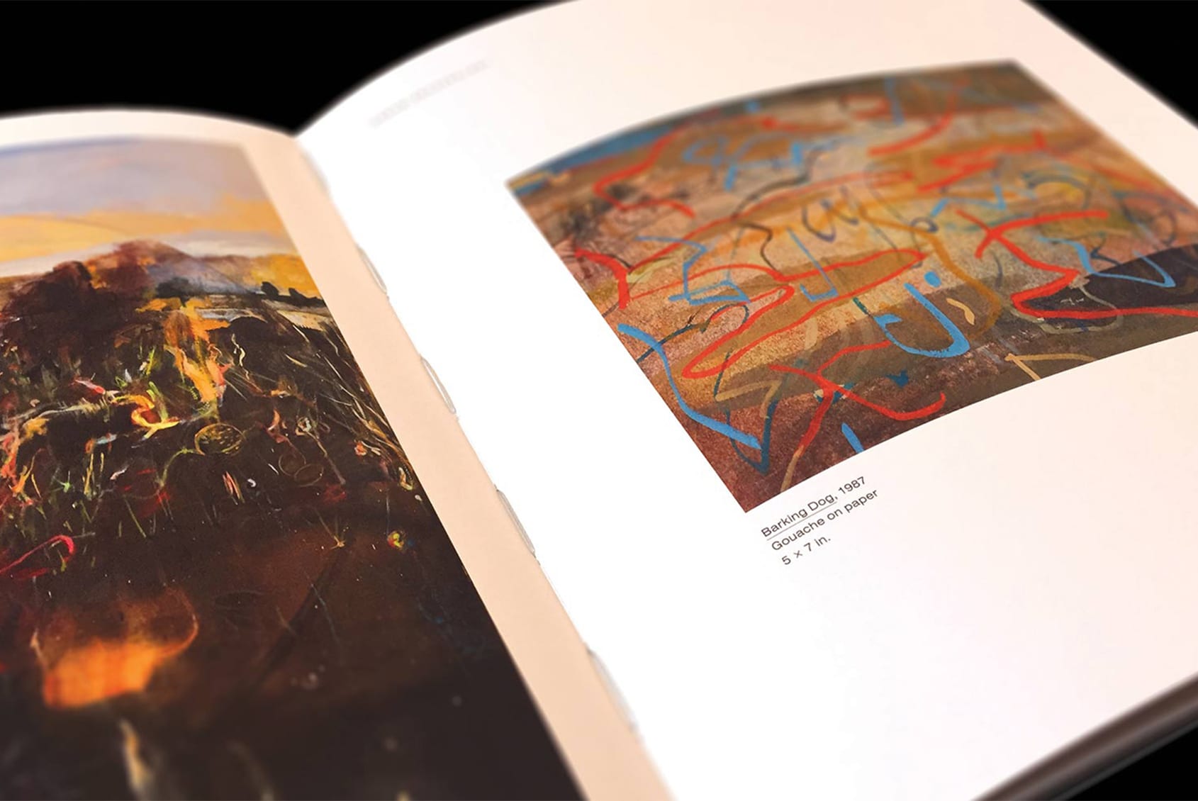
Bunny Harvey: Four Decades marked Professor Harvey’s retirement after 40 years of teaching at Wellesley. We took inspiration directly from the nuances of her work. Its frequently square composition determined the format, while the book’s red stitching mimics the vivid paint strokes that dart through her landscapes. As much of Bunny’s work exposes the unseen senses and underlying forces in the natural world, layering became a motif in the book. We revealed the book’s binding on the spine, and allowed the captions to float toward images, as if pulled by gravity.
Recognition: New England Museum Association First Place in Exhibition Catalogs
Book Design / Catalog
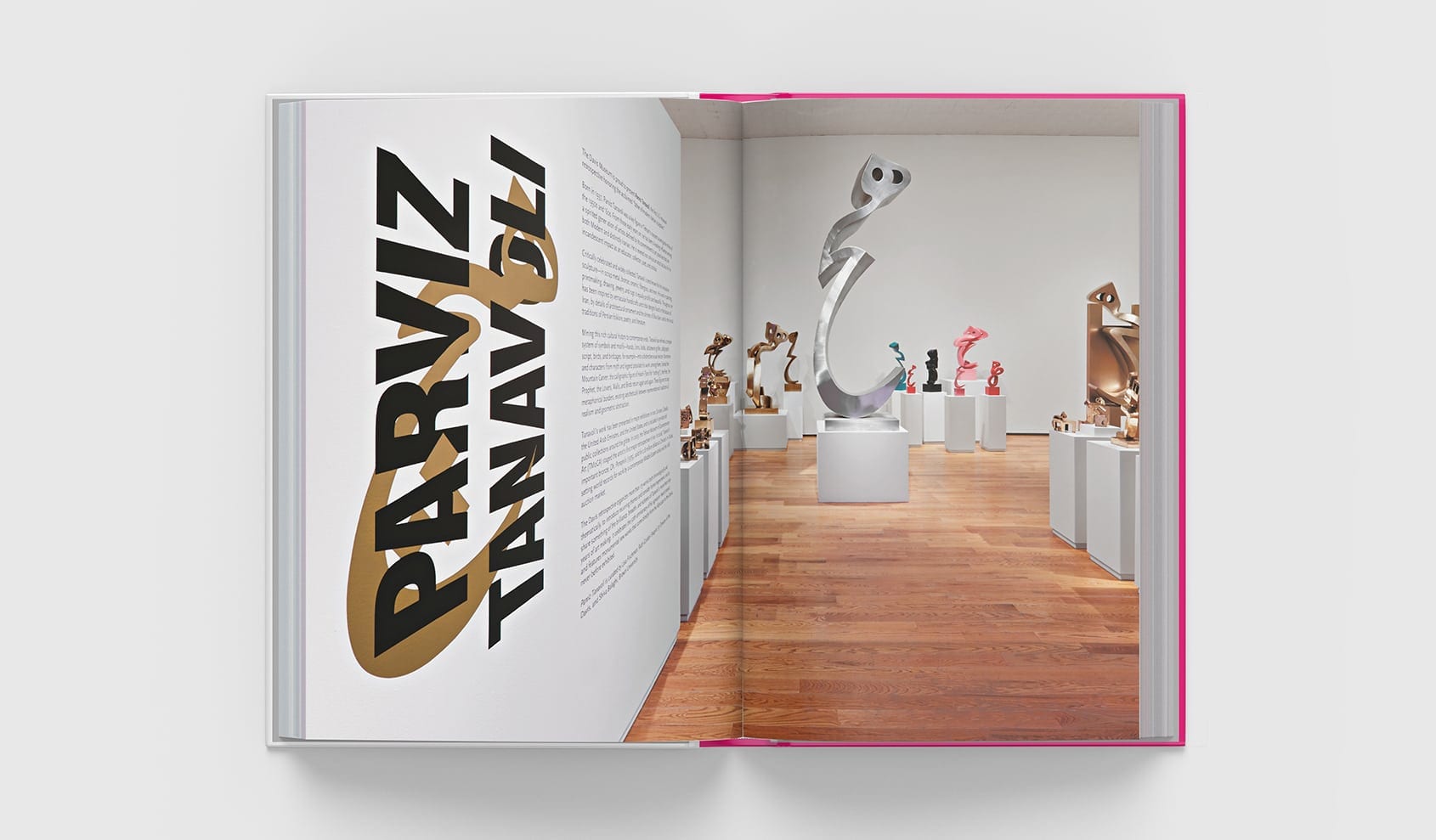
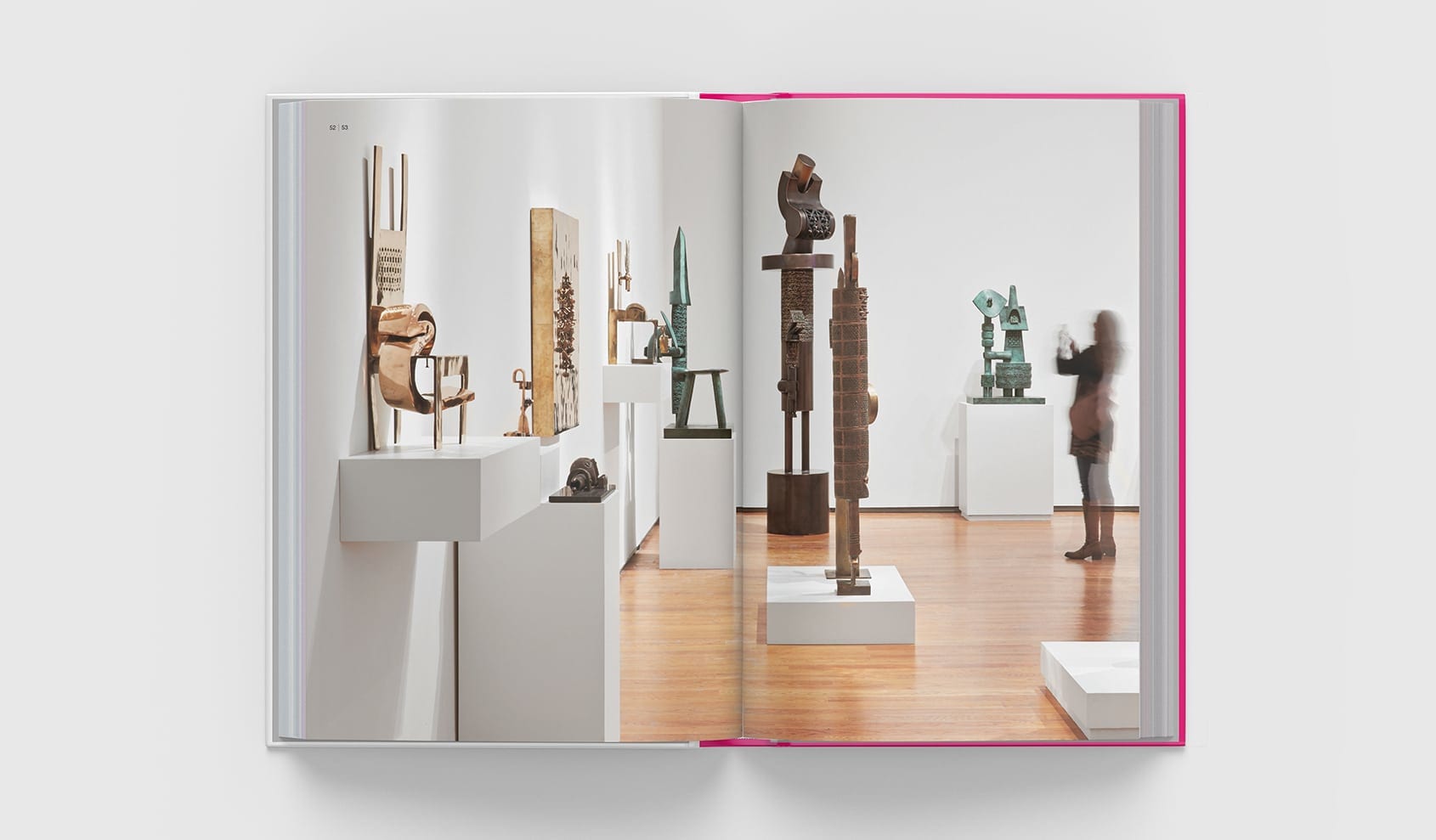
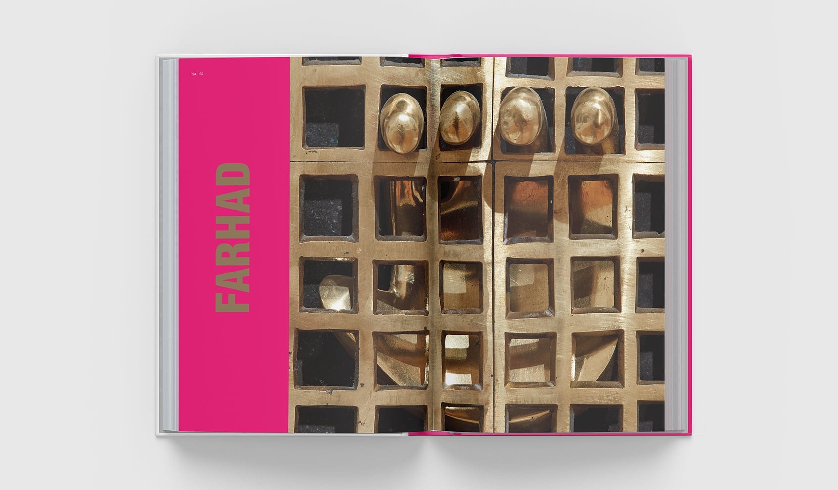
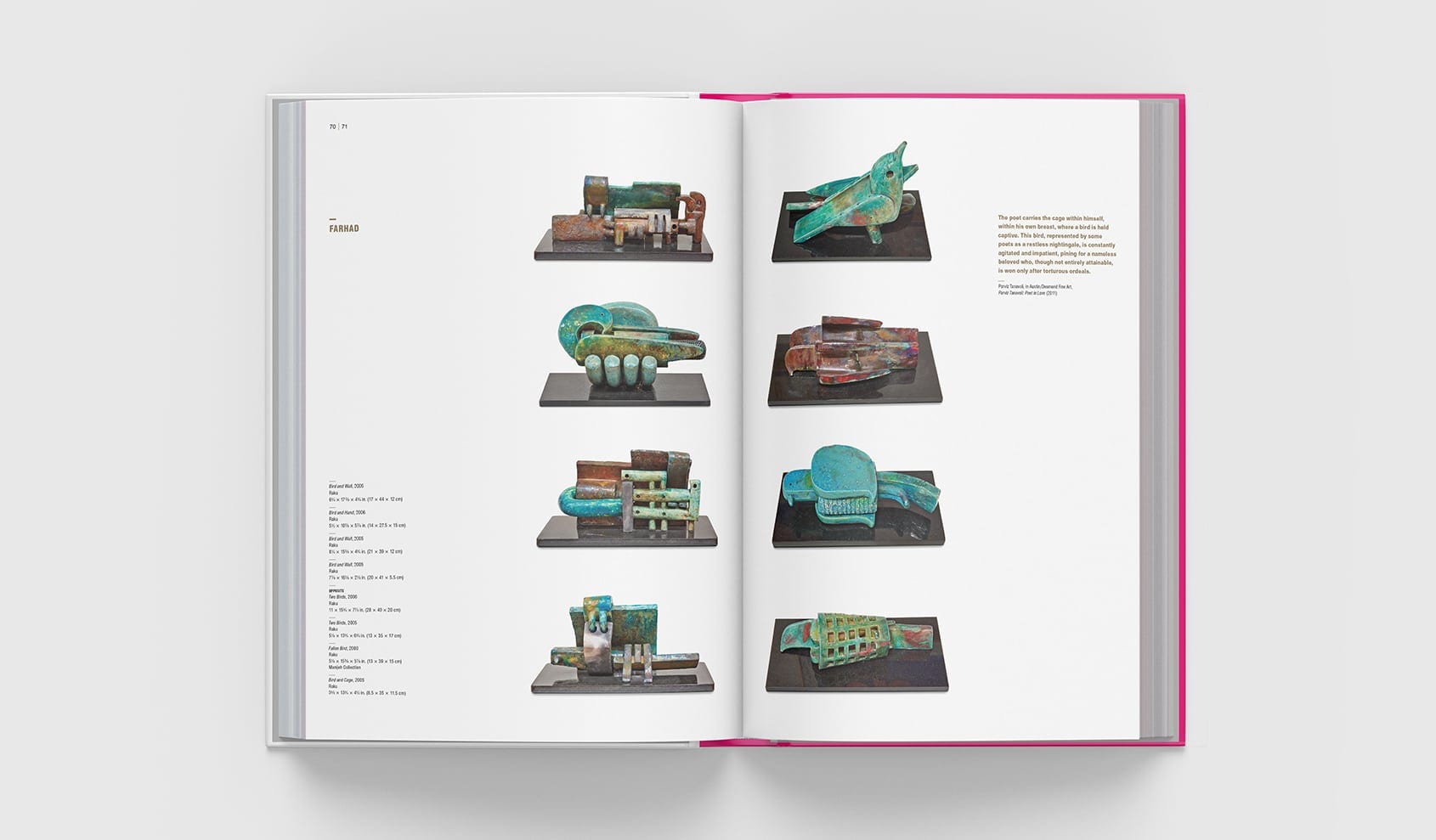
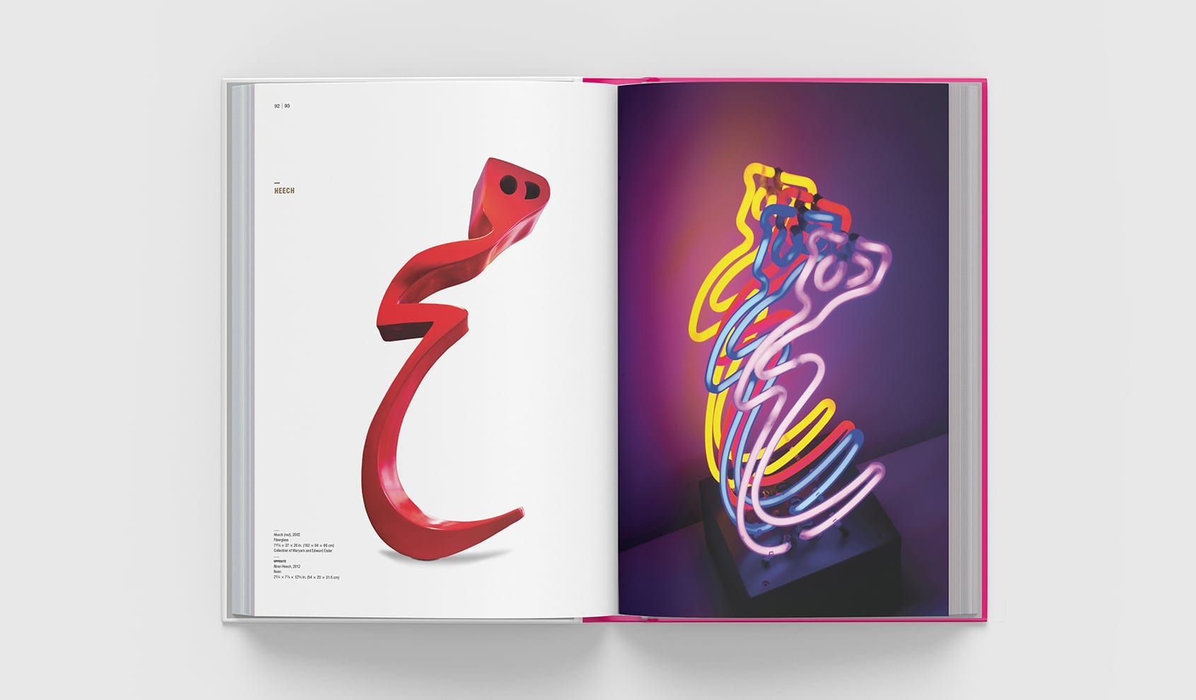
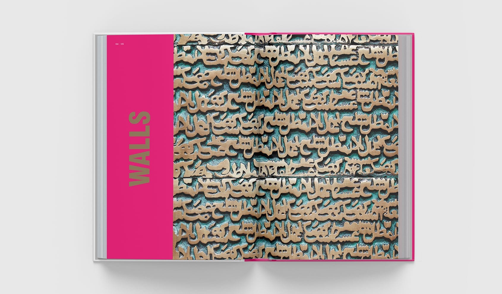
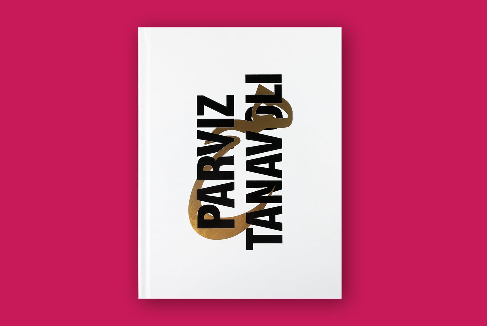
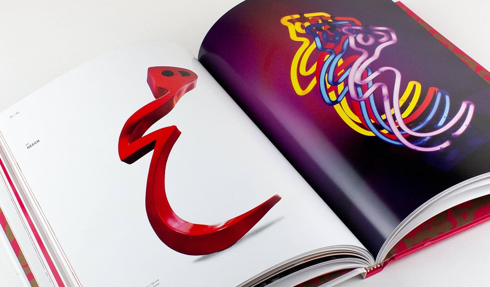
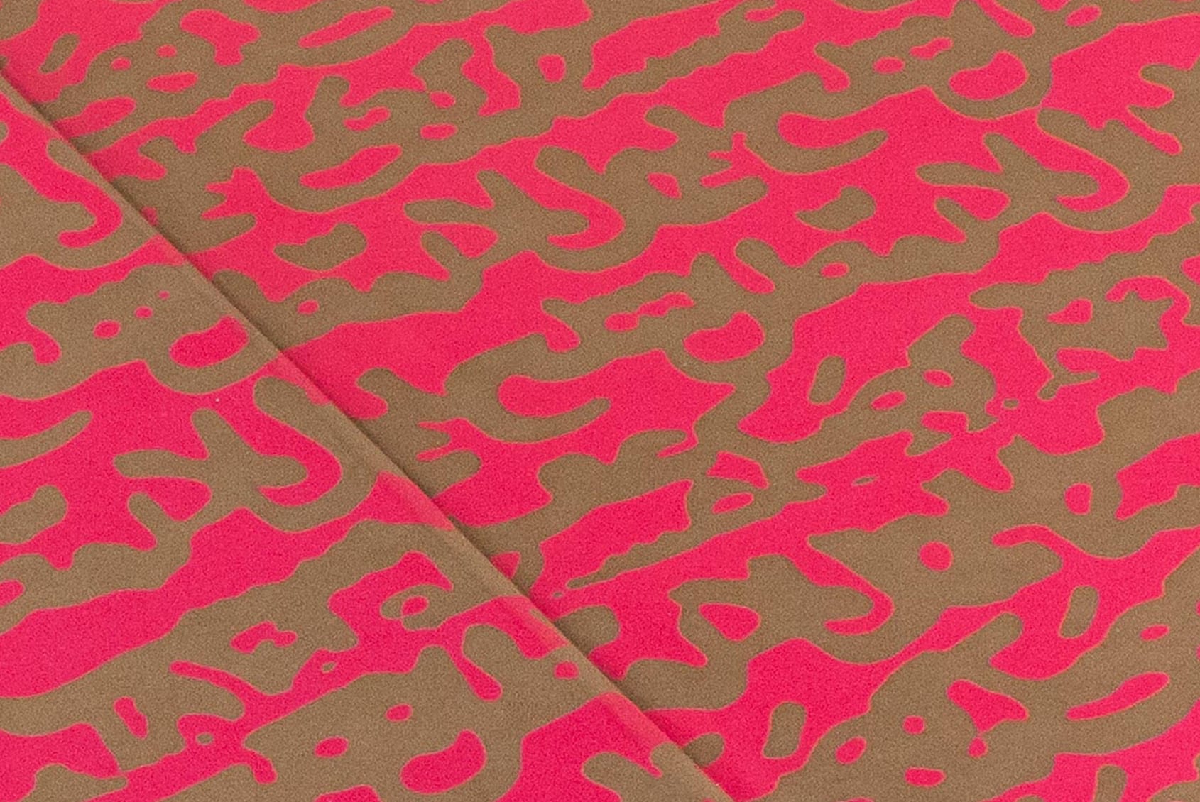
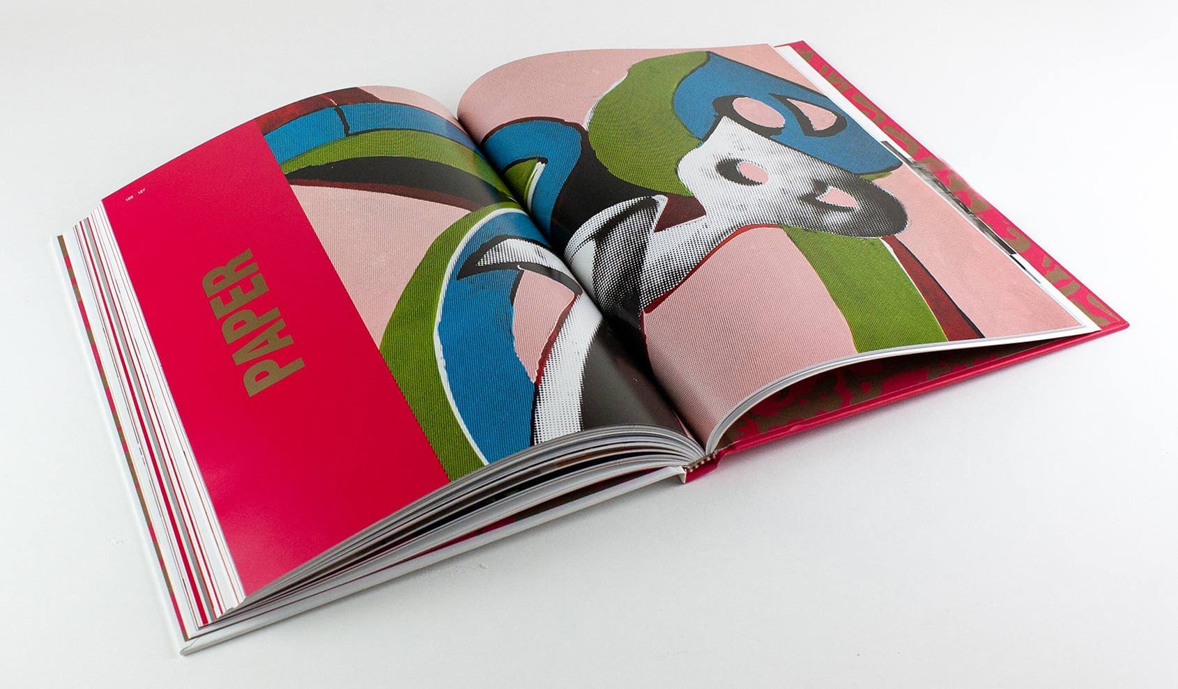
Tanavoli is known as the father of modern Iranian sculpture. The Davis mounted the first U.S. retrospective of his career, and the historic exhibition called for an equally notable catalog. The oversized hardbound format is organized to reflect the experience and flow of the galleries. A gold foil stamp on the cover and spot metallic ink used throughout the book reflect the metals in Tanavoli’s work. Neon pink section openers capture the artist’s pop sensibilities and play with language, form, and media.
Recognition: UCDA Excellence Award
Book Design / Catalog
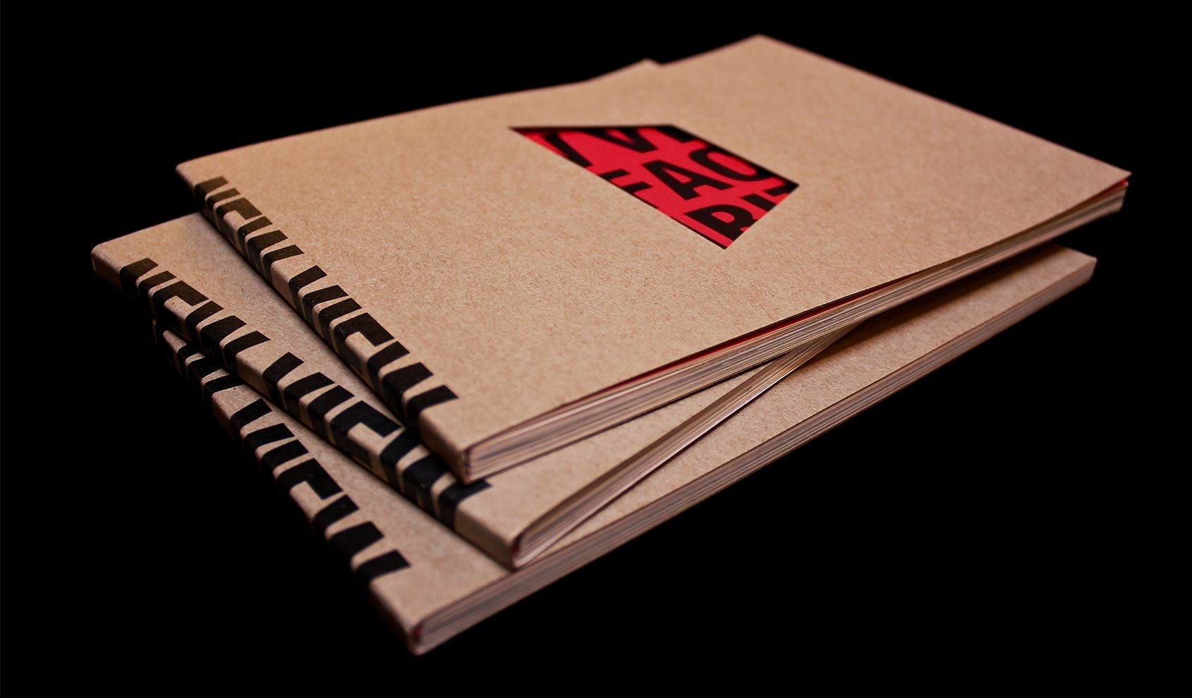
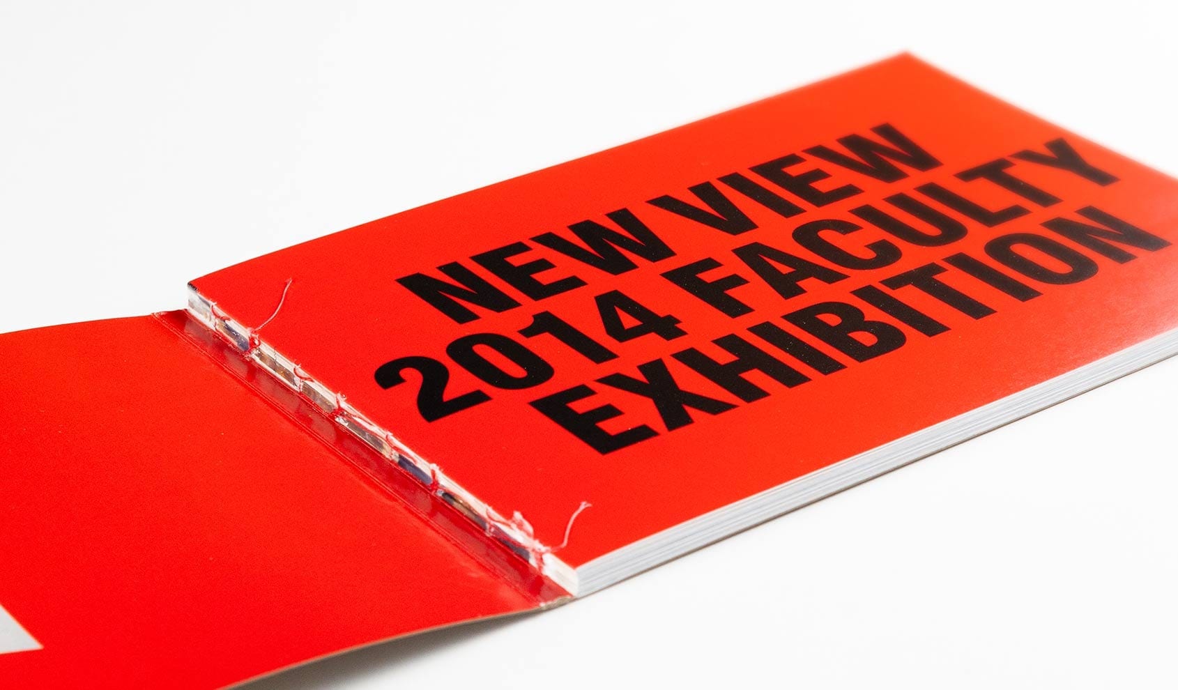
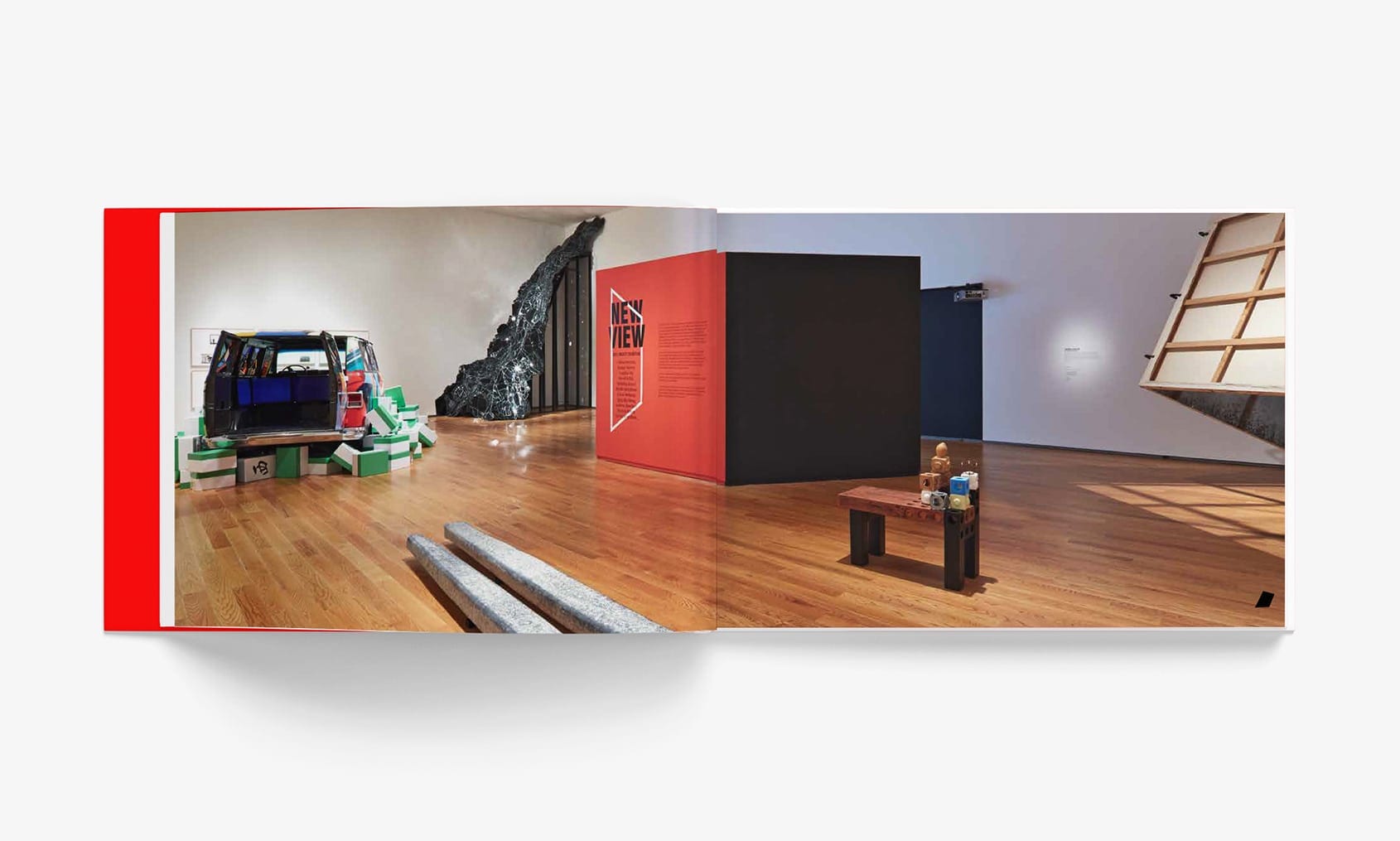
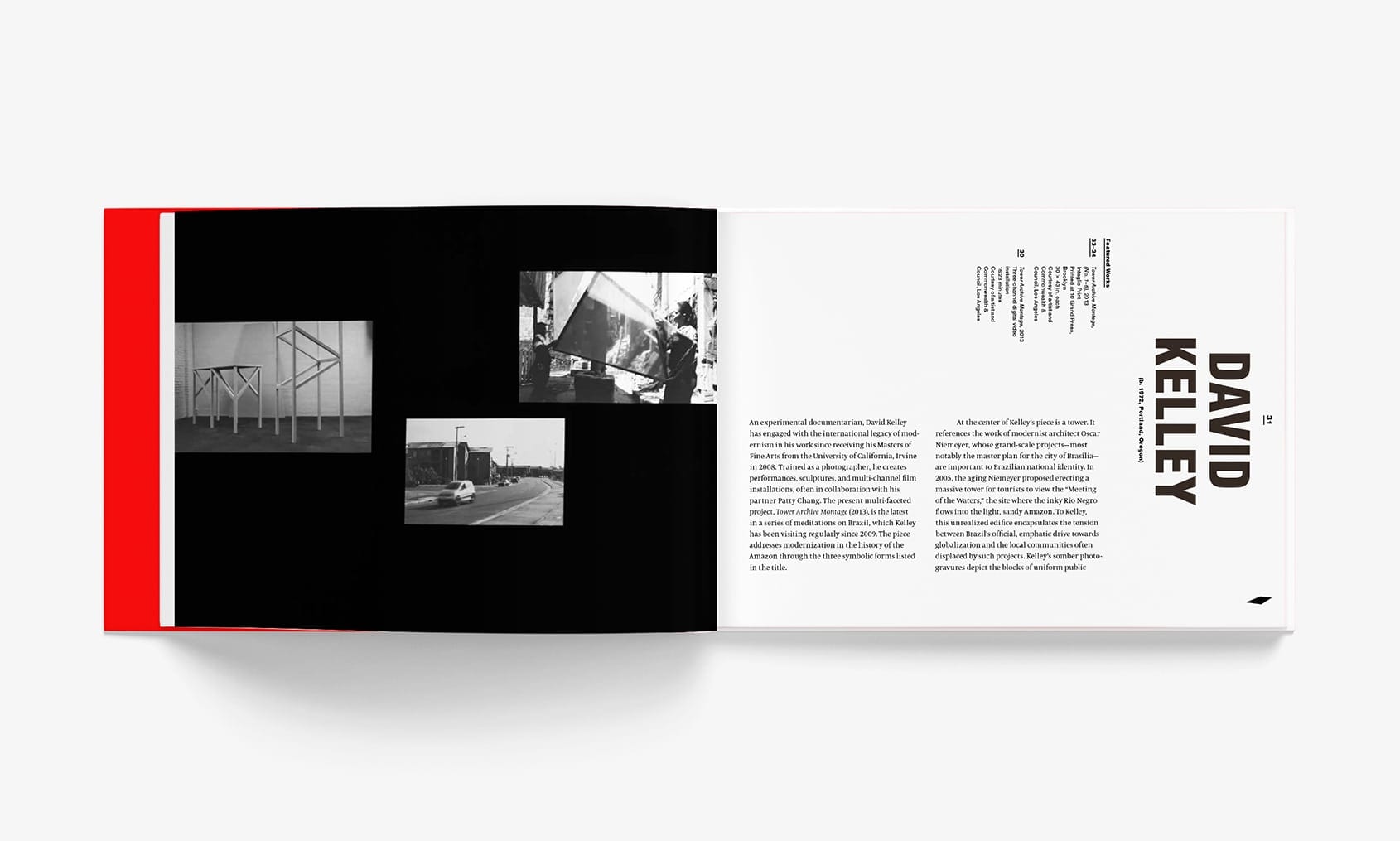
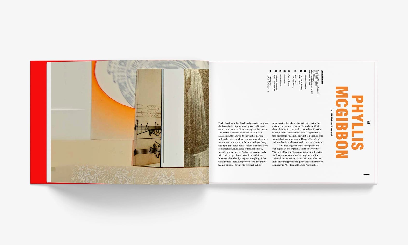
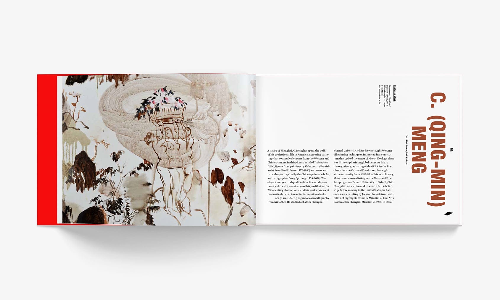
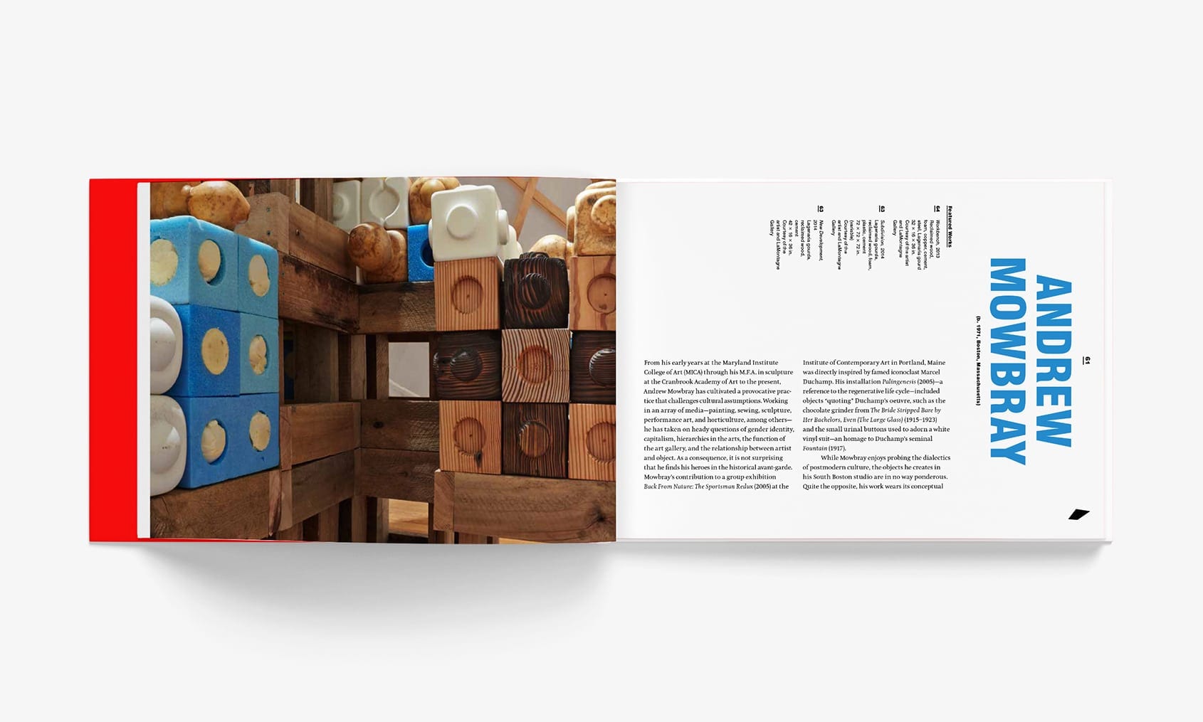
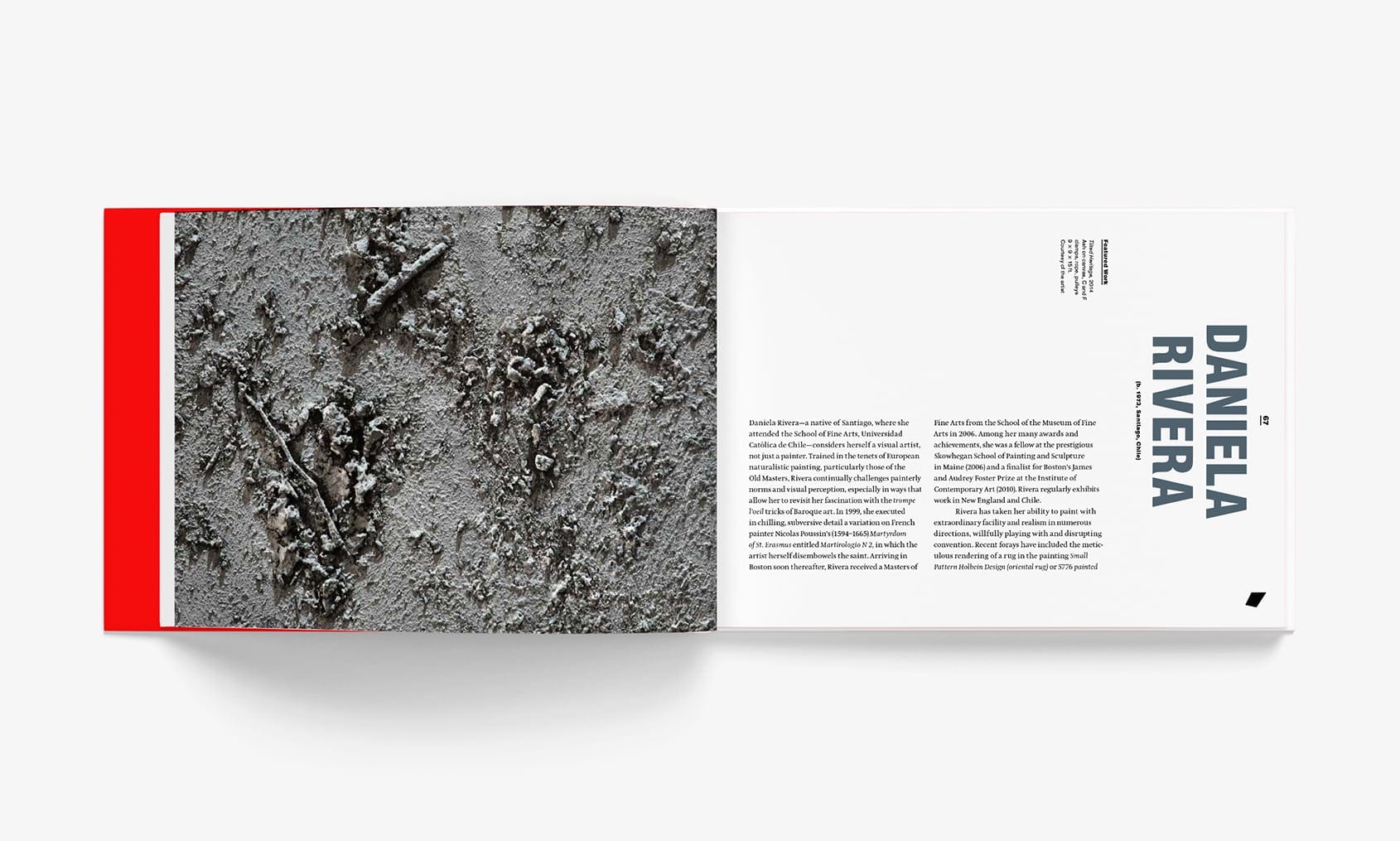
Our first collaboration with the Davis was the catalog for the 2014 faculty exhibition: New View. While hewing closely to the Davis’ identity guidelines, the title inspired ample play with the format. We designed a die-cut cover that becomes a viewfinder, vertically rotated title and caption type, and a trapezoid detail on each page that morphs like a flipbook. Each professor’s section begins with a close detail that reveals the process of their work—a gestural painted line, or the rough edge of a granite pylon. Similarly, we exposed the book’s inner workings with a Swiss-style smyth-sewn spine, and a raw bookboard cover.
Recognition: UCDA Excellence Award
