Boston Athenaeum
Identity / Brand Strategy / Print / Digital
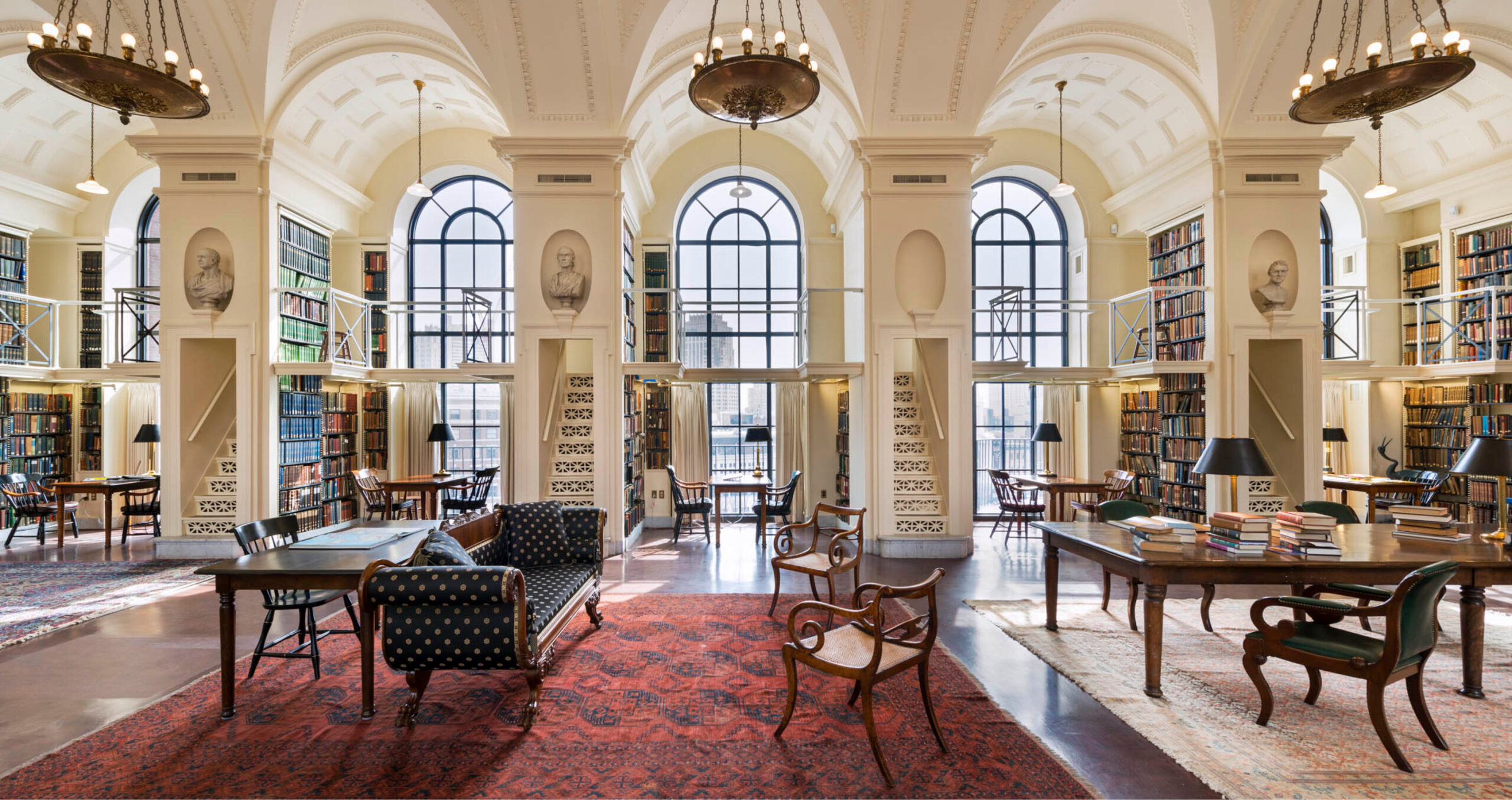
The Boston Athenaeum is a seamless combination of library, museum, and cultural center. Their stunning collection of rare books, manuscripts, maps, and art is housed in a magnificent space on Beacon Hill. An expansive renovation of the landmark building was recently completed, and it was clear the brand needed an update, too.
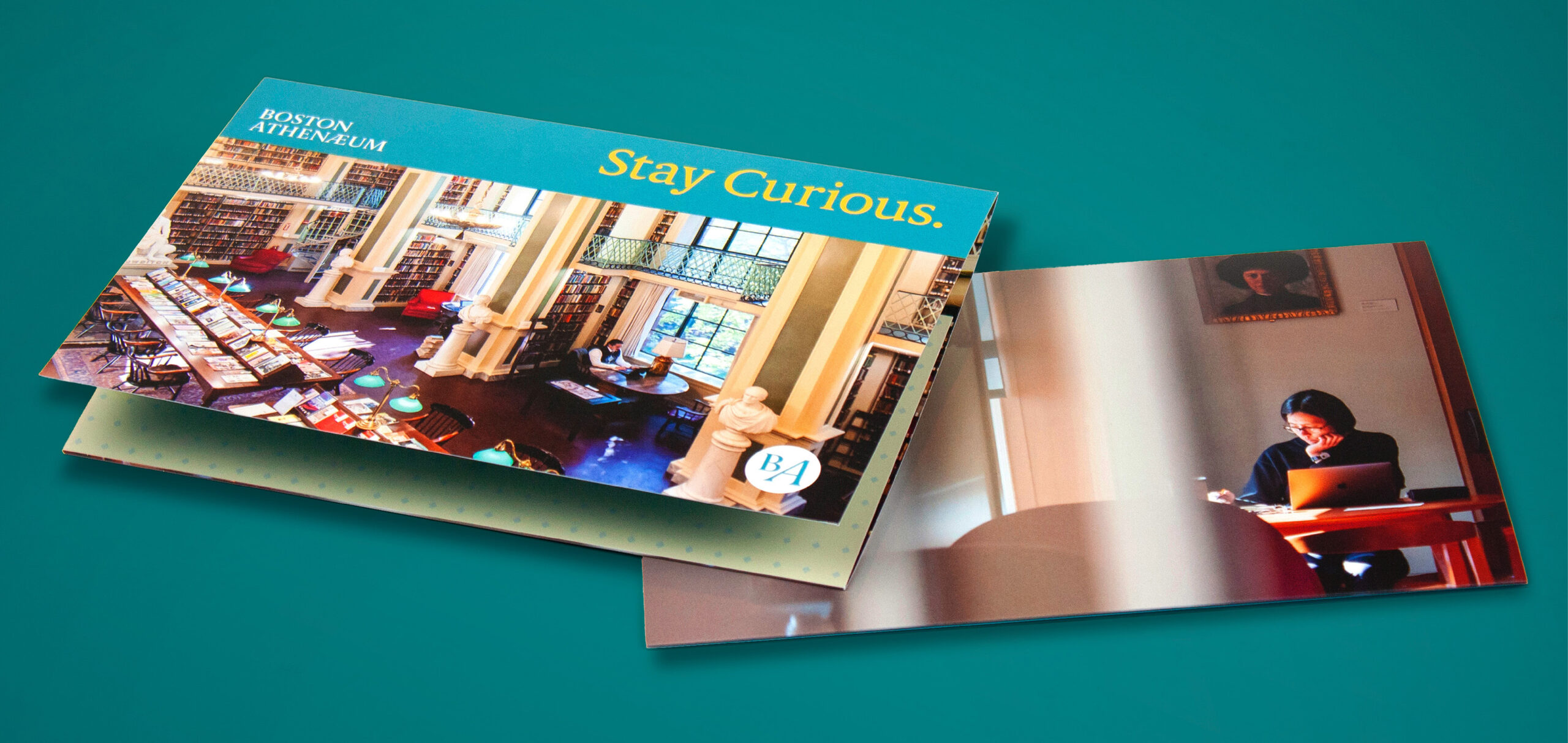
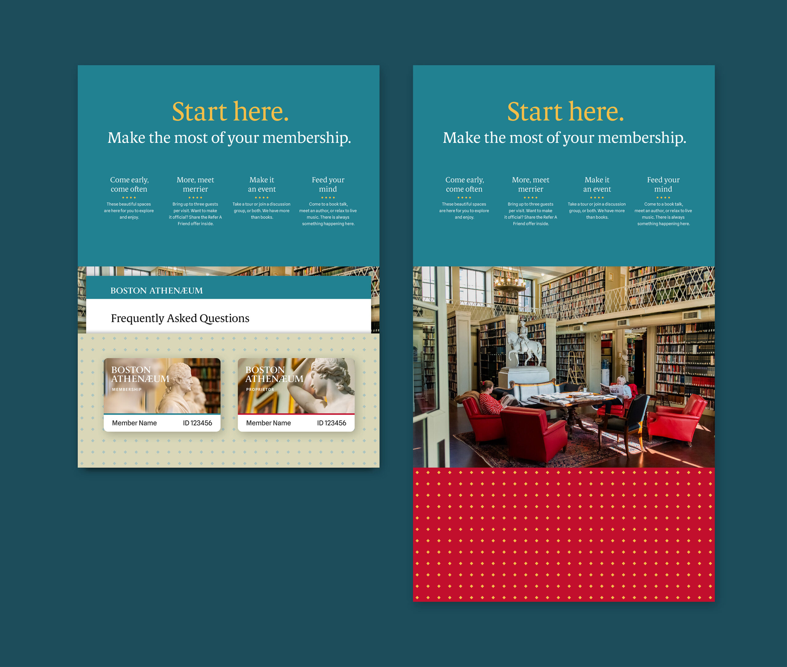
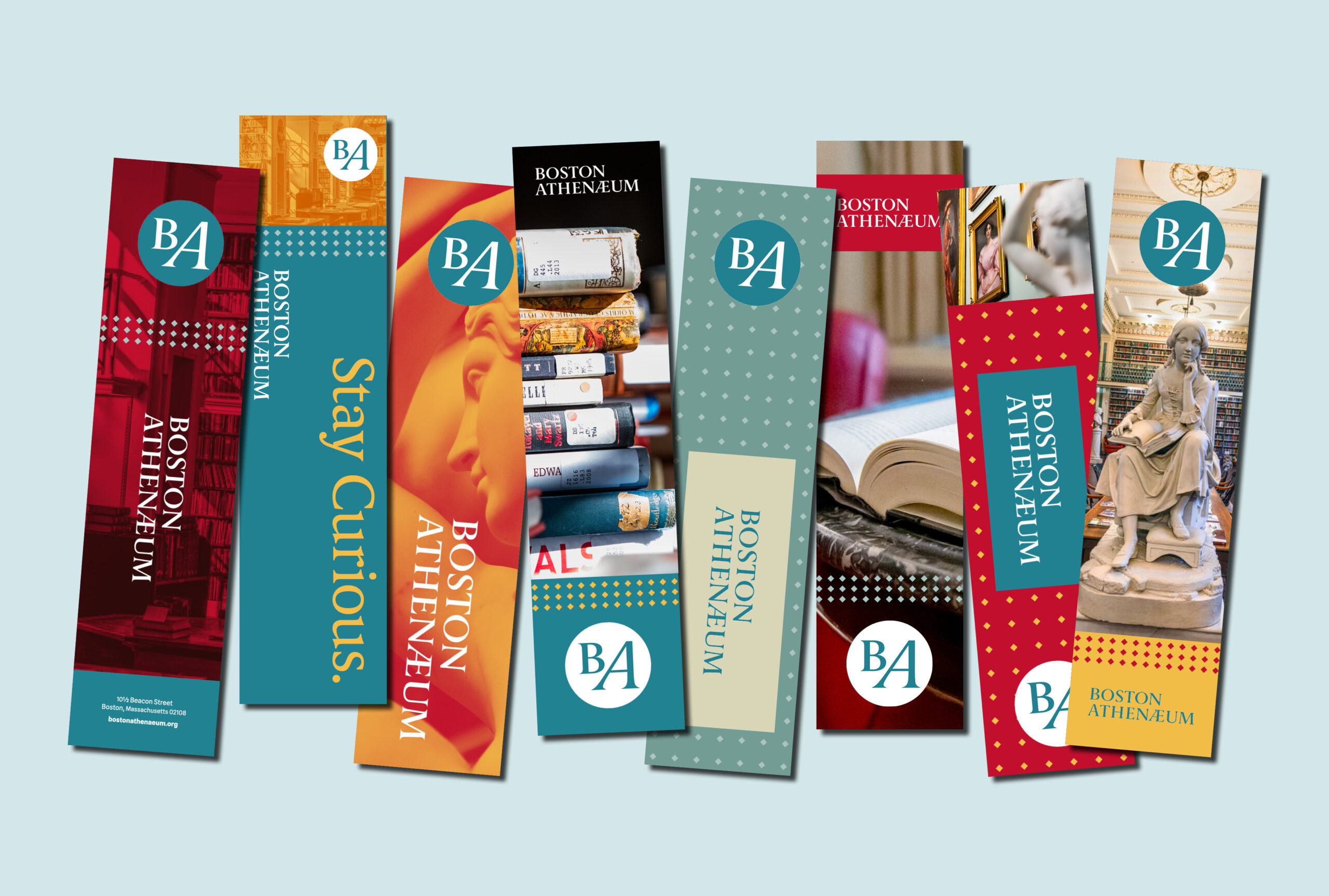
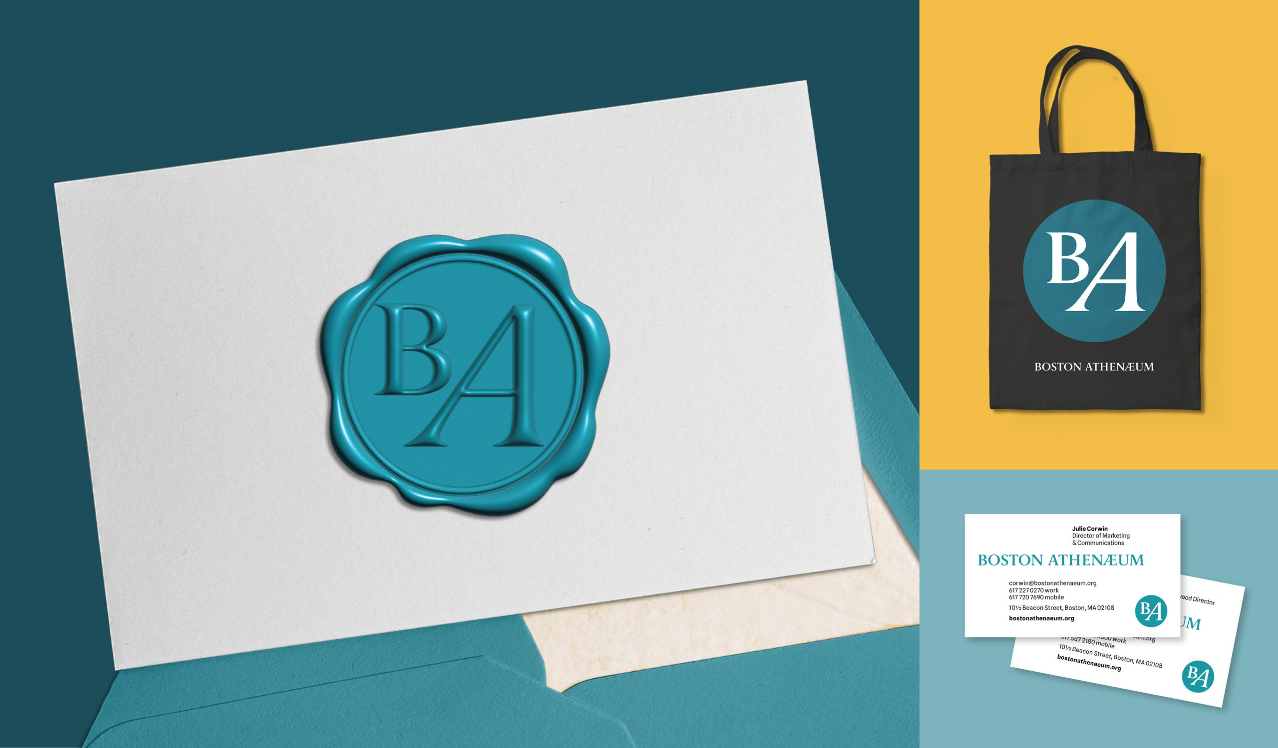
Working closely with the Athenaeum’s team, Stoltze developed a fresh, contemporary identity system to appeal to their diverse membership that can be applied easily and consistently by everyone at the Athenaeum.
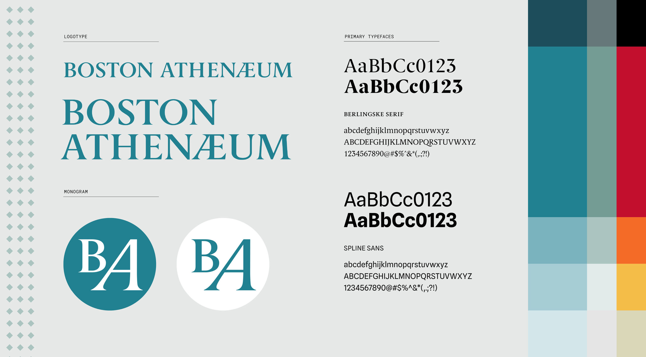
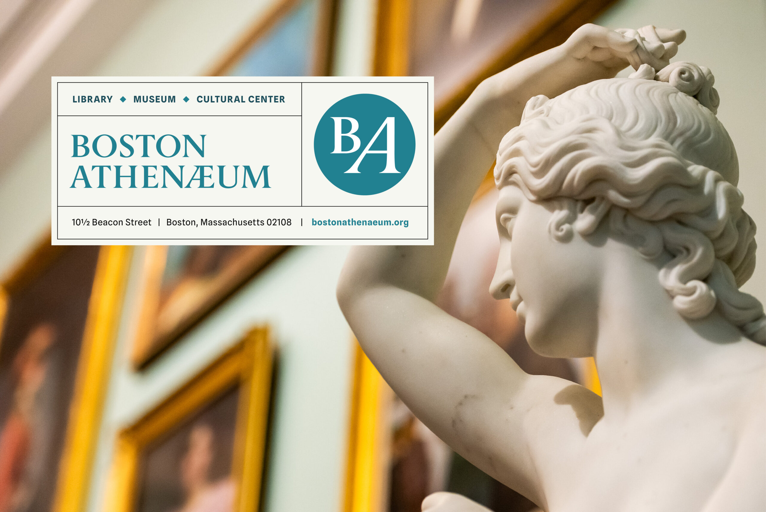
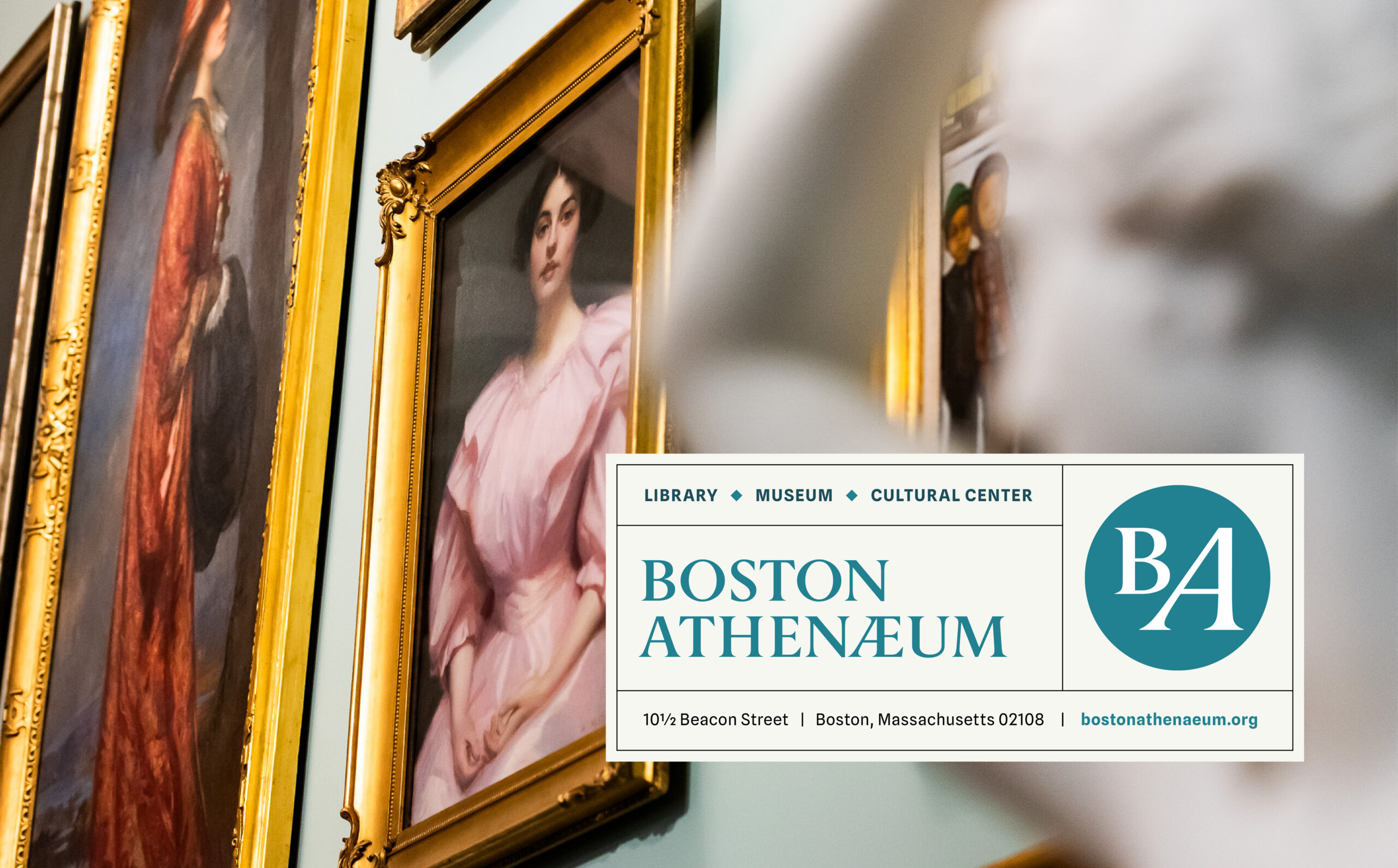
Berlingske, a contemporary take on a classic serif typeface, was used for the custom wordmark. Referencing the distinct AE ligature in Athenaeum, we also created a complementary acronym version of the logo, not unlike a printer’s mark. The open-source typeface, Spline, is a sans pairing that keeps the identity modern and flexible across platforms.
The spectacular space provided inspiration for a color palette designed to appeal to both new and longtime members. Likewise, each site visit revealed new patterns and silhouettes that we folded into the visual language. Brand guidelines were created to unify the Athenaeum’s voice across various applications, from social media, email and web, to print and environmental graphics. It’s a modern and elegant framework that elevates the identity of this extraordinary place.
Photography: Sarah Bastille, Anton Grassl, and Above Summit