Fort Point Community Branding
Identity / Branding / Messaging / Experiential / Illustration
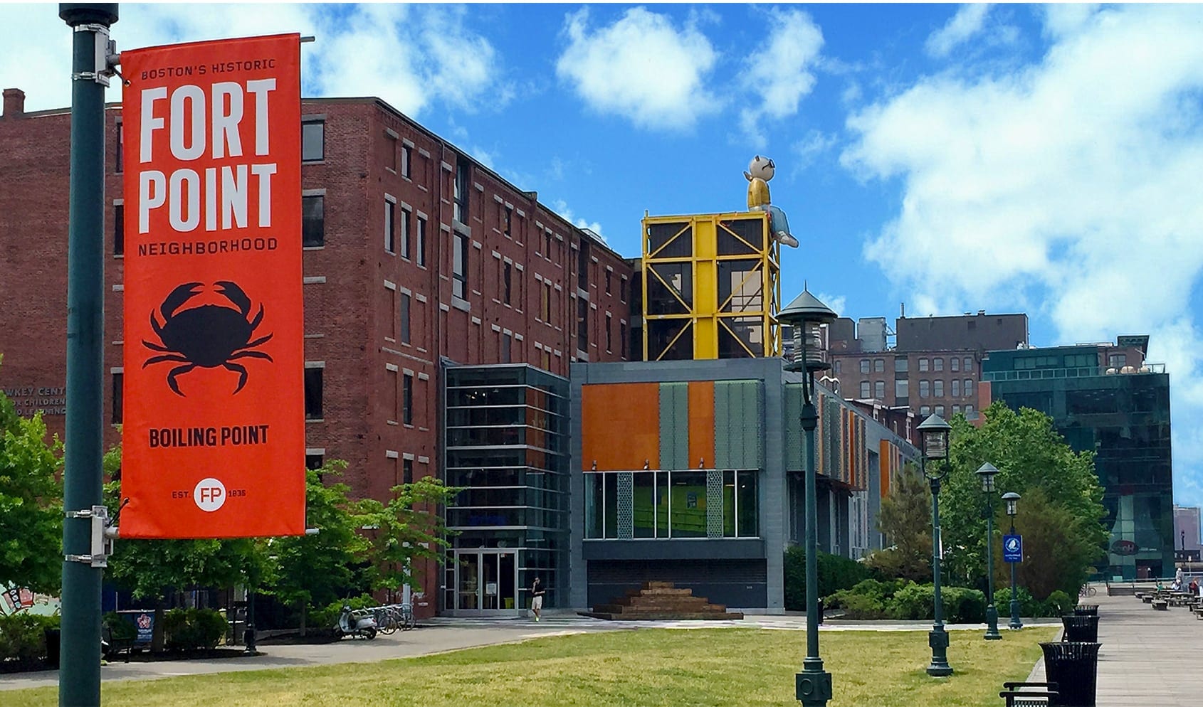
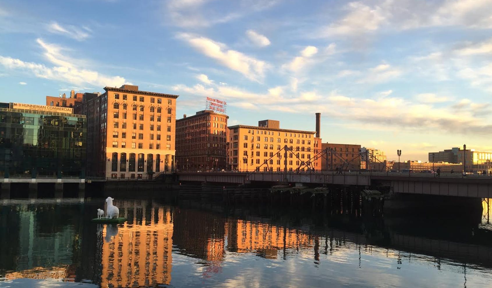
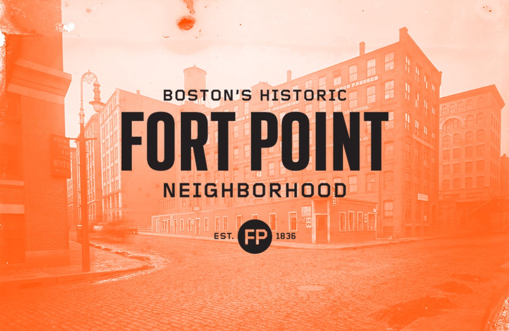
The Fort Point community, once home to a booming shipping industry and recognized as one of New England’s largest artists’ communities, now finds itself in the heart of high-priced office, retail, and residential development along Boston’s seaport. It’s also been the backdrop for Stoltze Design’s endeavors since we opened our doors in the mid-’80s. Given our fondness for and deep familiarity with the neighborhood, we were thrilled to work with the Friends of Fort Point to develop branding that speaks to its industrial past while projecting the promise of contemporary rejuvenation.
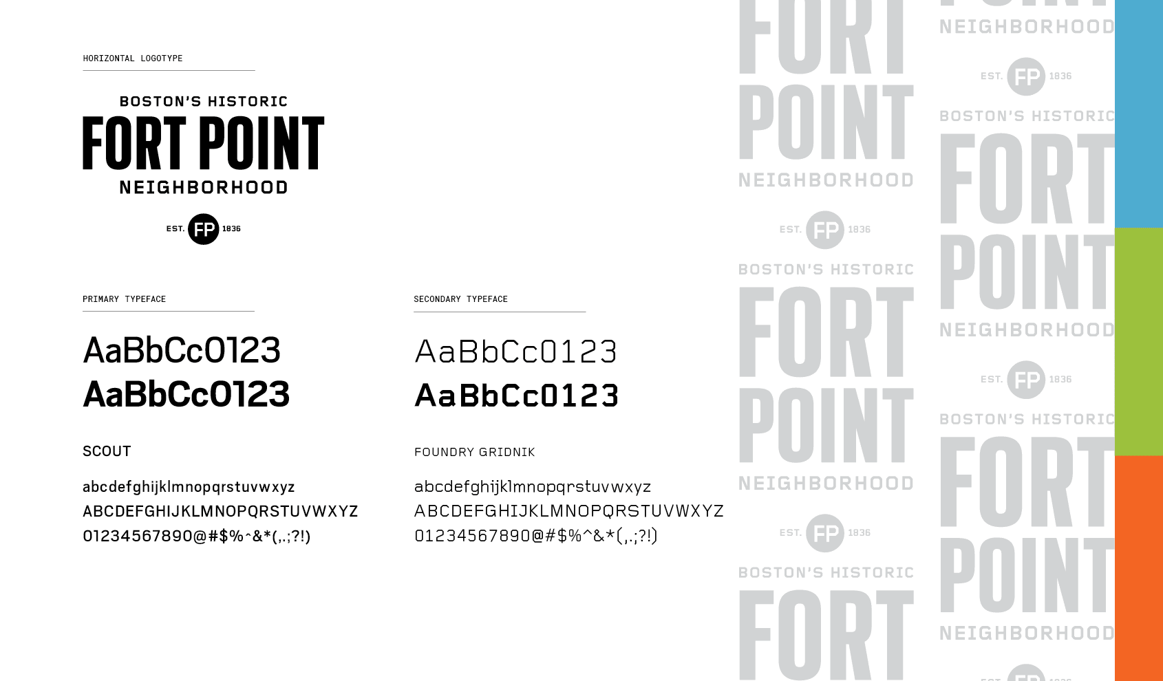
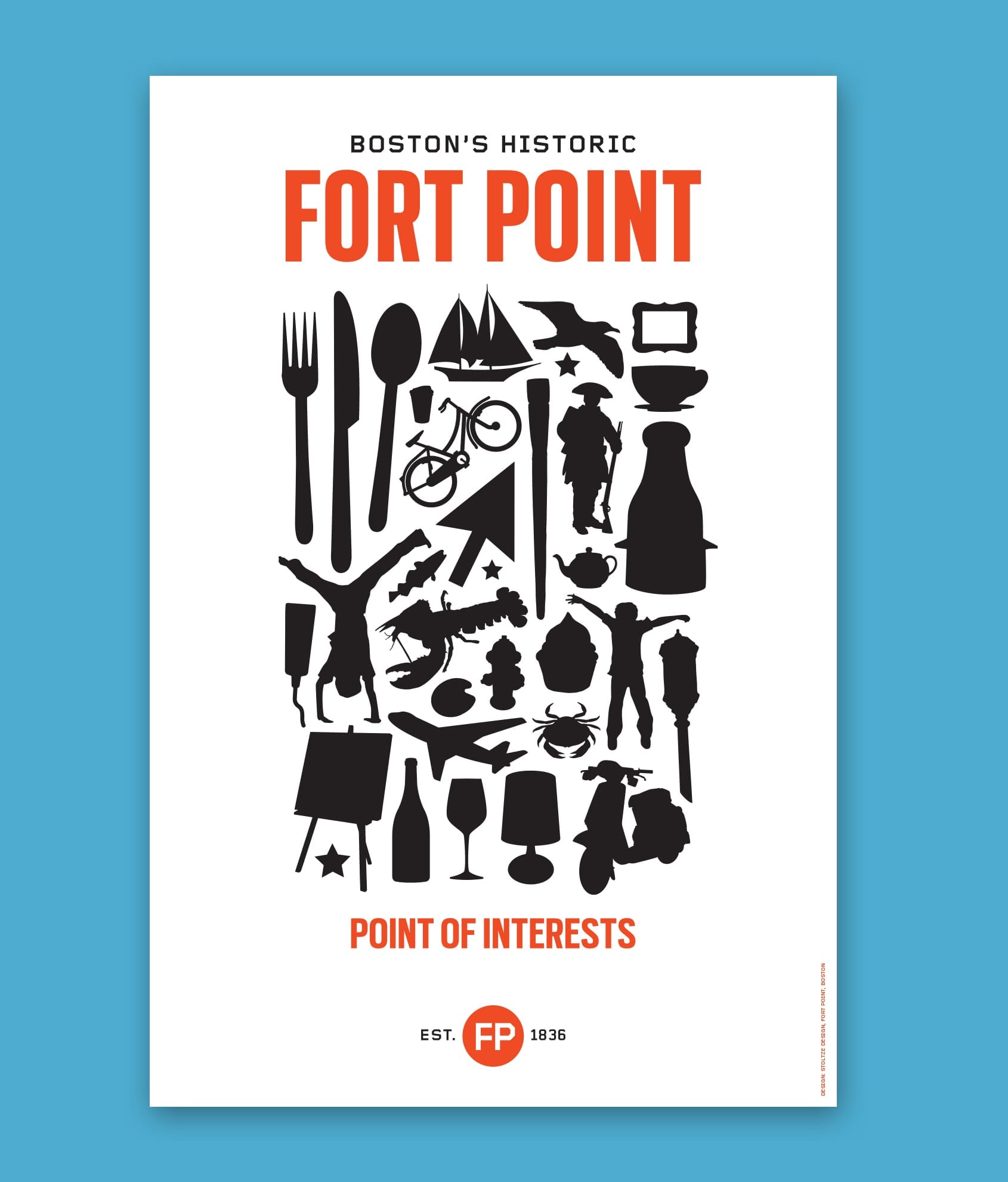
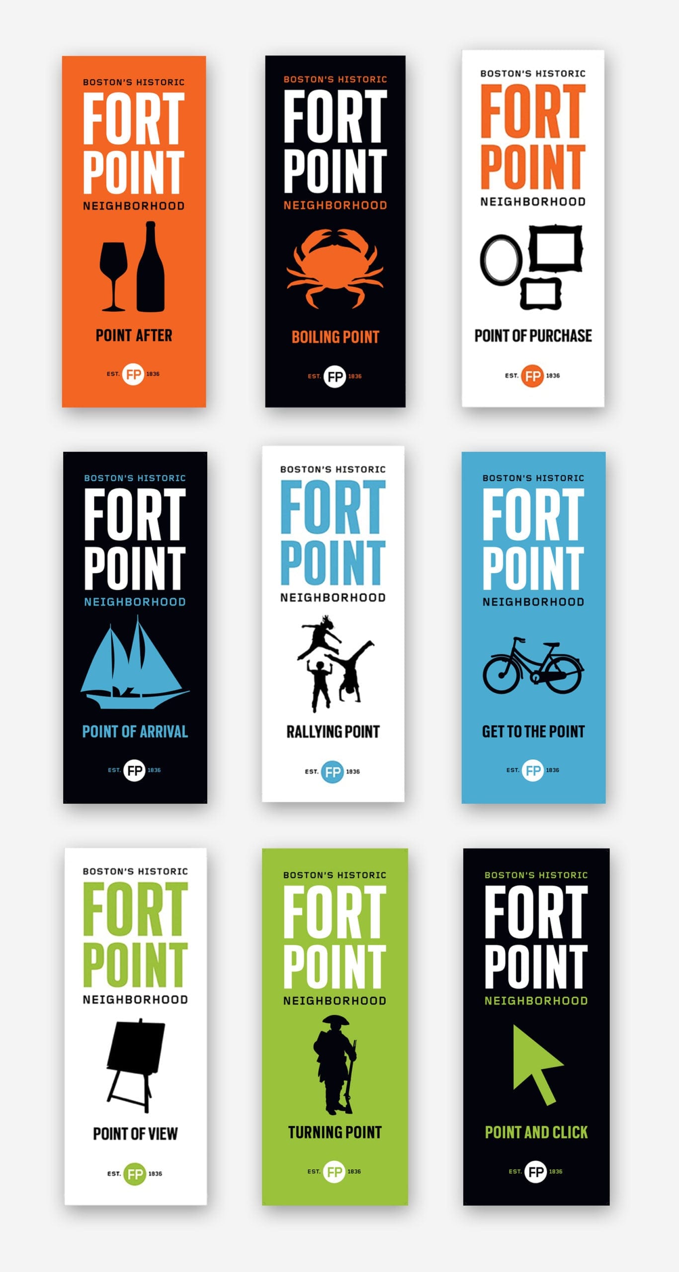
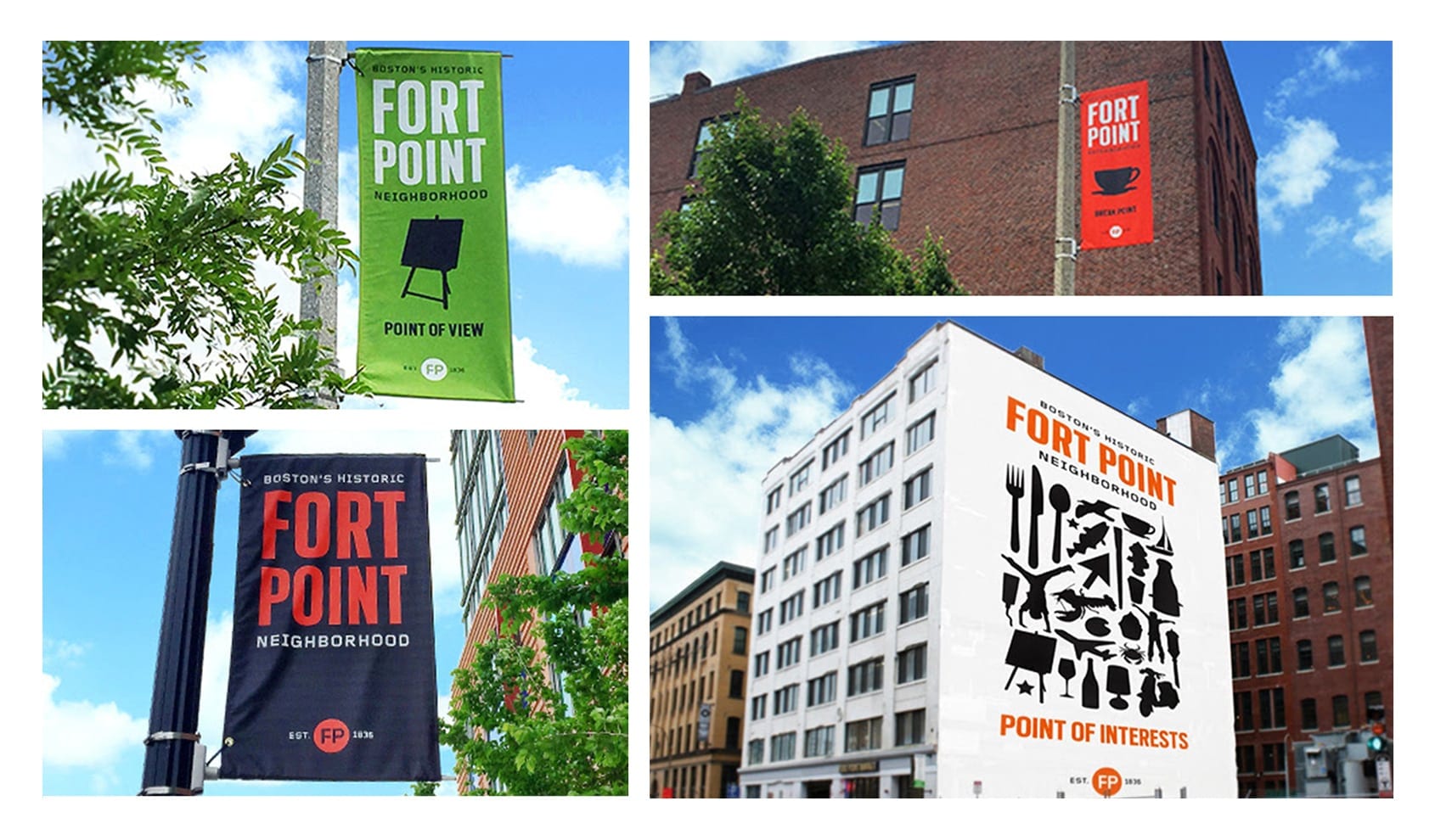
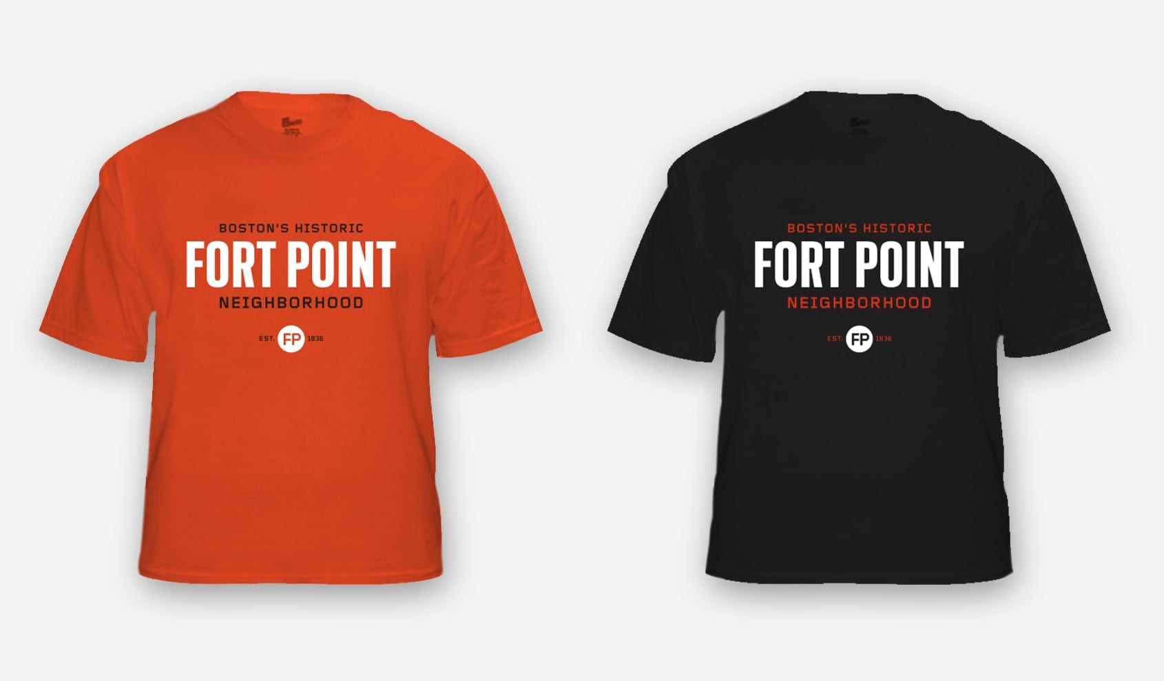
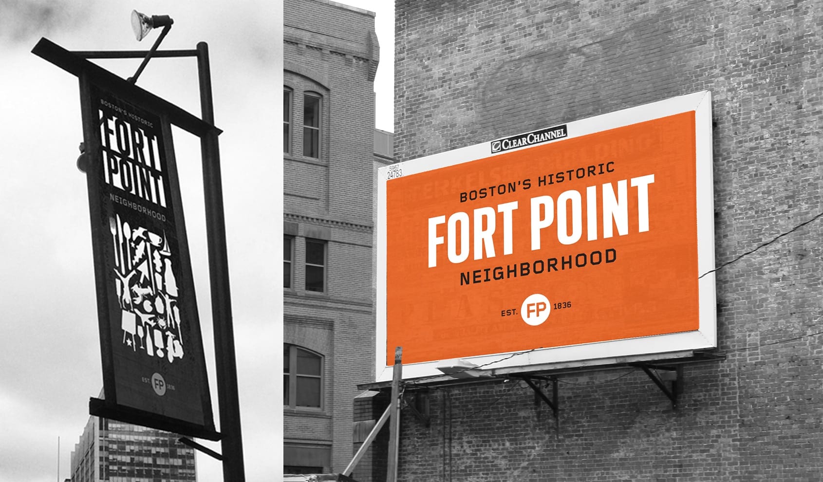
Through extensive research and rounds of community input, we developed a visual identity system for use on banners, websites, marketing materials, and environmental graphics. The color palette takes its cue from the neighborhood’s brick buildings juxtaposed against outdoor parks and the waterfront. Historically inspired typography was updated with the contemporary typeface Scout, from our neighbors, Font Bureau. We also developed a messaging platform using familiar phrases that incorporate the word “Point.” When paired with locally relevant icons and placed near specific landmarks and businesses, the phrases take on playful alternate meanings.
Recognition: Print Regional Design Awards